How to Design for Web Accessibility (5 Essential Tips)
There have been substantial advances in web accessibility in recent years. However, with so many developments to consider, you may not be sure how to get started with accessible web design. From contrasting colors to readability and mobile-friendliness, Beaver Builder can help you reach the latest accessibility standards with ease.
In this post, we’ll discuss what website accessibility is and why it’s important. We’ll then share five ways you can design for accessibility. Let’s get into it!
Table of Contents
- What Is Web Accessibility?
- Some Examples of Web Accessibility
- Why Is Web Accessibility Important?
- The Legal Implications of Web Accessibility
- How Beaver Builder Supports Web Accessibility
- How to Design for Web Accessibility Using Beaver Builder (5 Tips)
- Add Alt Text to Your Images
- Improve Readability
- Use Contrasting Colors
- Implement Keyboard Navigation
- Ensure Your Website is Mobile Accessible
- Conclusion
What Is Web Accessibility?
Web accessibility enables individuals with disabilities or alternative needs to use the internet. It allows them to more easily understand your content and navigate your website.
Those who may need extra assistance with web accessibility include those with auditory, visual, cognitive, neurological, or physical disabilities. All those mentioned have differing needs, and creating a universally accessible website can be challenging.
Some Examples of Web Accessibility Issues
Now let’s look at some specific examples of web accessibility issues. For instance, blurry, distorted, or unclear designs may be an obstacle for those with limited vision. Meanwhile, people with motor impairments may be unable to use a mouse, making a page impossible to navigate.
Some additional issues that users may face include:
- Confusing forms: These can be a problem for individuals with cognitive impairments.
- Poor color contrast: Those with color blindness may struggle to read pages.
- Lack of subtitles: Users with limited hearing will struggle with videos if you don’t provide accompanying text.
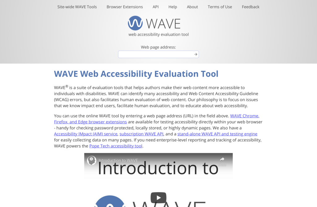
This list is by no means comprehensive, and you should consider doing a check to see what your website’s current standard of accessibility is. You can do this by using an online checking tool such as the WAVE web accessibility evaluation tool:
WAVE can identify many accessibility errors and “facilitates human evaluation of web content.” You can check any website by simply entering the URL in the field provided. An extension available for Chrome, Firefox, and Edge will allow you to test password-protected, locally stored, or highly dynamic pages.
Why Is Web Accessibility Important?
Web accessibility is a growing concern and something you might wish to seriously consider. One billion people — approximately 15 percent of the world’s population — live with some form of disability. Moreover, 75 percent of Americans with disabilities report using the internet daily.
Globally, the market that includes people with disabilities is worth over $13 trillion, meaning it isn’t something you should consider a minority issue. In our more socially conscious age, 58 percent of companies have started exploring inclusive innovation opportunities.
In fact, 29 percent have a targeted network of disabled consumers or stakeholders. As these numbers continue to grow, businesses that don’t move to implement web accessibility risk the competition leaving them behind.
The Legal Implications of Web Accessibility
Web accessibility isn’t just an ethical or business issue. It’s also a legal one. The Americans with Disabilities Act (ADA) requires businesses to make accommodations for those who are disabled.
However, there are no clear regulations on what such web content should look like, only that certain businesses offer a website that includes “reasonable accessibility.” These include blind or deaf people who will need to navigate your webpage via voice, screen readers, or other assistive technologies.
Since the ADA doesn’t offer set guidelines, many companies use the Web Content Accessibility Guidelines (WCAG) as a reference point. The WCAG is not a legal requirement but offers four areas where you can check if your website meets standards for accessibility:
- Perceivable: You should present your content in a way that is easily perceivable by at least one of the user’s senses.
- Operable: Your website navigation is easy to operate and does not require an interaction the user cannot perform.
- Understandable: Your content and the operation of your user interface are easy to understand.
- Robust: Different user agents, including assistive technologies, can interpret your content.
If you meet the standards of the WCAG, you will essentially meet the requirements of the ADA as well.
How Beaver Builder Supports Web Accessibility
Our Beaver Builder plugin is a drag-and-drop builder for WordPress. It allows users to easily create professional-looking websites and landing pages without knowing a single line of code. Our tool has implemented several web accessibility solutions into its products to make creating a compliant website much more straightforward.
Web accessibility has two different fronts: the authoring side (where the user creates their website) and the HTML rendering side (which is viewable to the public). Beaver Builder modules are accessible at a basic level for both.
The authoring side features both keyboard navigation and color contrast. While the HTML rendering side features attributes that are useful to screen readers.
What’s more, Beaver Builder has also recently addressed several accessibility issues. These include changes to the Beaver Builder plugin’s Menu Module. Users are now able to tab through submenu items. Similarly, there is a new Menu label setting to allow the creation of a custom ARIA label. Plus, you can add alt tags to our Slideshow Module.
We have also changed the Beaver Builder Theme to include considerable new accessibility improvements. For example, navigation search has keyboard tabbing support and an ARIA label. Search widgets and comments form fields have ARIA labels, and submenus allow keyboard tabbing. You can find a full breakdown of what Beaver Builder offers in our documentation.
How to Design for Web Accessibility (5 Essential Tips)
There are several other things that you can do to help make your website accessible. Now, let’s go over five of the essentials for meeting and exceeding web accessibility standards. Keep in mind that the majority of these are implemented using our Beaver Builder plugin.
1. Use Alt Text for Your Images
Alternative text or ‘alt text’ for short is used within a site’s HTML to describe the appearance or function of an image that appears on a webpage. While using alt text isn’t strictly related to design, we’ve included it because it’s a crucial part of web accessibility.
Visually impaired users using assistive technologies such as screen readers will hear the alt text to understand what the image represents. Your website will also display alt text if it cannot load an image.
When writing alt text you should be clear and descriptive. However, remember to remain concise. Here’s an example of what alt text looks like in HTML:
<img src="beaverbuildingdam.png" alt="A beaver building a dam">
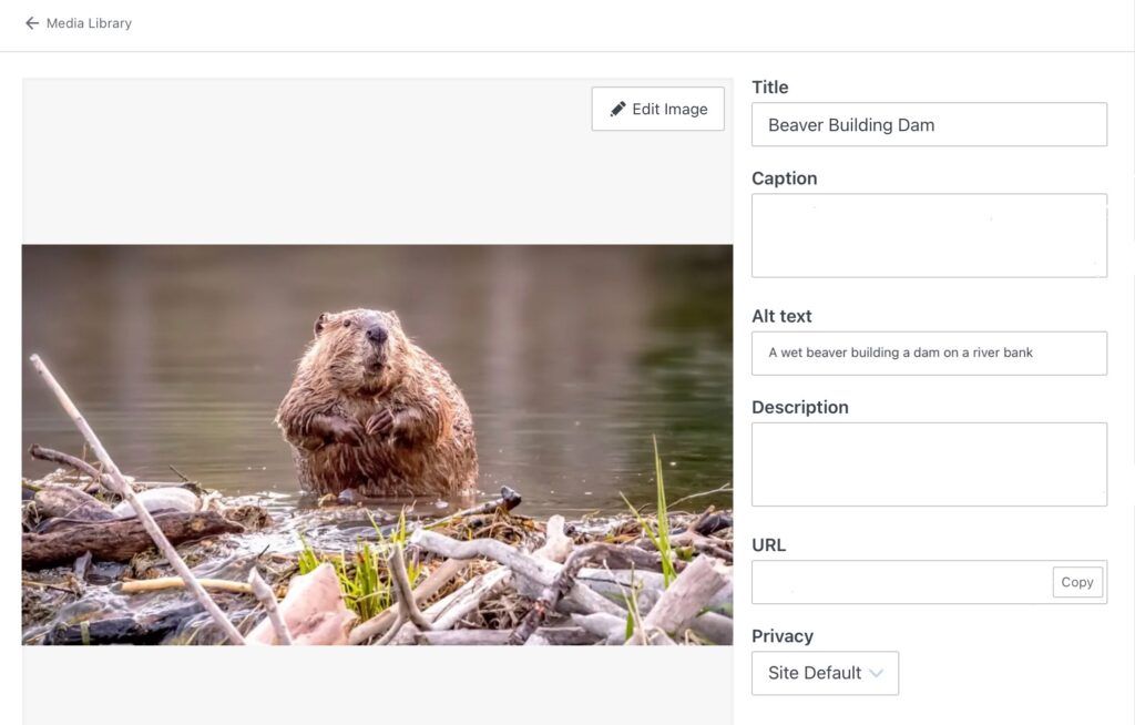
One way to implement alt text is to upload your image via the WordPress Media Library and then click on Edit:
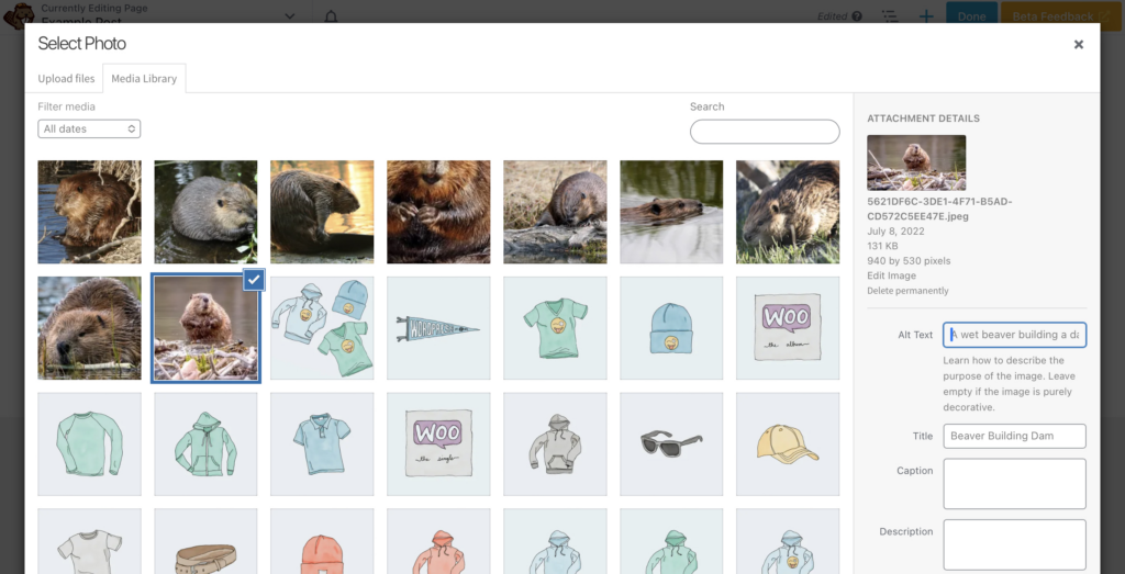
As you can see, there is a space to end Alt Text on the right of the screen. Entering the text here will ensure WordPress automatically adds alt text every time you use the image.
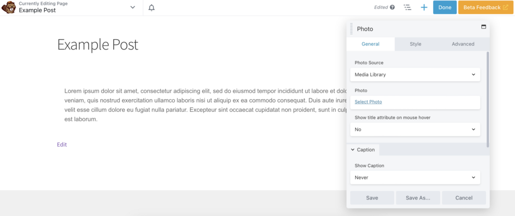
Alternatively, you can simply insert an image in your page or post using your preferred Beaver Builder photo module. Then, click on Select Photo to add your desired image:
Next, locate Alt text (alternative text) under Attachment Details in the popup:
It’s that easy!
2. Improve Readability
Readability is key when it comes to accessibility. This means your text should be clear and easy to read. To achieve this, it’s best to use plain fonts like Arial or Helvetica. While more elaborate designs are attractive, they can be challenging to read.
Typically, fonts and link colors will be stylized in your theme customizer, not one by one. However, there may be times that you need to style an individual module.
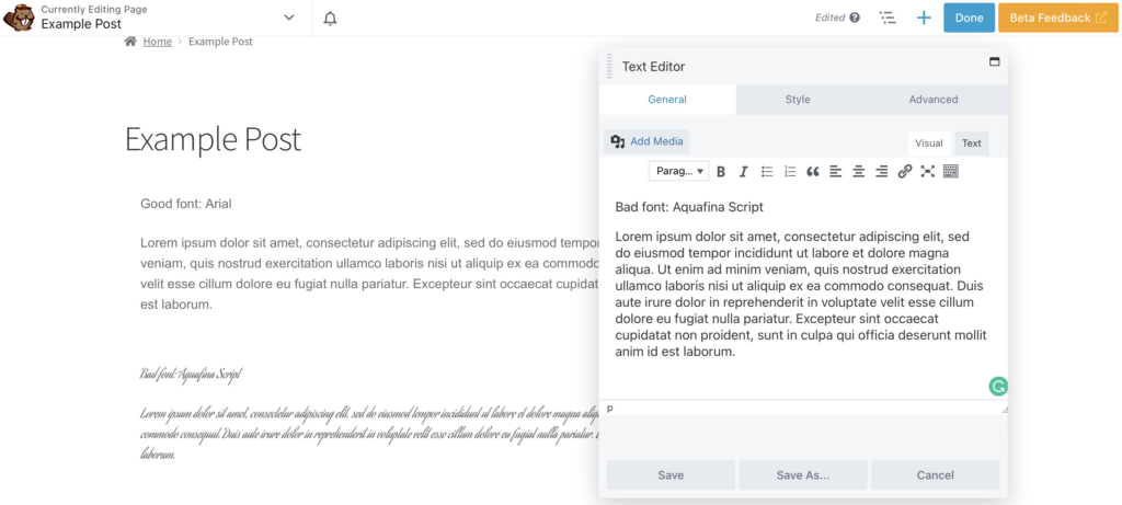
To change your font in Beaver Builder, select your Text Editor and find the Style tab. Open the Font selection to make adjustments. Below, we have included a good and bad font implemented using this method:
You should also avoid using too many different fonts or using all capital letters. Also, avoid underlining text outside of identifying links, as this can confuse the reader.
Furthermore, when it comes to embedded links, anchor text must make sense without the context of surrounding sentences. This means, you shouldn’t use text such as “Here,” “More,” or “Click Here.” Instead, give a complete description of the purpose of the link.
Additionally, while providing links in a different color is standard, this alone is insufficient for web accessibility. It’s also a good idea to give a non-color indicator like underlining or bolding text.
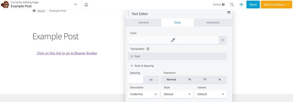
To achieve this look, you can open the Text Editor and make the link Bold in the General tab. Then, go to Style > Style & Spacing. Here, you can select Underline in the Decoration dropdown:
Screen readers also use heading structure to navigate content. Therefore, you should ensure that your text is broken up using heading tags. Beaver Builder offers a Heading Module. Beaver Builder offers a Heading Module that allows you to easily assign an HTML Tag under the General tab:
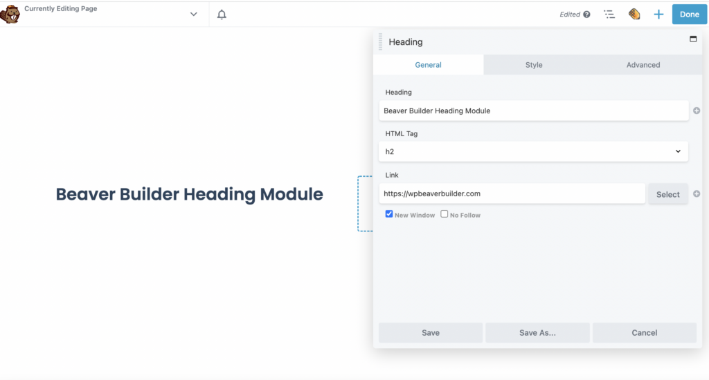
Finally, ensure that your sentences are concise, and look for other ways to break up your text. Including relevant images or videos is excellent, as long as you remember the accessibility rules for both.
3. Use Contrasting Colors
Contrast and color use is vital for good web accessibility, particularly for those with visual impairments. Users must be able to adequately perceive the page’s content and perform the desired website actions without being hindered by color.
Therefore, for text to be adequately readable, it must have sufficient contrast to the background. The recommended contrast minimum is 4.5 to 1. With this in mind, it’s advisable that you create a suitable color palette for your website.
While most themes will ensure links are in a contrasting color, it’s worth double-checking. Additionally, your buttons should have an appropriate contrast too.
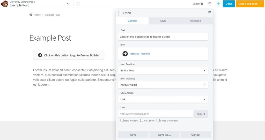
In Beaver Builder, you can change the text color by navigating to the Text Editor and finding the Style tab. Here, we created a button and used settings in the General tab to add an icon and make it more readable:
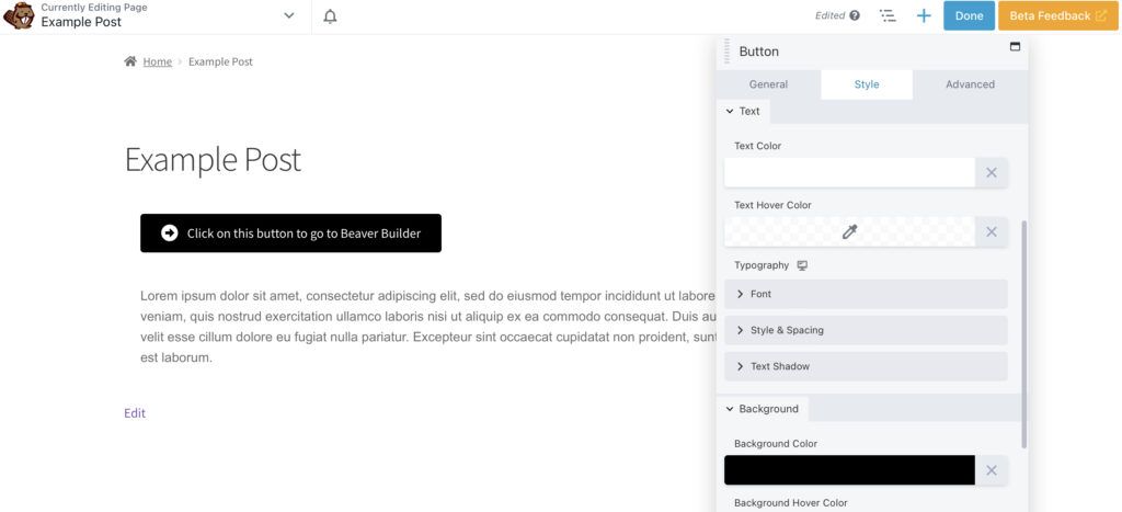
Then, also in the Style tab, we changed the Text color to #FFFFFF and the Background to #000000:
This creates a suitable contrast. Remember, if you can’t change something within a few clicks in the Beaver Builder settings, you can also easily alter it with CSS.
4. Implement Keyboard Navigation
Many users with motor disabilities rely on a keyboard, as do those with visual impairments. Similarly, some users without disabilities will use a keyboard for preference reasons. A mouse is therefore not universal.
Keyboard navigation is generally well supported with all computer operating systems and most software applications. However, problems can arise when web designers use techniques that break the keyboard’s standard functionality. Primarily, the ability to use the Tab key to navigate through interactive elements.
Therefore, there are two requirements for keyboard accessibility that you should be aware of. Firstly, keyboard users must be able to access all interface elements.
Secondly, your website should provide a clear, consistent, visible focus indicator. This focus indicator is activated or manipulated with the keyboard. You can use CSS to make the focus indicator more visually apparent.
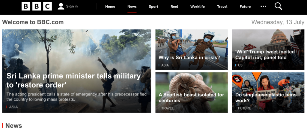
One good example of this is the BBC website. Its focus indicator combines both a color coding and underlining:
As you can see, when you hover or select the News tab you will see a red underline. Plus, all related articles in this category have a red label. Other topics such as Travel and Sport are labeled with different colors for further clarity.
Lastly, you should ensure the keyboard navigation order is logical and follows the visual flow of the page. This would usually require possible changes to your source code and CSS. However, Beaver Builder’s Menu Module allows tabbing, meaning you can create such a menu through the usual method. As we mentioned previously, Beaver Builder modules also have keyboard navigation on the authoring side.
5. Ensure Your Website is Mobile Accessible
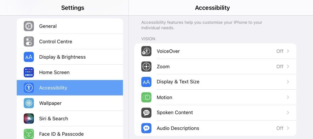
Another key part of web accessibility is mobile accessibility. Many mobile devices boast a range of accessibility options which can also make them a better choice than standard computers:
Therefore, when you are designing an accessible site, you should also prioritize a mobile-friendly or mobile-ready design.
When designing for mobile users, you should keep in mind the following:
- Adaptable screen sizes
- Large touch targets and simple touch gestures
- Simplified navigation
Of course, this is not an exhaustive list. Fortunately, Beaver Builder is mobile-friendly, with a responsive editing mode. This makes it easy to build a mobile responsive website.
Conclusion
Prioritizing web accessibility can be challenging at first. However, as a website owner, there are many reasons (both ethical and legal) that will likely compel you to make sure that your web pages are accessible. Regardless of your motivations, when you design an accessible site, you maximize the number of people you reach.
To recap, here are five ways you can implement accessible web design using Beaver Builder:
- Add alt text to your images.
- Improve readability with clear fonts and headings.
- Use contrasting colors.
- Implement keyboard navigation and a clear focus indicator.
- Ensure your website is mobile accessible.
Are you ready to build your accessible website? Download our Beaver Builder plugin and get started today!
Related articles
Build Beaver Builder Sites with AI
Building a WordPress website still involves many repetitive steps such as writing copy, structuring layouts, generating images, and refining design…
Build Dynamic WooCommerce Archive Pages with Beaver Builder’s Loop Module and ACF
Default WooCommerce archive pages are functional, but can be clunky. They give you minimal control over layout, and displaying custom…
How to Nest Components in Beaver Builder: Build a Design System That Scales
In the last tutorial, we built a component from scratch. Now we’re taking it a step further by nesting components…
Join the community
We're here for you
There's a thriving community of builders and we'd love for you to join us. Come by and show off a project, network, or ask a question.
Since 2014
Build Your Website in Minutes, Not Months
Join Over 1 Million+ Websites Powered By Beaver Builder.

