Version 1.5 of the Beaver Builder Theme Is Now in Beta!
The latest version of the Beaver Builder theme is now in beta and ready to test! If you haven’t already, head on over to your account area and download a copy of the beta to check it out.
In addition to a handful of new settings, this update focuses a lot on what can be done with the header. Here’s a look at the details of what we’ve been working on and what to expect.
New Header Layouts
This version of the theme adds three new (and much requested) header layouts that can be selected in the Customizer under Header > Header Layout > Layout. Those are…
Left & Right Vertical Header

Centered Nav + Inline Logo

Left Nav
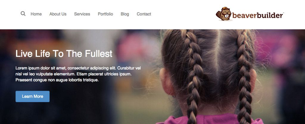
Please note that even though these header layouts appear the way they do in the screenshots above, they will adjust to our standard header layouts on smaller devices such as phones and tablets.
New Fixed Header Options

In addition to more options for the header layout, we’ve also given you more options for the fixed header that shows when the page is scrolled.
The only options you had before 1.5 were to disable the fixed header or have it fade in. While having it fade in is nice for tall headers that wouldn’t shrink well, that technique essentially requires two copies of your header to be in the markup. That’s not necessarily going to cause any problems, but there are some of you that have requested better alternatives.
With that said, as of 1.5 I’m happy to announce that you can now choose to either have the main header shrink when the page is scrolled (as shown above), or have the main header be fixed to the top of the page all of the time.
Hiding the Header Until the Page Is Scrolled

As of 1.5 it will be possible to hide the main header until the page is scrolled by the user. This new setting can be found in the Customizer under Header > Header Layout > Hide Header Until Scroll and is only available if you have the Fixed Header disabled.
We’ve also given you the option to set the distance that the page must be scrolled before the header is shown with the new Scroll Distance setting.
Mega Menu

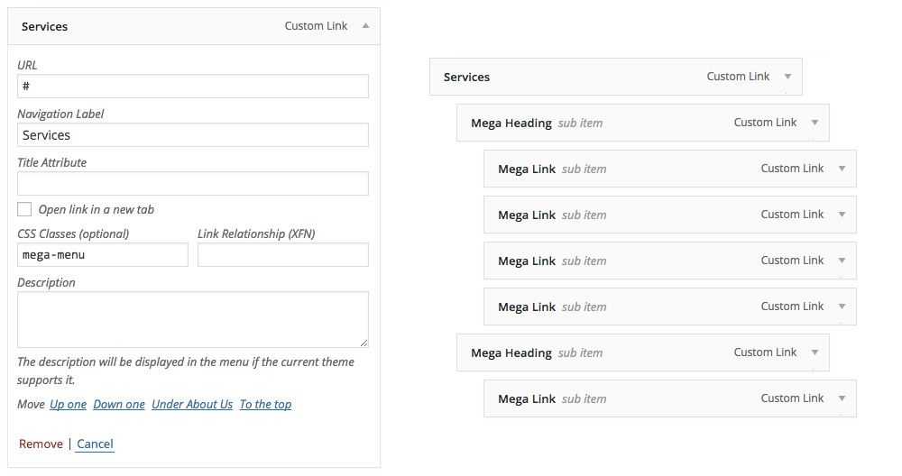
Another popular request that made it into this update was the ability to add a mega menu (shown above) to the theme. While mega menus can be a great option, the interfaces for building them aren’t always so great. To keep things simple and easy to manage, we’ve utilized the native WordPress menu editor for building your mega menus.
Just add the class mega-menu to any top-level menu item (shown below) and all of the menu items nested below it will be converted into a mega menu. It’s that easy!
New Settings
In addition to all of the work done on the header, in this release we’ve also given you a number of much-requested settings. Those should be fairly self-explanatory, but if you have any questions, be sure to let us know in the comments! Here’s a list of everything that was added…
- Body Line Height
- Heading Line Height
- Heading Letter Spacing
- Custom Content Width
- Custom Sidebar Width
- Featured Image Above Content/Title
- Hide Comment Count
- Top Bar/Content/Footer Opacity
- Footer Parallax
- Disable Beaver Builder’s WooCommerce CSS
Customizer Slider Controls
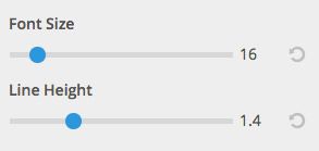
Last but not least, in this update we converted a number of the theme’s text inputs into slider controls to make it easier to adjust things like Font Size and Line Height.
Let’s All Thank Ozan!
If you haven’t met the newest developer on the Beaver Builder team, then head on over to Robby’s update post and meet Ozan! While this isn’t the first time I’ve personally taken a backseat on an update (Diego rocked 1.6.4), this is the first time that my only role was managing it. Ozan is responsible for everything you’ve seen here and we think he did a stellar job. Thanks Ozan!
When Will This Be Available?
As with all of our beta releases, we’re planning on having this in beta for the next two weeks unless anything major comes up. Our goal is to get this out as soon as possible, but we need your help! More beta testers mean that we can find and fix bugs faster. If you haven’t already, be sure to download the new beta from your account area and test it out! If you run into any issues, be sure to let us know in the forum post for this beta.
What’s Next?
We already have version 1.8 of the Beaver Builder plugin in the works and are hoping to get that into your hands for beta testing soon after this theme release goes public. Be sure to head on over to our public roadmap if you’re interested in seeing what we have cooking for that. It’s going to be a good one!
Over to You
What’s your favorite part of this update? Be sure to let us know in the comments below! And as always, don’t hesitate to let us know if you have any feedback or if you run into any issues.
35 Comments
Related articles
How to Push Content to the Bottom of a Box in Beaver Builder (Flexbox Solution)
How do you get a button to stay pinned at the bottom of a card? It’s a common problem where…
Build Beaver Builder Sites with AI
Building a WordPress website still involves many repetitive steps such as writing copy, structuring layouts, generating images, and refining design…
Build Dynamic WooCommerce Archive Pages with Beaver Builder’s Loop Module and ACF
Default WooCommerce archive pages are functional, but can be clunky. They give you minimal control over layout, and displaying custom…
Join the community
We're here for you
There's a thriving community of builders and we'd love for you to join us. Come by and show off a project, network, or ask a question.
Since 2014
Build Your Website in Minutes, Not Months
Join Over 1 Million+ Websites Powered By Beaver Builder.


Amazing – can’t wait to try out the new headers! Thanks guys
Thanks, Joseph! Let us know what you think.
Can I use the child theme with the beta for testing? or should I just test the theme directly.
Either should work just fine. Let us know if you run into any issues with that.
In the preview video that was released a few weeks ago did I overlook the mega-menu addition? On top of everything else, that was a nice surprise to find included today!
I don’t believe it was in the video. I’m glad you liked the surprise! 🙂
So glad i upgraded to the full theme! This is great, cant wait to try the new features.
Thanks, Villionaire! Let us know what you think.
Wow, well done Ozan and team BB! Mega menus and more header options is awesome and definitely a welcome addition to the theme.
Keep killing it! (in a good way)
Thanks, Simon! We’ll do our best to keep killing it 🙂
This is awesome guys! Thank you for the excellent work!
Thanks, Athlone! You’re welcome!
You guys are amazing thanks for your work
You’re welcome 🙂
Thank you! I can’t wait to try these. I’d love an option to have a header image above the navigation, is this possible with the upgrade?
You’re welcome! Could you provide an example of what you’re trying to achieve?
Way to go BB team! We’re excited to test out the new theme! We just installed it and are now playing with all the new features! So far so good!!!
one Quick Question. Is there a way to position the Navigation items completely to say the left? The logo and the navigation items don’t exactly line up. Either that or the ability to add or remove padding maybe on the logo?
Thanks, Elizabeth! Can you provide an example of that in the forums? We can have a look there.
This is wonderful! I have the plugin, but want to get the theme. I have a quick question about the content modules. .is it possible to design a layout where i can for ex: specify just the title, then in another module specify just that posts featured image, and another module for the meta tags, and another for the post content?
Not currently, but that is something we are working on for version 2.0 of the plugin. For now, you have to enter that info manually.
Yes, this is freaking awesome. Nice update what adds a lot of value. Thank you amazing BB team.
Thanks, Ismail. You’re welcome!
Is there any chance that em support and % support are going to be added. Working in px is so old. 😉
Thanks for the feedback, Norm! We hear that request often and have it on our internal roadmap, but there’s no ETA as of yet.
how do you install the new upgraded theme when you already have the older version installed? I cannot delete the older theme apparently because it’s working with the child theme which is active. Thanks!
Hey Jeffrey, you can temporarily enable another theme (such as Twenty Sixteen), delete the old BB theme, and then upload the new one. Sorry it’s such a hassle for beta testing. We hope to have a beta testing updater at some point. Thanks for checking it out!
Great Stuff Guys Keep up good work. Can’t wait to try it on my next project.
You BB guys are great!
Thanks,
J
AWESOME!
I would like to suggest as we can have menu on top, right and left now, if it would be possible to have it below and sticky. It might seem strange but it would give a lot more flexibility and creative possibilities. As a photographer, I think it gives a lot of emphasis on the photo. You just see the photo and then the navigation looks like seperate. One example is like on https://themify.me/demo/themes/fullpane/. I don’t know if it would demand a lot of programing, but for me it would add a lot of flexibility to BB users. Thanks
This is actually very easy to do. First, you’ll want to disable Fixed Header in the customizer, then use a tad bit of custom css to get the menu to the bottom:
.fl-page-header-wrap {

    background-color: #fff;

    bottom: 0;

    position: fixed;

    z-index: 999;

}
Since you’ve added the scroll to top, which I like, is there a way to disable the menu from being sticky?
The update looks great. I have been playing around with it especially the mega menu and it all works great. There is one thing that I’ve noticed and not sure if I am not configuring it correctly. I have set up a mega menu with sub menu. Each submenu is a header which has more menu links. Now it works great in desktop however we you move to mobile view the menus are not nested correctly. Here is an example
I have set “Schoo” as a mega menu
Main menu
– School
— Elementary
— Grade 1
— Grade 2
— Grade 3
— Grade 4
— Grade 5
— Grade 6
— Middle School
— Grade 7
— Grade 8
— Grade 9
— High School
— Grade 10
— Grade 11
— Grade 12
The above looks great on desktop however when switching to mobile view this is what I get
Main menu
– School
— Elementary
— Grade 1
— Grade 2
— Grade 3
— Grade 4
— Grade 5
— Grade 6
— Middle School
— Grade 7
— Grade 8
— Grade 9
— High School
— Grade 10
— Grade 11
— Grade 12
You Guys rock – Keep on smashing it – Go Beaver Builder!
It would be nice if you guys would start on columns within columns: https://wpbeaverbuilder.uservoice.com/forums/270594-general/suggestions/6694111-columns-inside-columns