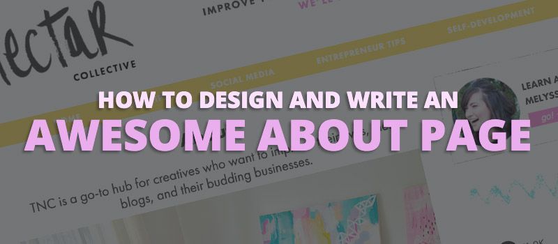
Tips for Building an Awesome About Page with Beaver Builder
Riddle me this:
What’s greeted often and yet highly neglected at the same time?
Your About page.
An article on Inc. showed that one of the first three pages a consumer often visits is your About page.
If you have an About page in an easy to find place on your website, it’s very likely to be one of your most popular pages.
However, for most people — from freelancer to big companies — the About page is an afterthought; the design of it and what it contains tends to be a bit, blah.
Why Your About Page Needs to Be Buffed and Polished
As mentioned above, many About pages tend to lean towards the boring and bland.
But you really shouldn’t let yours settle for mediocre when you could create something that helps people to love your brand, and that adds a much needed human touch of authenticity to your website.
It’s important to ask yourself why someone would even be looking at this page.
I mean, think about why you’d click on an About page on a website.
Nine times out of ten, my guess is because you’re curious about the person or people behind the site.
But why do you care? Have you ever wondered that?
From a psychological standpoint, the answer is rather straightforward.
We want to feel a connection with the people that we associate with or admire.
That’s why sites that list the biography info of celebrities always get a ton of traffic, and why magazines with famous people fly off the shelves.
We want to know more about these people because we want some kind of connection to them.
The same sort of idea applies to businesses and brands that people follow online.
They crave a connection, so the About page is naturally attractive to them.
Therefore, if you have an About page, or you’re thinking of putting one together, then you need to leverage the power of this page.
Here are some tips to help you create an amazing About page for your brand or your business.
3 Design and Copy Tips for a Better About Page
1) Don’t Be Boring
When people write an About page, they know that they have to write about themselves. But this endeavor often makes even the most enthusiastic person sound drab.
Let’s say that you’re a freelance web designer, and you decide that you’re going to create your About page. You create your page, start typing, and this is how is goes:
Hi, I’m [place name here]. I’m a freelance web designer specializing in responsive design and editing CSS to make your site look better. I spent four years in college learning design, and now I’m ready to use my knowledge on your website. Ready for a great looking site? Contact me below.
On the surface, this may look okay, but this is terrible for an about page.
Your visitors to your about page likely already know you’re a web designer.
But, CSS? What’s that?
Responsive Design… Doesn’t everybody do that now?
You went to school. Cool. Doesn’t mean you’ll be easy to work with.
Essentially, there’s nothing here that would make you stand out. There’s nothing unique. You’re using tech jargon that the average guy wouldn’t understand, and all you’re doing is trying to make a quick lazy sell — which won’t convert.
Plus… it’s BORING!
Here are a few copy tips to help your About page be interesting:
- Tell your story. Your professional background is great, but that’s not really what people tend to be after. They want a story; even something fun. Weave your tale. Stories stick with people and letting your personality shine through is something that can keep people remembering you long after they’ve left your site.
- Write the way you speak. Again, drop the drab. If you’re someone that says something like, “Bazinga!” then use that in your copy.
- Don’t forget to have a bit of fun. Do you love bacon? Are you addicted to Game of Thrones? Were you a ballerina in your past life? Adding a bit of the fun isn’t a bad thing so don’t shy away from it.
2) Use Design to Show Off Your Brand’s Personality
Can a brand or business have a personality?
Absolutely.
Look at MailChimp as an example.
What’s the first word you think of when you think of them?
Probably, fun? Or even, young? Vibrant?
Their design has a lot to do with that.
Similarly, you can leverage design in your About page to help humanize your brand and help people to feel that attachment to you or your business.
Now, unless you have some serious coding skills and a good eye for design, then doing this is going to prove difficult if you don’t have a tool to help make it easier.
Thankfully, the Beaver Builder plugin makes building and designing your page really simple.
And if you need some inspiration for your overall design, then be sure to check out Best About Pages for some help getting your creative juices flowing.
3) Still Make It About Your Customer
While your About page is about you, it’s also still important to make it about your customer.
The Nectar Collective’s About page is a perfect example of this.
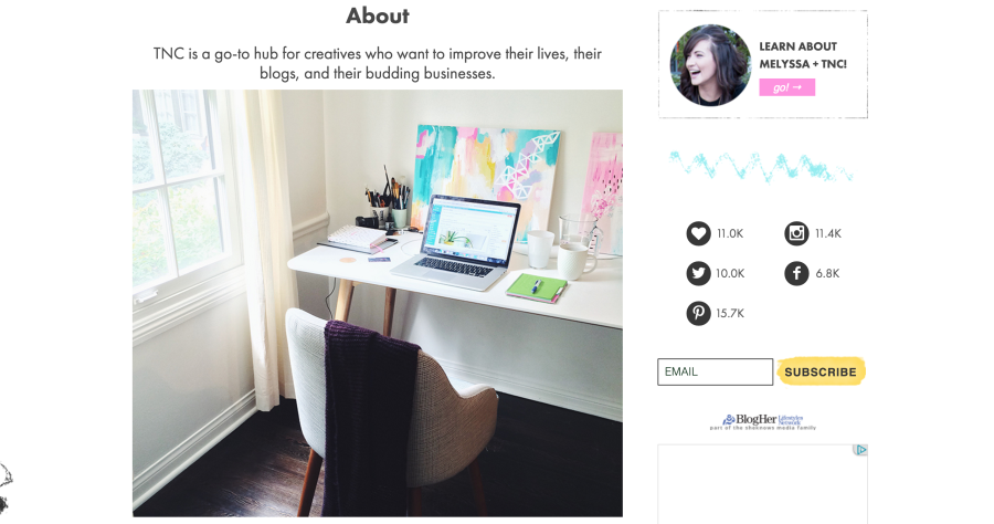
Melyssa manages to mesh talking about why she created her blog, how her readers benefit from her blog, and a little bit about herself and her blogging team.
Really, her About page is the perfect example of a well-written, captivating, fun and slightly funny page; it contains all the elements that help you seem more human and to bring your brand to life. If you need help understand
I highly recommend you read her page to get a good sense of what I mean by this.
Wrapping It Up
Your About page can be a big asset to help you get people to trust and like your blog or brand.
It’s easy just to type something you didn’t put much thought into and then publish it, but if you do that, you can be missing out on a lot.
Don’t wait around. Go polish that page!
2 Comments
Related articles
How to Sell Websites to Clients (Without Talking About Tools)
Struggling with how to sell websites to clients without getting lost in tech talk? Learn how to communicate the real…
Case Study: How One Freelancer Built a Web Design Business with Beaver Builder
Wondering about Beaver Builder for freelancers? Cami MacNamara operates WebCami Site Design, a successful solo web design business in West…
Best Practices for Managing Web Design Clients
Managing web design clients effectively is one of the most crucial skills for a web designer, agency, or freelancer. Whether…
Join the community
We're here for you
There's a thriving community of builders and we'd love for you to join us. Come by and show off a project, network, or ask a question.
Since 2014
Build Your Website in Minutes, Not Months
Join Over 1 Million+ Websites Powered By Beaver Builder.

Amazing tips! This gonna be helpful to alot of people out there. Thank you for sharing! 🙂
Great writing and formatting, but ultimately doesn’t answer the question, “how to build a great about me page WITH beaverbuilder”. It only answers “how to build a great about me page” =P