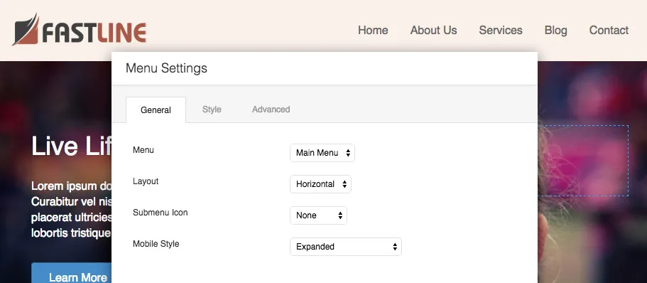
The Menu Module Is Now In Beta!
Today we officially released the new post modules that have been in beta for the last two weeks as well as a beta of the new Menu module. If you haven’t already, head on over to your account to download the latest beta and take the Menu module for a spin!
Supercharged Custom Menus
Like the built-in Custom Menu widget, the Menu module allows you to select one of your menus that was created under Appearance > Menus to insert into your layouts. That’s where the similarities stop as the Menu module allows you to do so much more with options for the layout, style, and responsive display of your menus.
Multiple Menu Layouts
The Menu module comes packed with four different layout options for your menus. Those options include…
- Horizontal – A standard horizontal layout that’s similar to what’s found in most themes. This layout also supports dropdown submenus.
- Vertical – A vertical layout that has support for submenus that flyout to either the left or right of the menu.
- Accordion – A vertical accordion layout that displays submenus inline when the toggle icon is clicked.
- Expanded – A layout that is similar to the Custom Menu widget in that top level menu items and submenu items are displayed in an unordered list style format.
Style Everything
The Menu module also comes packed with a handful of style options that allow you to create a number of different unique menu designs. Those options include styling for things like text colors, font sizes, background colors, and overall menu alignment. Make sure to check out the Style tab in the Menu module settings to see all of the available options.
Works Great On Mobile
In addition to allowing you to create a supercharged custom menu, the Menu module also looks great at smaller screen sizes such as those found on mobile devices. Under the general tab you will find an option titled Mobile Style that allows you to customize how your menu will look at smaller screen sizes. Those options include…
- Expanded – The menu will not collapse and all of the menu items will show in an unordered list style format.
- Hamburger Icon – The menu will collapse and a hamburger icon toggle button will be shown.
- Hamburger Icon + Label – The menu will collapse and a hamburger icon toggle button will be shown along with a menu label.
- Menu Button – Similar to how the Beaver Builder theme works, this option will display a full-width menu button.
When Does This Go Live?
As mentioned in my previous post, beta periods will last approximately two weeks as long as we don’t run into any big issues. If everything goes according to plan, the Menu module should be officially released the week of August 17th.
What’s Next?
I’m happy to announce that standard and global row/module templates are now being tested by the team internally! If all goes well with that, we’re hoping to release a private beta next week and a public beta the week after that. In addition to row/module templates, we’ve also begun work on implementing a new color picker that has the ability to save color presets as well as looking at solutions for adding Genesis support to Beaver Builder.
Let Us Know What You Think!
As always, I leave the floor to you. Don’t hesitate to let us know in the comments below what you think about the new Menu module, if you have any feedback as to how we could improve it or if you run into any issues.
Until next time, happy building!
47 Comments
Related articles
Beaver Builder Favorite Features & Why We Love Them
Ever wondered what features the Beaver Builder team loves the most? 🤔 We asked our team members to share their…
Beaver Builder Dev Update: The Road to 2.10 and Beyond
Greetings, Builders! It’s been a busy stretch since our last dev update, and we’re thrilled to bring you up to…
Beaver Builder 2.9 & Themer 1.5: Multi-Layer Backgrounds, Enhanced Color Picker, Loop Module
We’re excited to introduce Beaver Builder 2.9, also known as “Coyote”, packed with exciting updates designed to simplify workflows and…
Join the community
We're here for you
There's a thriving community of builders and we'd love for you to join us. Come by and show off a project, network, or ask a question.
Since 2014
Build Your Website in Minutes, Not Months
Join Over 1 Million+ Websites Powered By Beaver Builder.
 Beaver Builder


Very cool y’all! Good work.
Tinkering with the menu module as I write this. So far, so good! Works as expected.
Loving your release cycle. 🙂
Thanks, Ben! I’m glad to hear you like it.
Hi
Nice job! New features steadily coming up.
Just had to try out the new beta menu module and need to ask: Should it appear as a list or as a dropdown menu? For now I get an expanded (multi-level) unordered list – I guess that’s not the goal…?
Also it is only possible to select one out of the menus I’ve made.
I thought this could be caused by the theme I use here (Bridge – it has been a bit… sensitive) but switching to TwentyFifteen changed nothing (well, apart from the looks…;o)
If this sounds strange and you’d like to login to have a look, please tell me. And keep up your good work!
Kj
Hi Kjetil,
Thanks for posting! The menu can appear a number of different ways based on the layout you choose. However, it sounds like there might be an issue here. Would you mind posting in the forums so we can login and have a look?
Justin
Will do!
Here’s the funny menu by the way: http://www.dolcevita.no/demo1/gardasjoen-sykkeltur/
Kj
Hi NEWBIE bb builder great work can you tell me how you a achieved the effect of the page sliding down over the footer
Hello Guys!
This is a great addition! I am playing with it already. I think I found a bug.
I have created a menu that is centered. Only the menu items are showing a background. Then when I resize the window to see the mobile functionality and resize it back, the bug shows up. The menu is not center anymore, and the background goes all the width of the row. I am using Chrome, and here is the link: http://miracomoes.com/chia/
I hope this helps!
Thanks, Carlos! That certainly is a bug. We’ll get that fixed before this is released.
How will this work if we have been using Dynamik Website Builder?
Hi zenoform,
It should work just fine, but if you do run into any issues, let us know in the forums and we’ll have a look.
Thanks,
Justin
Hi Guys, great addition to the product.
If I create a concertina menu with all the level1 items having short name eg: MENU1, MENU2 then have level2 items that have a slightly longer names, eg; MENU1.1, MENU1.2 etc the whole nav structure widens when the level1 item is selected. An styling option for control over width would be a nice option.
Thanks, Dean
Hey Dean, can you tell me what layout style you are using?
Hi Justin
Sorry, wrong term, the layout is accordian
Here is a link to a slide with a screen shot of what I am referring to.
https://docs.google.com/presentation/d/1t2wbUEvhf4SAWNk3W5ASLZjuEExXpcWOcRYrykTV56o/edit?usp=sharing
Thanks, Dean
Thanks, Dean! I’ll file a bug report and we’ll get this fixed.
Another bug i think – I need to set the bottom to a -5 or it has 5 pix of extra space at the bottom under the Link Background Hover Color to make it flush like the top. Looks good.
If you are still working on it can you please add in a way to set the size of the height of the menu so we can make thick menus like this. You have Link Spacing but no menu height/size only one setting away from being able to do this.
http://destinvacationguide.com/testtwo/
And a way to use a Google font if possible.
Thanks for the report, Edward! I wasn’t able to recreate the 5px spacing issue. Maybe that’s a theme issue?
The spacing/height issue makes sense. I’ll file a report on that. We’ll also be working on a Google fonts setting for the builder later this year, so we can implement that in the menu module then.
How to i get rid of the old top menu now it keeps saying – Choose Menu or if i pick one then i have two top menus showing?.
Thanks
To do that, you’ll need to hide the header in the Customizer by setting Header > Header Layout to none.
Ok one more question any way to make this new menu the default menu for all pages up top i see it only works on the page i made it on ?
We’ll be releasing the ability to save “global” rows within the next few weeks. Once that’s out, you’ll be able to drop the same row into all of your pages and edit it in one place. Unfortunately, there isn’t any other way to do it currently.
Hi
Regarding the menu selector (in the menu module): I mentioned previously that the selector didn’t work. Well, it does. I had made two menus and only one appeared, but somehow alle the contents of the second menu had gone. So: You cannot select empty menues, and I guess that is ok…
Just wanted you to know :o)
Kjetil
Ah, good catch! We’ll add some logic for empty menus.
awesome. While you’re working on the menu, would you please consider adding a setting to control the alpha channel so that menu headings can be transparent (not sure if im saying that right, do you get my meaning?). I would love to make header navs transparent. Is that in the works? Thanks.
Thanks for the feedback! Although, I’m not quite sure I follow you yet. 🙂 Are you asking for the text to have an opacity setting or the background for the menu?
The nav background for the menu, so the image shows through. Like this: http://screencast.com/t/2zZJEjPqmMpl
Thanks, Brian! We’ll have a look at implementing that.
it would be nice if there was an option to choose what level of the menu to show. For example if i want to show only sub-menus (2nd level pages) will I have that option?
Hi Natalya. Thanks for the suggestion. I am not sure if this is something we would include in the plugin. Feel free to add it as a feature request, though:
https://wpbeaverbuilder.uservoice.com/forums/270594-general
Also, you could experiment with creating two menus in the WordPress admin area. One for the top-level navigation and one for the second level. Then, you could use the second level menu on your pages. Think that might work?
I use Genesis. I wonder if what you are suggesting would work with Genesis Subpages as Secondary Menu plugin. The idea is to generate the secondary menu dynamically to show the child pages.
AWESOME! 🙂 i’am playing around with the beta and the row/module templates is exactly what i was looking for on my current project 🙂
Best regards!
David
That’s good to hear, David! Let us know if you have any feedback.
Am I missing something? I don’t see the menu module anywhere in my downloads under my account. I even tried the latest beta for agencies and I don’t see the module in the page builder at all.
The Menu module was actually released last week. Have you updated to 1.6.2 yet?
I’m on 1.6.3 (beta) and don’t see it at all. the selection just goes from “maps” to “posts.” I assume it would have shown after the maps module.
Can you post in the forums so we can login and take a look?
Howdy – Great addition 🙂 However, would you be able to add the option to enable the responsive burger menu for desktop/all screens? A common design request these days! 🙂
Thanks
Thanks, Nick! That’s an interesting suggestion. Feel free to add it to our UserVoice page so we have a record of it for future updates… https://wpbeaverbuilder.uservoice.com/forums/270594-general
If I use the menu module to create the menu for my site, is there a way to make that show up on all pages/posts? I can make a global row with the menu in it and add that manually to each page, but there doesn’t seem to be a way to add it to post/category pages, etc.
Hi Bill. Not currently. This is a feature we would love to have someday, but it’s still in the idea phase.
Technically, you can do this with a workaround using a plugin called Insert Pages. It’s a bit of an advanced technique, though. Basically, you create a page for your menu, then you can use the Insert Pages plugin to include the menu/page in your php templates.
Shoot us an email from our contact page if you’d like. I am happy to elaborate if you’re not scared off yet. 🙂
For the accordian style menu I think it would be nice to have an option to somehow say, menu links that have children either:
1. Show Page When Clicked
2. Dont show page and only expand level
This way we could create accordians that dont rely on the user clicking exactly on the cross – which in my opinion isnt always intuitive. Along with this an option to have no expand icon.
Another nice option would be to auto expand the accordian menu based on the current page.
Hi,
Been working with the menu module. I can’t seem to get it to span the full width of my layout. When I set the General-Layout option to Horizontal and the Style-Menu Alignment option to Center, the menu sits in the middle of the layout, but the width of the menubar (colored) only spans the extent of the text. If I set the Menu Alignment to Default, the menubar will extend full width, but the text is aligned left. Can you help?
Thanks, John
The module is great, but does anyone know why I get this using the menu module instead of the page title? : #26 (no title)
Hi Barry, could you shoot in a ticket so we can have a look? Thanks!
For the Menu Module…Is there any way to have the drop down menu have some smooth css fluidity? It just seems to appear. I would like to to slide down or fade in. Is there a way to achieve this?
Hey Rob. This would probably be possible with CSS transitions. I would start doing some research there. We’ll keep this in mind as a potential feature too! Thanks for the comment. 🙂
is there a way to change the icon from the hamburger? and is there a way to change the label from “menu” to say something like “more”
working on a site that sells food, the word menu could lead someone to believe that they can find a menu of food items there
Hey Luke! You can override any of the core modules and tweak them to your liking. This article has more information on that:
http://kb.wpbeaverbuilder.com/article/124-custom-module-developer-guide