How to Build Effective Mobile Landing Pages with Beaver Builder
In this article, we will walk you through how to to use Beaver Builder as a mobile landing page builder.
Responsive landing pages are a crucial part of marketing campaigns and can help you generate more leads and boost conversions.
However, it can be challenging to know how to build effective ones or even which tools to use.
Fortunately, Beaver Builder easily doubles as a mobile landing page builder and provides a relatively straightforward and hassle-free process for creating these key pieces of content in minutes.
In this article, we’ll discuss what makes an effective mobile landing page, and why it’s so important to ensure it’s responsive and smartphone-friendly.
Then we’ll walk through how to create one with Beaver Builder.
The Value of Building Effective Mobile Landing Pages
First, let’s discuss the general characteristics that set landing pages apart from other content on your website. They’re typically designed to eliminate distractions and focus users on performing specific actions such as contacting you, filling out a form, purchasing a product, etc.
There are two types of landing pages – lead capture and click-throughs. Lead captures use Calls To Action (CTAs) aimed at acquiring user information such as email addresses. This is helpful when it comes to building out your email marketing list.
On the other hand, click-through landing pages take customers straight through performing an action such as making a purchase. An example is a page with a CTA button that adds a specific item to users’ carts and takes them to your eCommerce checkout page.
Some of the most important components of an effective landing page include:
- Headline: An introductory message about your product or service
- Problem: The pain point or issue you’re trying to solve
- Benefits: What potential users will gain
- Solution: An overview of your product or service’s features
- Social proof: Customer testimonials
- Credibility: What makes you trustworthy, or why your visitors should choose your products over alternatives
- CTA: A directive users need to follow cash in on the benefits promised, such as clicking a button reading “Get Started” or “Buy Now”
- Incentives: Soft pushes towards clicking on your CTAs, such as discounts
- Forms: Means of collecting customer information such as email addresses
A landing page builder can help you quickly incorporate these elements on your page and ensure they’re responsive.
Landing pages are extremely beneficial to your brand. Statistics show that companies that increase their number of landing pages from 10 to 15 see a 55 percent increase in leads. Fully 86 percent of the top landing pages are mobile-friendly.
Further, it’s estimated that mobile eCommerce could make up almost 72.9 percent of all sales by 2021. You can see why it’s important to make your landing pages fully responsive and ensure they perform well on small screens in order to stay competitive and take advantage of the vast online market.
Examples of Effective Mobile Landing Pages
Understanding how mobile landing pages work is easier if you see a few examples. Let’s start with Airbnb:

This mobile landing page is dedicated to sourcing hosts. It starts with an estimate of how much the current visitor can make based on their location.
Immediately below that, leads can fill out a form with more information about their properties to receive more accurate estimates:
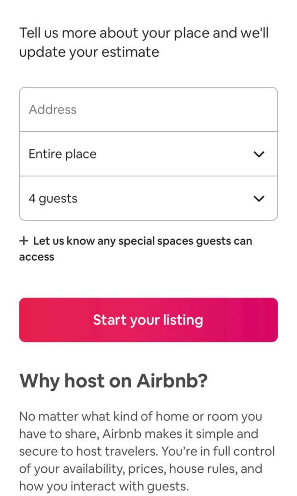
This landing page provides Airbnb with valuable information about the prospective host. The page also features a short testimonial from a current host, as well as multiple CTA buttons to give leads plenty of chances to convert:

Another example of a strong mobile landing page is from Norton. It features a bright and eye-catching CTA button right at the top:

It also provides a significant discount to visitors who purchase right away. Further down on the screen, Norton includes further explanations of its features and benefits.
You’ll also find the credibility element covered, in the form of recognition from industry-renowned PC Magazine.
A Brief Overview of Beaver Builder as a Mobile Landing Page Builder
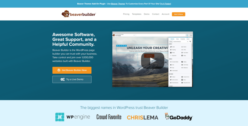
Beaver Builder is a WordPress page builder with powerful capabilities. It provides a quick and easy means of building attractive and professional sites using an intuitive drag-and-drop interface:
Some key features include:
- Dozens of templates to work with and the ability to create your own templates
- Compatibility with almost any theme and the ability to switch themes without losing your content
- Responsive Editing Mode in the Beaver Builder editor
- Mobile responsiveness out of the box with the ability to customize settings
- Extensibility via widgets or a custom module boilerplate
These features apply when using our plugin as a mobile landing page builder. You can feel confident your content will be readable and navigable on any size screen.
Although there’s a free ‘lite’ version of Beaver Builder, we recommend upgrading to one of the paid premium versions if your primary goal is to use it to create landing pages. These licenses include additional modules such as CTA buttons and callouts that will streamline your design process.
The Standard package starts at $99 per year, while the Agency package goes up to $399 per year. This latter option is suitable for web development businesses and offers both multisite functionality and white labeling, but the same modules are available in all premium versions.
Regardless of whether you choose a free or premium version, you can augment your options with PowerPack for Beaver Builder, an add-on that provides more modules such as pop-up boxes and subscriber forms. You can pay annually or a one-time price for lifetime access to Powerpack for Beaver Builder.
How to Build Effective Mobile Landing Pages with Beaver Builder (In 5 Steps)
Creating an effective landing page that contains the key components we mentioned earlier is straightforward with Beaver Builder.
In the following steps, we’ll work with an existing template to illustrate the process. Note that the premium version is required to access the features shown below.
Step 1: Install the Beaver Builder Plugin
The first thing to do is to install Beaver Builder. At this point, we’ll assume you’ve already purchased a premium license. Once your payment has been processed and confirmed, visit your account page to download the plugin’s .zip file.
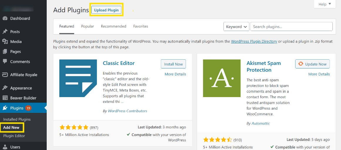
Make note of your license key, also on your account page. Then head to your WordPress dashboard and navigate to Plugins > Add New. Click Upload Plugin:
Click Choose File and select the plugin zip file:
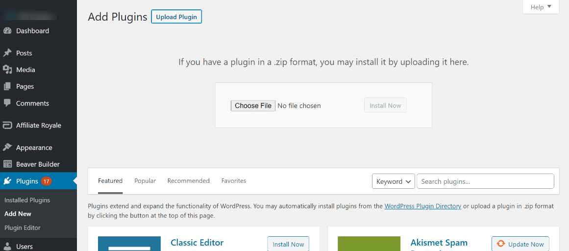
Note that if you already had the free version installed, it’ll be deactivated automatically. Any previous content you’ve created works in the premium version.
If you already have a premium version installed and you’re running WordPress version prior to 5.5, you’ll need to remove the existing plugin before installing a new one. Don’t forget to activate the plugin.
Then activate your license by heading to Settings > Beaver Builder and clicking the License tab:
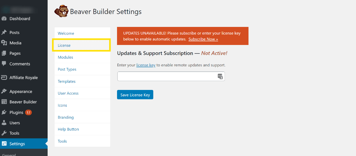
Paste the license key you copied earlier on your account page. If you performed an upgrade rather than a new installation, confirm on this settings page that your license is active.
Step 2: Create a New Page and Access Your Beaver Builder Modules
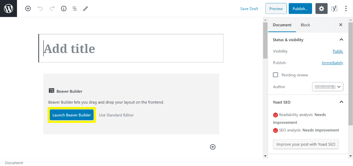
Once Beaver Builder is installed, you can create your first layout. Add a new page by navigating to Pages > Add New. Add a title and click Launch Beaver Builder:
To view all of the available modules, click the plus (+) icon in the top right corner of the screen. This opens the Content Panel:
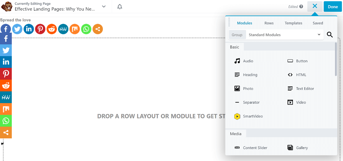
You can close the Content Panel by clicking the X symbol (which replaced the plus sign). We’ll describe more of what’s available in the Content Panel in the following sections.
Step 3: Build Your Mobile Landing Page on an Existing Template or Start From Scratch
Although you can create your page layouts and designs from scratch, Beaver Builder also includes many prebuilt templates you can start with. This is what we’ll be doing for the remaining steps.
We’re working with the Fullscreen template. To find it, open the Content Panel and search in the Templates tab. Select Landing Pages from the Group dropdown:
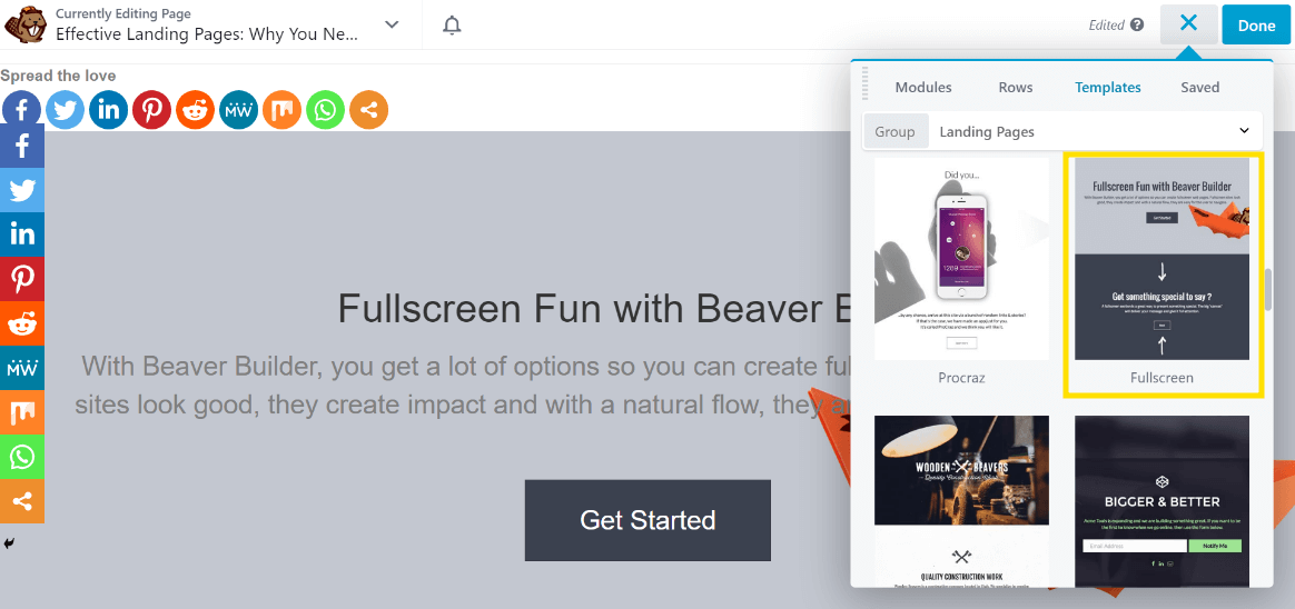
Click the template to load it in the editor. Because we’re focusing on the mobile landing page, switch to Responsive Editing Mode by typing R on the keyboard to open tablet view.
Type R again to open mobile view and one more time to exit Responsive Editing Mode. In Beaver Builder module settings, whenever you see the responsive settings icon, you can create different settings for large, medium, and small screens.
When you are in Responsive Editing mode, the responsive icon in the settings is automatically adjusted so whatever value you enter for a setting applies to that screen size. Here are some other ways that you can control responsive behavior in Beaver Builder.
When you add a template or prebuilt row, you can fully customize the content as you see fit, so think of a template as a suggestion, not a rigid enforcer.
To edit any row, column, or module in the layout, just hover over it to see the blue toolbar.
From there, you can click the wrench icon to access the settings for that element:
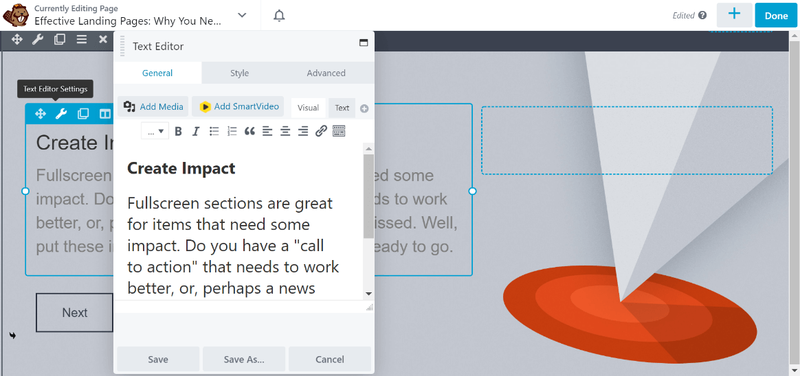
The other icons enable you to drag the element around, duplicate or delete it, and so on. You can also change the placeholder text and images as you see fit.
Step 4: Enhance Your Landing Page with Key Modules
You can add more modules from the Modules tab in the Content Panel. Click the Group dropdown to display standard modules, Beaver Builder widget modules, and any third-party modules you have installed.
For building landing pages, consider using the Call to Action, Callout, or Accordion modules:
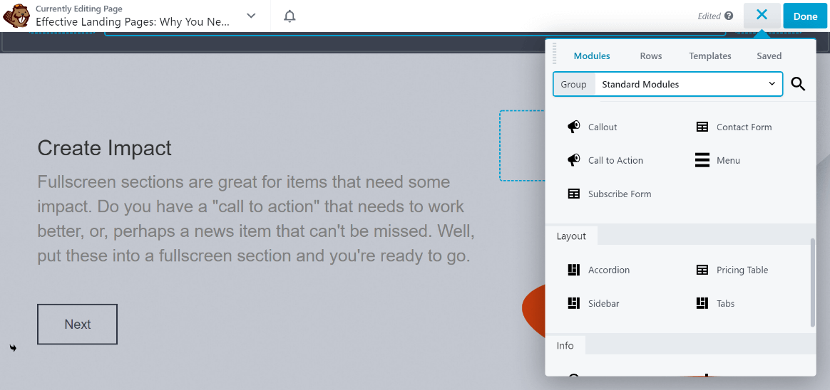
You can also add WordPress widgets to your layout by selecting WordPress Widgets instead of Standard Modules from the Group dropdown:
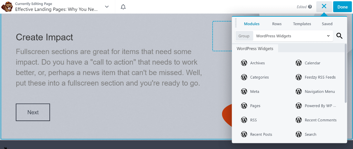
Drag any modules you want onto existing rows and columns and reorder them as necessary. As a quick example, we’ll add a pricing table and an FAQ section to our design.
In the Rows tab, expand the Prebuilt Rows category in the Group dropdown:
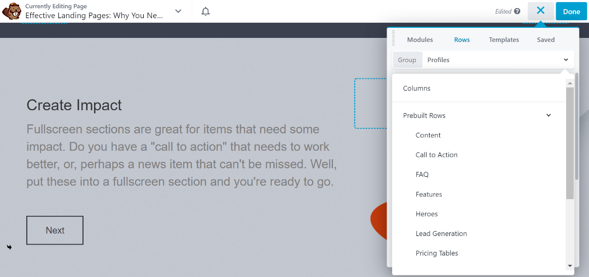
Click Pricing Tables and choose a design that appeals to you. We’ll use Pricing 4:
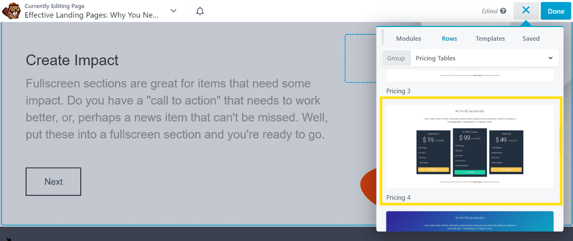
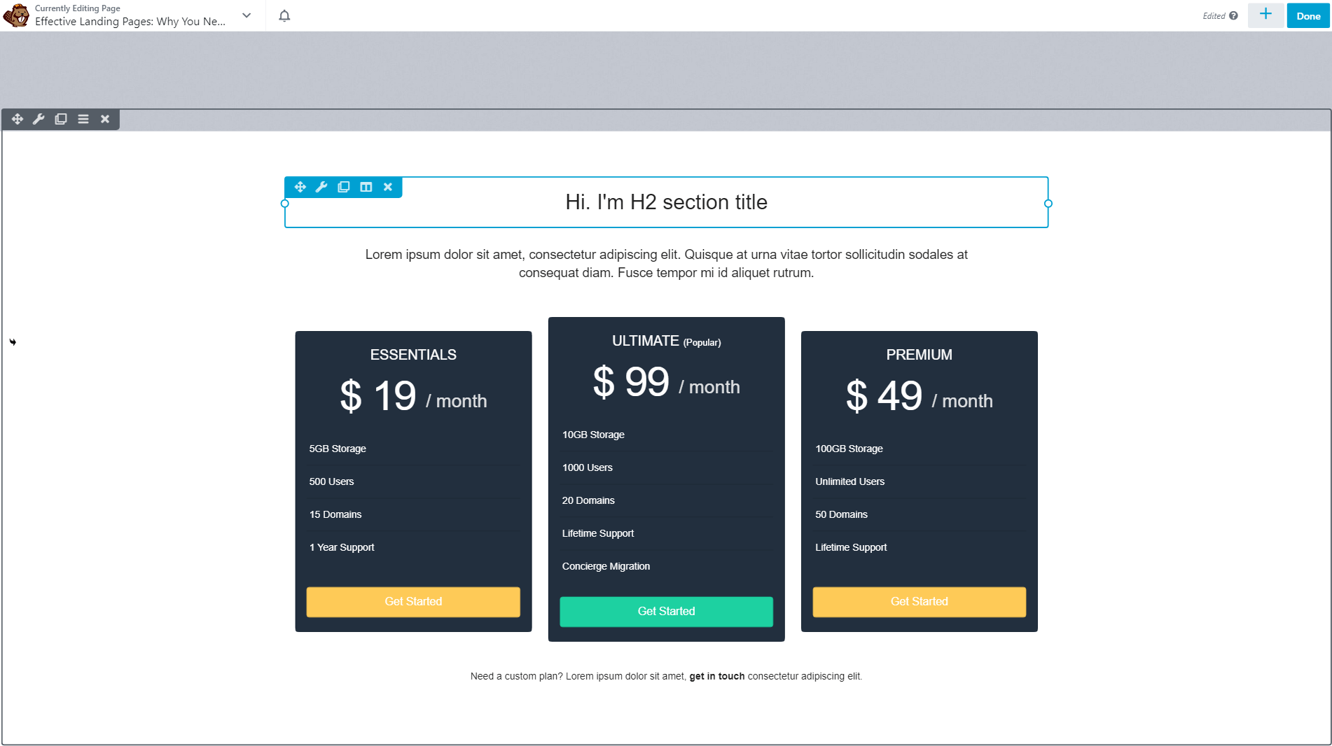
Drag and drop the prebuilt row into your layout:
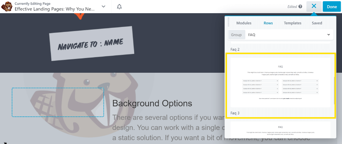
Next, we’ll select FAQ from the Prebuilt Rows collection just as we did with the pricing table. We’re using the Faq 3 design:
Here’s what it looks like on the page:
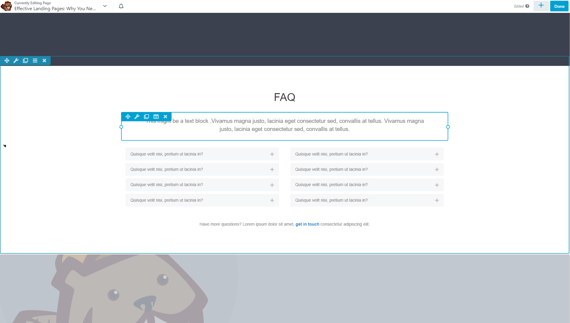
As you can see, you can create your entire design based on prebuilt rows and templates. Take your time to customize the page further or switch to a different template to start fresh.
Step 5: Save and Publish Your Landing Page
As you make changes to your landing page, they’re saved automatically. Even if you close your browser tab by mistake, all your modifications should be preserved. However, your page won’t go live until you publish it.
When you’re satisfied with your design and want to publish your landing page, click the Done button in the top right corner of the screen:
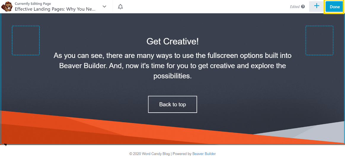
This will expose more options, and from here you can click on Publish:
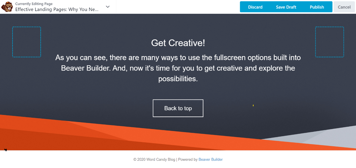
Otherwise, save manually by clicking Done > Save Draft. Clicking Cancel takes you back to the editor.
Responsive Editing mode is a great way to adjust responsive behavior without ever leaving the editor, but it’s always a good idea to test responsiveness in a variety of ways with various emulation and preview tools.
Finally, it’s useful to know that if you click the dropdown arrow next to the page title, you can view the Tools menu with more options.
For example, you can save your template for reuse or duplicate your layout to another page:
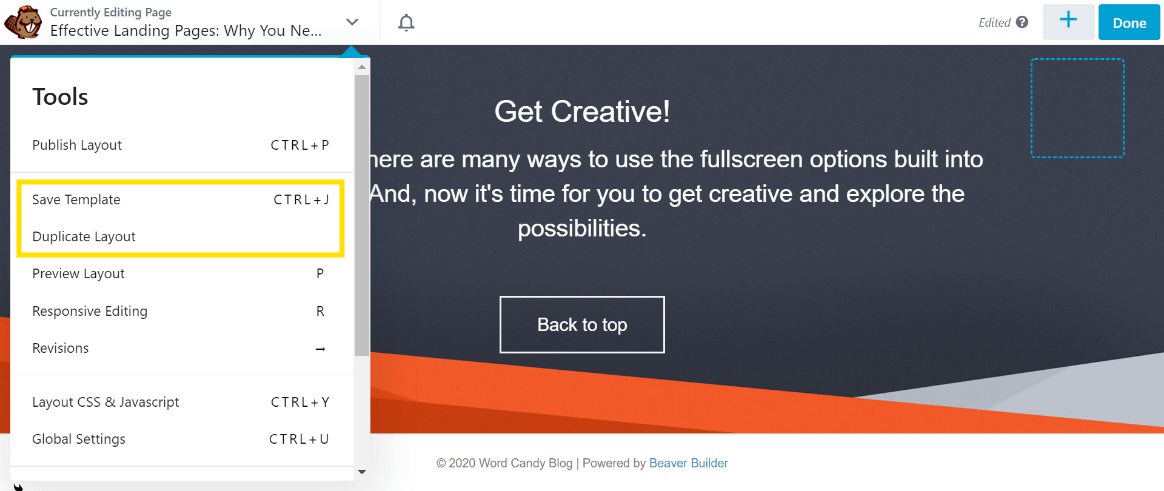
Saving a template will add it to the Templates tab in the Content Panel so that you can access it later if you want to reuse it. Additionally, the Publish Layout option enables you to publish your page without leaving the editor.
Conclusion
Building effective mobile landing pages is a science that often requires in-depth insight into the psychology and buying habits of your target users. However, the effort invested can be worth it, potentially leading to increased conversions and higher revenue.
To ease the process, you can use a mobile landing page builder such as Beaver Builder and create your landing pages in a few simple steps:
- Install the Beaver Builder plugin.
- Create a new page and access your Beaver Builder modules.
- Build on an existing template or start from scratch.
- Enhance your landing page with modules.
- Save and publish your landing page.
Do you have any questions about how to use Beaver Builder as a mobile landing page builder? Ask away in the comments section below!
Related articles
Beaver Builder Favorite Features & Why We Love Them
Ever wondered what features the Beaver Builder team loves the most? 🤔 We asked our team members to share their…
Beaver Builder Dev Update: The Road to 2.10 and Beyond
Greetings, Builders! It’s been a busy stretch since our last dev update, and we’re thrilled to bring you up to…
Beaver Builder 2.9 & Themer 1.5: Multi-Layer Backgrounds, Enhanced Color Picker, Loop Module
We’re excited to introduce Beaver Builder 2.9, also known as “Coyote”, packed with exciting updates designed to simplify workflows and…
Join the community
We're here for you
There's a thriving community of builders and we'd love for you to join us. Come by and show off a project, network, or ask a question.
Since 2014
Build Your Website in Minutes, Not Months
Join Over 1 Million+ Websites Powered By Beaver Builder.
 Beaver Builder
