10 Best Practices for Creating High-Converting Popups
Popups are well-established, versatile, difficult to miss, and have great conversion rates when used appropriately. Let’s also face the downside: popups can be annoying. If you’re a frequent internet surfer, you’ve probably come across popups that you’ve had a negative reaction to or have even caused you to leave the site. There’s no point to a popup that drives users away from your great content.
So there’s a double goal for mastering popups: maximize conversions while keeping the user experience pleasant. In this article, we’ll share with you the essential best practices for creating high-converting popups while minimizing annoyance.
Before You Start
Before you implement best practices for high-converting popups, you need to answer two important questions:
- What objective do you want to achieve?
- What type of popup will you use?
Your Popup’s Goal
A popup has to have a specific goal or it becomes unnecessary noise that distracts your visitors from the site’s content. Popups can be used to achieve goals such as the following.
- Drive more sales. Popups are a great tool for driving more sales using popular marketing tactics like cross-selling, upselling, and cart abandonment reduction. With popups, you can give your visitors a last chance to become new customers.
- Harvest emails. Growing an email list is now more challenging because visitors are legally required to opt-in, but you can get them to sign up more easily with pop-ups.
- Generate leads. Popups can be used as one of your content marketing tools to generate more leads for campaigns.
Popup Types
There are many types of popups and their efficiency depends on a number of factors, including industry (some industries need more aggressive practices than others), price range, and marketing persona. Here are the main types of popups you should think when implementing popups for high conversions.
- Entry popups. These popups are triggered when a visitor lands on your site and before they ever see the content. While they can be effective in some cases, they are typically not welcomed by visitors due to their intrusive nature.
- Scroll-based popups. These are usually activated when a visitor scrolls to a specific depth of your web page, say 30% of the page. Since the popup becomes active after proof of engagement, they often yield better results and work well for blog posts and articles.
- Delayed popups. These popups are triggered when a visitor spends a certain amount of time on your site. They are quite similar to scroll-based popups because they only become active after there’s proof of engagement.
- Interaction-based popups. These popups are an excellent tool for marketing teams looking for personalized experiences. They are triggered when a visitor has hovered or clicked over a certain element. Unlike entry or delayed popups, interaction-based popups provide more personalized experiences.
- Exit-intent popups. These popups are triggered when a visitor’s about to leave your web page. They are popular in the e-commerce space for their effectiveness in reducing cart abandonment.
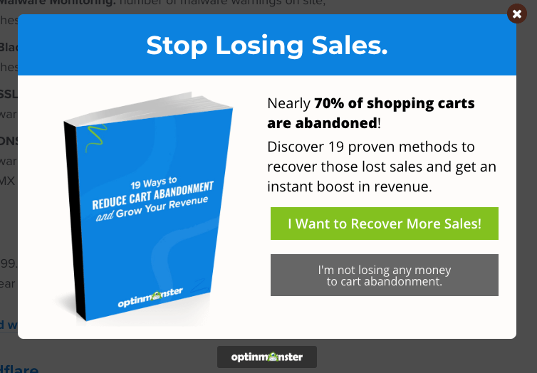
OptinMonster Exit Intent Pop-Up
Best Practices
Now you’re ready to supercharge your marketing with our 10 best practices – and one bonus best practice – for getting great conversions from popups without driving visitors away in annoyance.
1. Create a Clear Call to Action
A popup must contain a single clear call to action (CTA). It should not be used as a place to begin a conversation or for formal introductions. Bear in mind that your website visitor is browsing or reading and the popup interrupts their activity. Your intention is to get in, capture their email address or get them to take some other immediate action, and let them get back to your site as fast as possible.
As a result, you need to have a CTA that’s crystal clear. Visitors should only be required to perform a single task and not have to weigh between various choices. Otherwise, you can create confusion and your visitor won’t take any action.
2. Serve Your Popups at the Right Time
Timing is a crucial aspect when it comes to creating high-converting popups. If a popup appears immediately after a visitor comes to your website, this could largely interrupt their experience, particularly if they did not get a chance to evaluate your content. Such practices have given popups a bad reputation.
Normally, a visitor signs up because they’re impressed by what you’re offering and wants to get more. However, if you fail to give the visitor sufficient time to explore, it could result in the loss of potential customers. To get your timing right and ensure popups remain relevant, here are some timing strategies you can try out to see what’s most effective.
- When the visitor has viewed a certain number of pages
- When the visitor scrolls a certain percentage of a web page
- When the visitor tries to leave the site
- When the visitor opens a specific page on the site
- After the visitor has been inactive for a period of time
Generally, the more invested visitors are on your website, the higher their chances of signing up to your newsletter or taking advantage of what you have to offer. As a result, the later a popup shows, the higher the conversion. On the other hand, if you wait too long, the total number of visitors viewing your popup is too small.
Ultimately getting the timing right is all about testing what brings more signups. A great place to start is by looking at average time on the site. Triggering your popups shortly before that average time could help you catch conversions right before they get away.
3. Integrate Popups Stylistically with Your Website
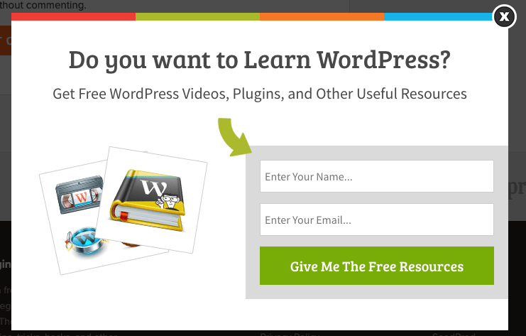
Ensure that popups integrate stylistically with your entire website. You can achieve this by including a few branding elements like your company or site logo, fonts, tone, and colors. This makes your popups appear less like unrelated advertisements and more like an organically integrated part of your website.
4. Personalize Your Popups to Your Visitors
Personalization makes your popups feel more friendly and less intrusive because you are connecting personally with the individual visitor. If you’re trying to build your email list, the chances are that you do not have any personal information for your target site visitors, so how do you go about personalization?
One great way is to base the content of your popup on the referral source. This means detecting where a visitor came to your site from and using the information to customize the popup they see.
There are multiple ways to use this kind of personalization. For example, if you have written a guest post or have been featured online recently, you can have a special popup ready for that audience. Do you receive traffic from Twitter? Shyami Goyal from Techigem recommends creating a popup that will target Twitter visitors. Personalization gives visitors the feeling that your popups are offering something exclusively for them.
5. Use Visuals
Images and other visual elements are a crucial part of creating great online content, so it’s no surprise that an image, particularly of people, attracts favorable attention when used in a popup. Images boost your visitors’ interest and get them to focus on your message.
Photo images can range from a full-scale photo shoot to free images from image banks, but an exciting background pattern or merely artistic use of color in the design can do the trick.
Make sure your images look good on mobile devices, or you might want to create a different popup for mobile, as described in our tenth best practice.
6. Offer an Incentive
It’s often easier to get a visitor to take action if they immediately benefit from it. This doesn’t mean a promise to receive great offers later or stay looped in, but rather something they get immediately.
One type of incentive is known as the “lead magnet,” and it can be in the form of a coupon code, something useful like a checklist, cheat sheet, eBook, or anything else they receive immediately after signing up. You can create a lead magnet by integrating your popup form with an email marketing service to deliver the reward to your new subscribers.
Another type of incentive is one that creates a sense of urgency. Using words like “Don’t Miss Out”, “Limited Offer”, or “Only Today” encourages your users to take action now instead of waiting. Just remember that an “only today” popup that visitors see every time they visit the site in the future can end up backfiring on you.
7. Use the Right Format
‘Popup’ is often an umbrella term used to describe various techniques used to get your visitor’s attention. Popups include:
- Classic popups that appear over the main page
- Popups that fly in from the side
- Bottom and top bar banners
- Full-screen popups
All these popups have merits and demerits and levels of intrusiveness, and their use depends on the use case. For instance, smaller popups are appropriate for smaller screens while larger interstitials – a full-screen or large popup that appears before the user is allowed to see the main content – make advertising promotions impossible to ignore. Just remember that you’re not limited to a single tool and you should always test to see what works best in your circumstance.
8. Create a Clear Path
Popups should be treated as mini landing pages. After all, their function is similar: move the visitor along a specific path to a specific objective. To ensure the popup is effective, create clear steps to be followed. Here’s a set of steps that applies in many cases:
- Grab the attention of the user
- Clearly mention the benefits the user will get from acting
- (Optional) Provide assurance of the safety, benefit, etc. of acting
- Prompt the action you want them to take
Similar to landing pages, it’s essential that you don’t overwhelm your visitors, so keep the content that appears in your popup to a minimum. For email signups, for example, focus on the first name and email or even the email address alone.
9. Make the Popups Easy to Close
Have we mentioned that popups can be annoying? If they are difficult for the user to close, you can add insult to injury. Users have been known to leave the website just because they can’t close the popup.
To be successful at making popups easy to close, observe the following guidelines:
- Make the closing element one that is universally recognized, such as an ‘X’
- Make the closing element prominent
- Don’t put the closing element too close to the edges of the screen
- Don’t do anything else to hide or delay the visibility of the closing element.
You may think that you’re increasing the chances of a sign up by making the popup hard to close, but, you’re essentially ruining the user experience. Don’t make visitors think of your site as a place to which they don’t want to return.
10. Include a Mobile-Specific Design
We probably don’t need to remind you about the importance of mobile visitors, who often make up a majority of your total site guests. Your entire site should perform well on mobile devices, and that holds true for popups.
Due to the smaller mobile screens, popups could appear more intrusive and even harder to navigate by touch. This is one of the reasons why Google threatens to punish sites with popups that interfere with user experience, particularly when they block access to the main content.
Bonus Best Practice: Test, Test, Test
We’ve given you 10 best practices, but you have to know what works in your own situation. The best way to tell is to test your popups with analytics and usability feedback. It’s also essential to make sure that Google approves of your popup since they have threatened to penalize sites with popups that obscure content.
One great way to fine-tune the effectiveness of your popup is to run A/B tests. You can create two versions of the popup and various factors such as design, content, timing, and placement on the page (preferably one at a time), then present either one version or the other and compare the results by measuring the effectiveness of your CTA. Here’s an article with information about A/B testing and tips for how to maximize the effectiveness of your popup.
To make sure your popup isn’t interfering with Search Engine Optimization (SEO), here’s a great informal overview article about popup types and some ways to determine their effect on SEO. The article also has tips for analytics to make sure your popup isn’t having the opposite effect of conversions, in other words driving people away from your site in annoyance.
You can also check out this Google article with basic advice on designing a popup, which can be taken as tips to avoid having your popup censured by Google.
Conclusion
Popups are an essential tool to interact with your website visitors. By adhering to the above best practices, you can easily populate your email list, recover the abandoned shopping carts, and boost sales without negatively affecting user experience.
Which among the practices above do you consider the most important one? Let us know by leaving us a comment below.
4 Comments
Related articles
Growing a Facebook Group to 14,000 Members: Community Management Tips with David McCan
David McCan grew the Dynamic WordPress Facebook group to over 14,000 members. We sat down to talk about his moderation...
Why Agencies Are Switching to Beaver Builder: Performance Testing Results
By Chris Smith – HYPEsites.com For WordPress agencies, page builder choice directly impacts the metrics that matter most: project margins,…
Best WordPress Black Friday Deals (2025)
Hey Beaver Builders! Are you looking for WordPress deals for this holiday season and Black Friday? Here are some great…
Join the community
We're here for you
There's a thriving community of builders and we'd love for you to join us. Come by and show off a project, network, or ask a question.
Since 2014
Build Your Website in Minutes, Not Months
Join Over 1 Million+ Websites Powered By Beaver Builder.


Hi Anthony – Good information. I’ve seen many of the irritating popups but I liked your comments on serving them at the right time. The times I have given my info on a popup was when they didn’t show until I could read enough of the article to know I wanted what the website had to offer.
Thanks Dan =) The timed or exit intent popups I think is a good balance… like you said it gives the opportunity for the person to read the article first.
You got to add Sumo.com to this list, I love there pops, welcome mats and other stuff. Super easy to use and customize.
Great suggestion Tyson. We will definitely consider your recommendation when we make updates to the article.