
How to Create a Web Design Portfolio That Attracts Clients (7 Key Tips)
It’s hard to overstate the importance of an attractive web design portfolio. A selection of your best work can demonstrate your skills and intrigue new clients. Fortunately, you can put together your own high-quality online portfolio by following a few rules of thumb.
In this article, we’ll start by discussing a few reasons why portfolios are so essential for web designers. Then, we’ll take you through seven key tips to help you craft the perfect one for your site. Let’s dive right in!
Why Web Designers Need Attractive Portfolios
If you’re in the web design business, appearances can be everything. After all, you’re probably responsible for creating stunning web pages. That means that a traditional written resume may not be convincing to your clients.
That’s why using a visual portfolio can make a lot more sense. It is a collection of your completed work, displayed online:
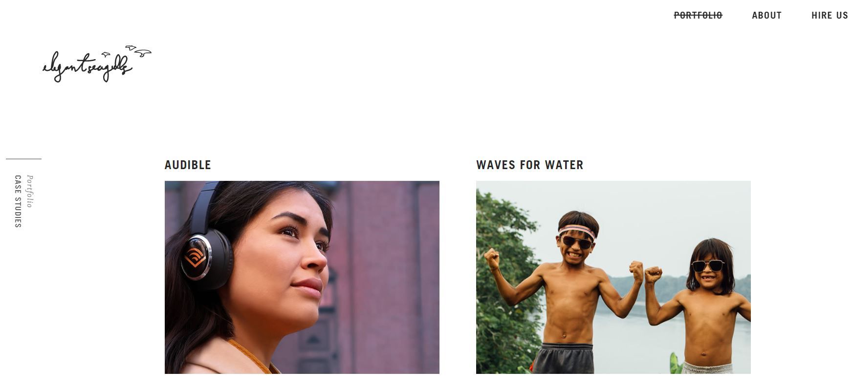
Instead of trying to tell potential clients about your skills, you can show them what you’re capable of instead. In other words, portfolios enable your designs to speak for themselves.
Furthermore, portfolios can also act as archives. Clients might be more inclined to hire you if they can tell you have a lot of experience. As such, compiling a collection of work that spans your career can be an effective way to demonstrate your proficiency.
However, portfolios are essential even if you don’t have years of web design experience under your belt. If you’re starting your career as a freelance web designer, you may not have any real-world examples.
Nevertheless, that doesn’t mean you should wait to create a portfolio. In fact, having a collection of your work can be vital to launching your career.
If you don’t have samples, you could try creating sites for imaginary clients. Even if nobody hires you to build it, the results won’t lie. A well-designed web page can show off your abilities regardless of why you made it.
Finally, portfolios aren’t only for enticing clients. You can also use one to control your image to clients. Social media can be a helpful marketing tool. Still, it’s hard to beat the spotlight of a tailor-made website dedicated to your work.
Given these factors, most web designers should have portfolios. However, it’s not always as simple as compiling examples. There are other elements that you might want to consider to optimize your portfolio’s impact.
How to Create a Web Design Portfolio That Attracts Clients (7 Key Tips)
As you build your portfolio, try to keep the following tips in mind to maximize its effectiveness.
1. Include Examples from Different Niches
From ballet studios to tattoo parlors, most businesses need websites to survive. If you’ve done web design for many clients, don’t be afraid to show that versatility in your portfolio.
Various niches can demonstrate different web design abilities. For example, designing a photography website will probably involve showcasing the pictures to their fullest extent.
On the other hand, a writer’s website may have minimal media elements. You might have to find different ways to make the content stand out.
Furthermore, no two sites are the same. Therefore, showing your proficiency in wildly different niches can be a powerful testament to your adaptability.
For example, here’s the varied portfolio of the Web Design Yorkshire agency:
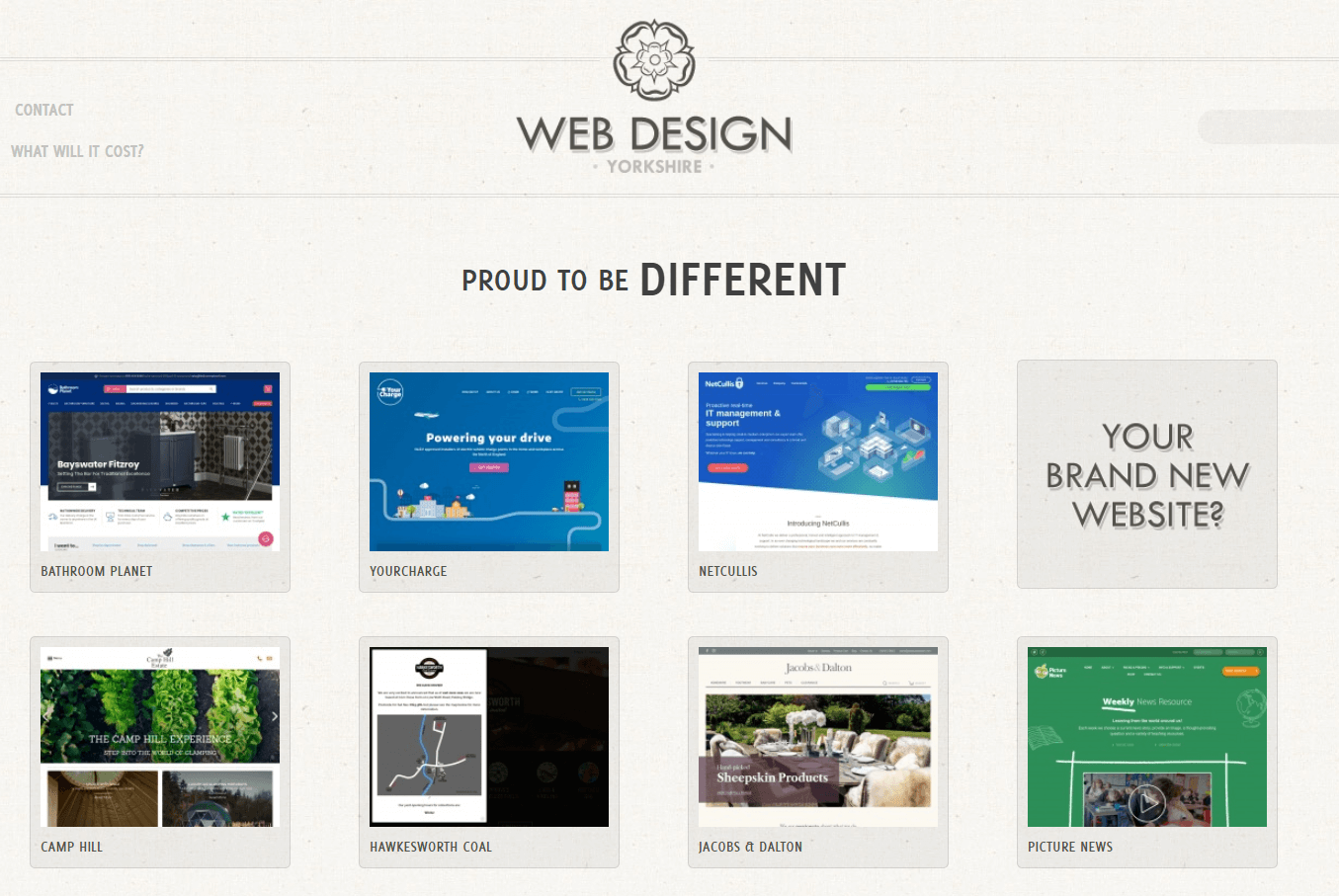
As you can probably tell, each item is unique. This agency displays websites with different color schemes, layouts, and tones. However, the overall focus on media across the examples shows a cohesive style.
This portfolio selection has two distinct benefits. Firstly, each unique page demonstrates the agency’s ability to address a client’s needs regardless of their industry. Nevertheless, the consistency among the samples can give customers an idea of what their tailored websites might look like.
As a bonus, including a wide range of niche designs can help add diversity to your page. Unique layouts and color palettes can keep your website from looking too uniform.
However, we recommend that you avoid cluttering pages with clashing elements. Doing so can result in a chaotic-looking portfolio that distracts from the substance. Spreading the samples out instead can obtain the same results with less confusion.
2. Feature Testimonials from Happy Customers
A web design portfolio will likely give clients an idea of your technical skills. However, that’s only half of the story.
As a web designer, you probably work closely with your customers. As such, demonstrating that you can fully and professionally address their needs can go a long way toward convincing potential new clients to work with you.
One reason for this is the customer’s expectations. Even the best-designed webpage would miss the mark if the client wanted something different from you. Glowing reviews can show your ability to direct your skills towards specific goals.
Furthermore, reviews can speak to your professionalism. Nobody likes working with a difficult business partner. That’s why you may want to showcase testimonials that highlight your collaboration capabilities, such as:
- Promptly finishing tasks on an agreed-upon schedule
- Working through any creative disagreements with grace
- Maintaining clear and consistent communication with customers
You can collect reviews by asking your clients directly. If you use this method, try to do so immediately after finishing projects. That way, your work will still be fresh in their minds.
On that same note, you may also want to consider white labeling your services. Removing external branding can help keep your agency at the center of attention.
You could also use Google reviews. The Charley Grey agency provides an example:
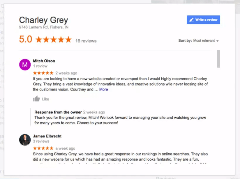
When you’re picking reviews, try to focus on comments that highlight how your services are unique. There are tons of web designers out there – standing out from the crowd can help you land your next job.
3. Make Your Web Design Portfolio as Easy to Find as Possible
No matter how well-made your web design portfolio is, it won’t help you land new clients if people can’t find it. That’s why we recommend that you take a few crucial steps to get as much exposure as possible.
For example, try to link to your portfolio wherever you have a web presence. If you use social media to promote your work, you might like to use this strategy – directing clients to a complete portfolio can take them one step closer to hiring you.
Another tactic to consider is Search Engine Optimization (SEO). Using the right keywords can go a long way toward boosting your place in the search engine rankings. As a result, you may be able to increase your portfolio’s organic traffic.
If you’re unsure how to best improve your SEO, consider using a premium search optimization tool. Think of it as an investment: with the proper software, you’ll also be able to improve your clients’ sites.
For example, you could invest in the premium version of Yoast SEO. It audits your content in real-time and provides suggestions on how to optimize your posts and pages:
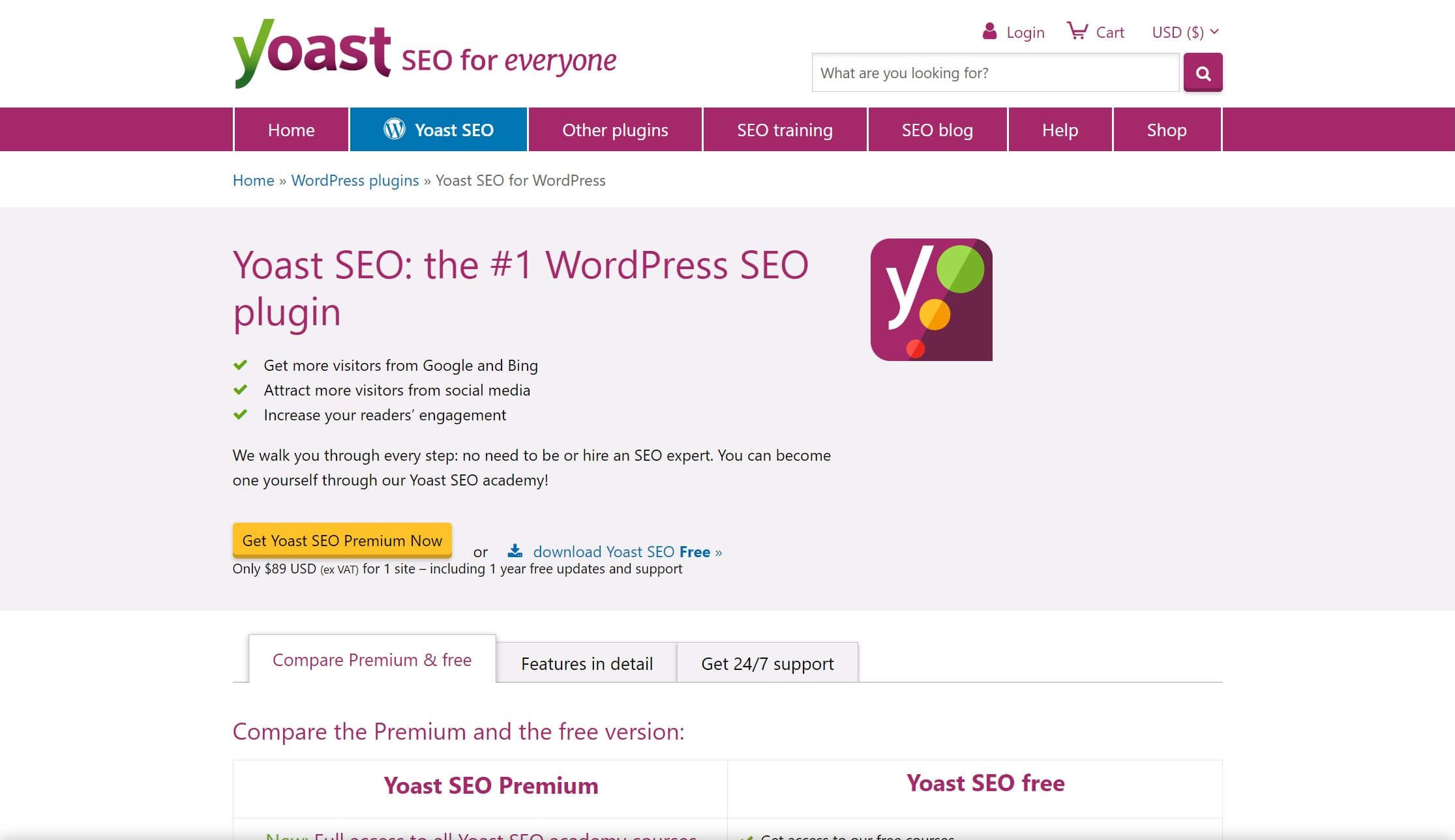
Finally, try to keep your domain name short and sweet. Long, complex URLs may discourage clients from clicking on links. They may also make it harder for people to remember your brand name.
However, the process doesn’t end once a user has reached your website. You should also consider a few ways to make them stay on your page too.
For example, you can make navigating your site easier with clear menus. Optimizing your website for mobile devices is also essential in the age of smartphones. Changes such as this can help ensure that you don’t frustrate high-paying clients after attracting them to your portfolio.
4. Organize Your Web Design Portfolio into Relevant Sections
As we discussed earlier, having samples from different niches can show off your versatility. However, you may want to make sure there’s a method to the madness.
For example, some clients may come to your site looking for a specific style. If all the niches are randomly lumped together, they might have to hunt through dozens of examples before finding the ones that are relevant to them.
You probably don’t want this to happen – chances are that your clients won’t appreciate starting a business partnership with a scavenger hunt. That’s why we recommend that you use categories.
A few simple categories can go a long way toward an orderly portfolio. You can divide your work by niche, layout type, or other groupings that make sense to you.
You can consider the drop-down filter menu from Grain & Mortar as an example:
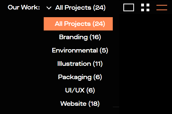
Regardless of how you decide to format these sections, we recommend that you limit their numbers. A massive list of categories can intimidate your clients. You also risk getting too specific, which could make your organization lose its overall focus.
However, it’s also worth mentioning that every portfolio is different. You don’t have to include categories if you don’t think they’ll help. If you’re not sure, we recommend that you keep it simple and trust your web design instincts.
5. Add Links to Encourage Networking
This tip may seem obvious, but it’s also important. You can’t get new clients if they can’t reach out to you. Thus, it’s wise to make it as easy as possible for potential customers to contact you.
Furthermore, your contact details should also be obvious. You could put them in the header so that clients can reach you before they hire you.
You can use Trent Walton’s web design portfolio as an example:

Casual contact links such as these can help increase the odds of getting a message. This is because users may feel intimidated by the formality of an official quote.
Try to include as many contact methods as possible. If you’re active somewhere, link out to it if you can. As a bonus, this approach will also give your clients the freedom to each you through their preferred channels.
However, we also recommend making a dedicated quote contact page. After all, there will always be clients who are eager to skip the small talk and get straight to business.
For these quote pages, you might want to link them to a single landing page. That way, users won’t get distracted by other URLs when they’re reaching out. In turn, this may help increase your conversion rate.
6. Prioritize Your Best Work
Let’s be honest for a second: not every website you design will be of equal quality. It’s nothing to be ashamed of – varied results are facts of life that nearly every professional deals with.
However, you probably want to use your web design portfolio to put your best foot forward. Therefore, you likely won’t display any examples you aren’t proud of. Still, there’s a strong chance that some samples will shine brighter than others.
While you’re picking your top-tier examples, try to vary the niches as well. That way, you can show that you always rigorously apply your skills regardless of the client’s needs.
You may even want to make your most impressive examples into case studies. For instance, you might offer a short article that explores your creative process and shares how you arrived at the result.
For example, the Dogstudio company provides a detailed case study of its work on the MSI Chicago website:
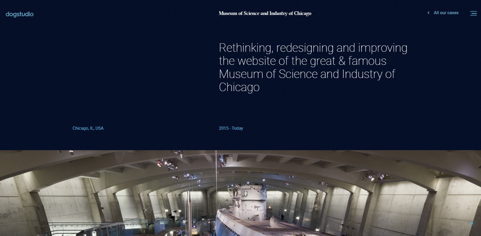
This type of walkthrough can emphasize how seriously you take your responsibilities. It can also highlight your greatest strengths as a web designer. For example, you can showcase your big-picture thinking or focus on even the most minor details, such as font choice.
Focusing on a single web design sample such as this puts a heavy spotlight on one project. Nevertheless, it’s not your only option.
Another strategy is using more subtlety. Instead of a deep dive on one part of your portfolio, you can put your highest quality work at the top of the page. That way, even clients who only glance at your site will see your full potential.
7. Include Context for Each Sample
In the last tip, we talked about the advantages of laying out your design process for a single project. However, your best work isn’t the only content that deserves context.
Every project in your web design portfolio should give at least an overview of the brief. Without understanding the goals you wanted to achieve, it may be hard for clients to gauge how successful you were.
Even if it’s brief, we recommend that you always try to answer a few vital questions with your context:
- What did the client want?
- How did you accomplish it?
- What was unique about this specific design?
Moreover, don’t be afraid to shy away from any difficulties you conquered! As with any other job, there will always be challenges with web design.
Speaking openly about how you approached a project shows that you’re flexible. It can also help assure clients that you can handle any issues that come up with their websites.
You may also want to mention if you still provide any maintenance to the sites you created. If this feature is a big part of your agency’s services, it’s essential to include it in your context.
Conclusion
A web design portfolio is a vital tool for landing new clients. When you craft it with care, it can help you show off your skills and stand out from the crowd. Fortunately, following a few rules of thumb can help you optimize the effectiveness of your professional website.
In this article, we covered seven key tips to help you create a web design portfolio that attracts clients:
- Include examples from different niches.
- Add testimonials from satisfied customers.
- Make your web design portfolio easy to find and use.
- Consider using categories to organize your samples.
- Link to your contact information liberally.
- Prioritize your highest-quality examples.
- Include context for each featured web page.
Do you have any questions about creating a world-class web design portfolio? Let us know in the comments section below!
1 Comments
Related articles
Best Practices for Managing Web Design Clients
Managing web design clients effectively is one of the most crucial skills for a web designer, agency, or freelancer. Whether…
Top 10 Web Design Trends (What Makes a Great Website?)
As a web designer, you want every website you create to be a great one. This is easier said than…
9 Best CRM Software for Marketing Agencies
Two important objectives for marketing agencies are to improve customer experience and boost sales. To help reach their goals and…
Join the community
We're here for you
There's a thriving community of builders and we'd love for you to join us. Come by and show off a project, network, or ask a question.
Since 2014
Build Your Website in Minutes, Not Months
Join Over 1 Million+ Websites Powered By Beaver Builder.
 Beaver Builder



May I ask if what is the best review star plugin that will be compatible to WP Beaver builder? assuming I am not using the WP beaver theme. I tried to use some but seems that I have no luck but they look so bad after I tried it. SO I have to remove it. Good thing beaver has this portfolio feature already.. We will be rebuilding our website and planning to use Beaver Builder so hopefully we can have this review stars plugin working as we needed to display some reviews in the website.