5 Tips for Building a Better Sales Page
As a developer, it’s important to set your clients up for success with well-designed websites. Their conversion rates reflect the effectiveness of your work, which may influence your ability to secure recurring and future gigs.
Building a dedicated sales page that turns visitors into customers is one way you can give your clients a leg up and prove your value.
In this article, we’ll explain what a sales page is and what are the key elements involved in designing an effective one.
Then we’ll offer five tips for turning sales pages into conversion machines. Let’s dig in!
An Introduction to Sales Pages (And Why You Should Build Them for Clients)
A sales page is an area on a website that is designed to turn visitors into customers by convincing them to purchase a product or service. Ultimately, this page can make all the difference in your conversion rates and revenue.
Sales pages aren’t to be confused with landing pages, although they share many similarities. Both focus on persuading visitors to take action.
However, the primary goal of a sales page is to sell a product or service. Landing pages focus more on collecting user information, such as email addresses.
When it comes to developing websites for clients professionally, it can pay to talk them into letting you build sales pages for them.
Ultimately, the greatest benefit will be to the clients themselves, because they should see an increase in conversions and revenue as a result.
Creating effective sites that deliver the results your clients want also reflects well on you and your business. You’ll be able to point to past projects to show future leads how you directly impacted your previous clients’ success, which can help you close the deal on new work.
Short-Form vs. Long-Form Sales Pages
Before we get into our tips for building effective sales pages, it helps to first understand the different types you can create. The best sales page examples typically follow either a ‘short-form’ or ‘long-form’ structure.
Short-form sales pages present relevant information quickly and concisely. They are common in eCommerce and are ideal when you don’t need a lot of copy to explain a product or its purpose:
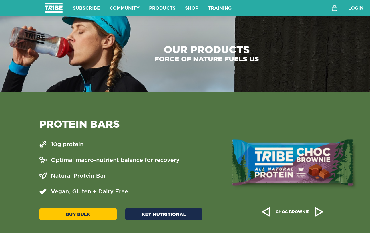
Short-form sales pages make it easy for visitors to immediately understand the main takeaways without getting distracted by clutter. However, there’s a risk of leaving out pertinent details that might otherwise inform customers’ buying decisions.
Long-form sales pages take a deeper and more detailed approach, usually consisting of several sections:
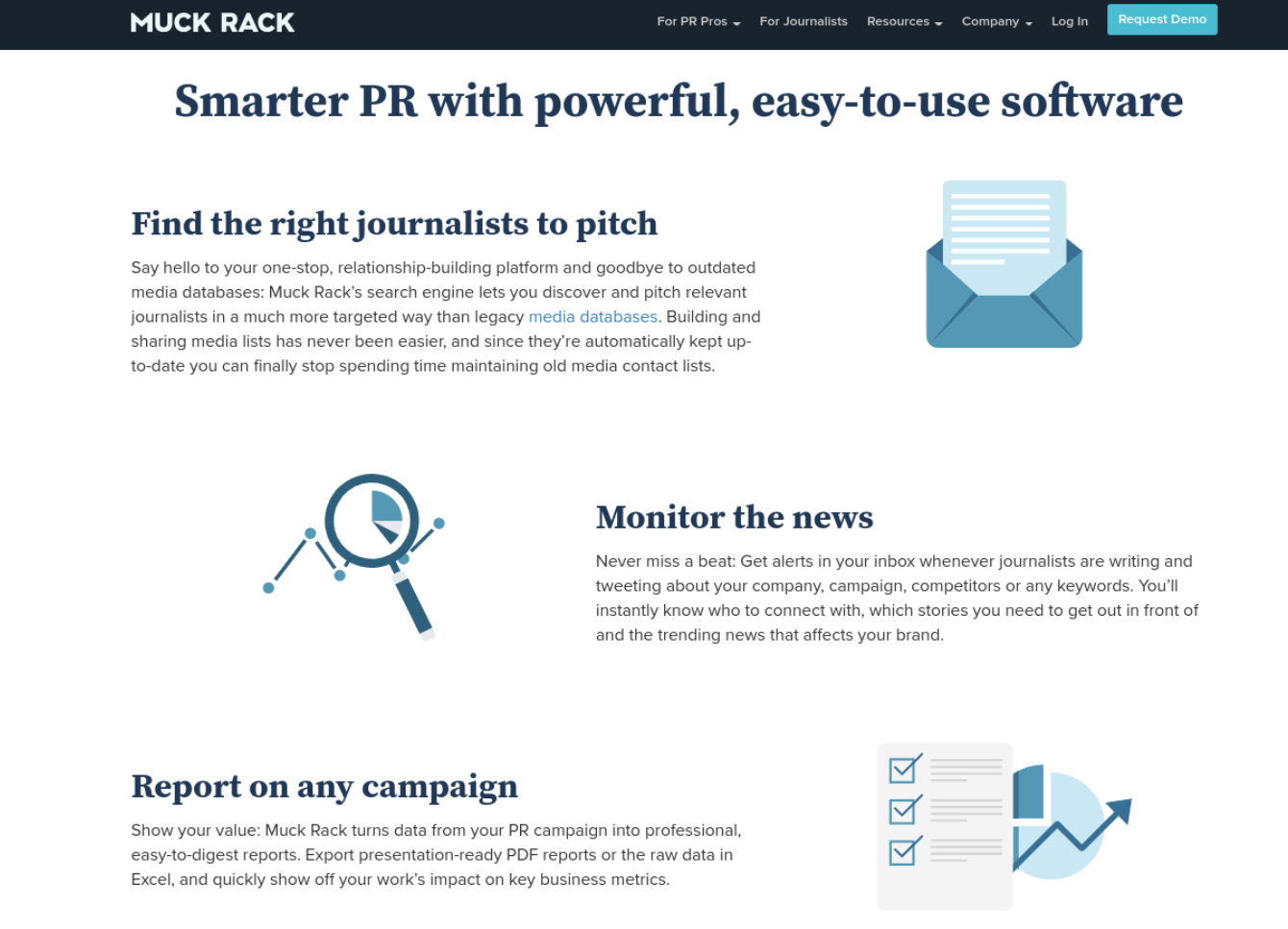
Long-form sales pages are particularly useful for products that are more complicated or require background explanations and context. It’s also the recommended option if you want to include multiple Calls To Action (CTAs).
Long-form sales pages can help your Search Engine Optimization (SEO) as well since they provide more opportunities to target keywords. The potential downside is that too much information can overwhelm visitors.
Regardless of which form you and your clients prefer, all of the best sales pages have one thing in common: they’re optimized for conversions.
Some of the key elements needed for an effective sales page are:
- Compelling, customer-oriented copy
- Product price and main features
- Clear CTAs
- Quality design and imagery
- Social proof and testimonials
For a sales page to be successful, it must be built with customers in mind. Every decision you make – from the language you use in your copy to where you place your images and CTA – must work to persuade visitors to complete purchases.
5 Tips for Building a Better Sales Page
Now that we’ve covered a little bit about what a sales page is and the important elements to include, let’s take a look at five tips you can use for building a better sales page for your next client site.
1. Know Your Audience
Compelling copy is a cornerstone of high-converting sales pages. However, to build one that converts as many visitors as possible, it’s essential to know who you’re selling to.
Therefore, before you even begin building a new sales page, it’s wise to conduct market research to learn more about your target audience. This can help you better understand their pain points and preferences, as well as users’ possible objections so you can craft your copy accordingly.
One method you can use to collect relevant data is to track user behavior via a tool such as Google Analytics:

This lets you see your website visitors’ activity, demographics, and interests. You can also take inventory of your clients’ social media analytics to gather even more data on their audiences’ preferences and attitudes.
Another option for getting to know your audience better is by simply asking them.
For example, customer surveys can be a quick yet efficient way to learn more about them and better understand what they’re looking for.
2. Write Copy to Address Your Customers’ Pain Points
Considering your copy is the bread and butter of your sales page, it makes sense to start with this before anything else. After all, it does the heavy lifting when it comes to selling products.
Also, once you’ve written your copy, it will be easier to place it in the appropriate areas while you’re designing the layout.
When writing your copy, always try to relate the product or service’s features back to real-world examples and use cases.
Seek to answer the following questions:
- What pain points do customers have that this product can solve?
- How does this product make customers’ lives easier?
- What unique features and benefits does this product offer?
- Why should customers trust this product?
It’s also smart to anticipate any counter objections or hesitations users might have about purchasing the product. You can then address them before visitors even get a chance to raise their issues.
3. Include Social Proof
Many online shoppers rely on customer reviews to inform their purchasing decisions. Social proof is crucial for persuading leads that a product is trustworthy and reliable:

Including testimonials, positive reviews, and customer success stories on your sales page is an excellent way to demonstrate credibility and build trust. It can add credence to your claims and effectively minimize objections or concerns.
You can gather testimonials and positive reviews via the website, social media accounts, or reaching out directly to customers.
If you’re having trouble deciding which submissions to use, look for ones that speak specifically to the ways the user benefited from the product or how their pain points were alleviated by it.
4. Use a Smart Layout
Once you have a captivating copy and social proof, you can turn to the sales page design and layout.
Depending on how much information you need to include, use a long-form or short-form format. With either, it’s essential to keep the most important content ‘above the fold’. This refers to the area on the sales page visible to users without scrolling.
It’s also important for the content to be easy to digest and scan. Some of the ways you can do this include using attractive lists for key points and varying the placement of images and text.
To make building a sales page and experimenting with different layouts as efficient as possible, consider using Beaver Builder:
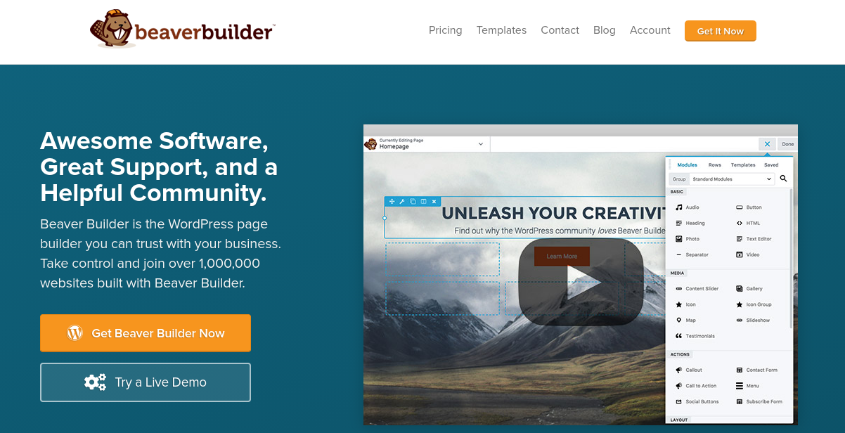
Our page builder plugin provides a collection of ready-made templates you can use to get a head start on your sales pages. You can choose layouts based on whether you want a long-form or short-form structure, as well as specific features and elements to include.
It also features a visual editor and drag-and-drop interface to make crafting the perfect sales page effortless. You can use a prebuilt template or create your own from scratch by dragging and dropping the content modules you want to use in place.
To give Beaver Builder a try, feel free to check out the live demo. You can also learn more about the features our plans include.
5. Test Your Sales Page
Once you’re done creating your sales page, it’s important to test and tweak it to maximize conversions. This process is known as Conversion Rate Optimization (CRO) and involves watching analytics and conducting split tests (or A/B tests) to find the best-performing configuration of a page.
For example, you may still be undecided about whether to use a long-form or short-form sales page.
For some companies, one of these options will perform much better than the other. However, it can be hard to know which will be more engaging for your audience without testing it.
When performing A/B testing, you can assess various aspects of the page, including:
- The phrasing of headings, CTAs, and other copy
- Placement of elements on the page
- Color and design of elements
- Different versions of images
When you use a page builder such as Beaver Builder, you can easily make changes to your sales page based on the results of your A/B tests.
You can also save different versions as templates, then modify them based on which elements perform best with your audience.
Conclusion
Making sure your clients have everything they need to succeed in online sales and lead generation is not only important for their businesses but for yours as well.
Building quality sales pages into their websites can help them maximize conversions and demonstrate your expert design skills.
Give these five tips a try and you should be well on your way to crafting effective sales pages:
- Define your target audience and learn as much as you can about them.
- Write copy to address your customers’ pain points and explain how the product can solve them.
- Include social proof and testimonials to build trust and demonstrate the credibility of the product.
- Use our Beaver Builder plugin to create a smart sales page layout.
- Test your sales pages thoroughly to find what works and what doesn’t.
Do you have any questions about optimizing a sales page? Let us know in the comments section below!
2 Comments
Related articles
LifterLMS and Beaver Builder Integration: Effortless Online Course Websites
Introducing the LifterLMS and Beaver Builder integration. Streamline your online course website creation by combining powerful learning management tools with…
Figma to Beaver Builder: Design and Build WordPress Sites
Curious about converting Figma designs into WordPress websites? A smooth design-to-development workflow is essential for saving time and delivering top-notch…
Best Practices for Managing Web Design Clients
Managing web design clients effectively is one of the most crucial skills for a web designer, agency, or freelancer. Whether…
Join the community
We're here for you
There's a thriving community of builders and we'd love for you to join us. Come by and show off a project, network, or ask a question.
Since 2014
Build Your Website in Minutes, Not Months
Join Over 1 Million+ Websites Powered By Beaver Builder.
 Beaver Builder
Great article. But how do you perform a/b tests with beaver builder to see which page performs better?
Hi Vincent you should check out https://absplittest.com/ as it’s compatible with Beaver Builder