Bento Grid Design in WordPress with Beaver Builder’s Box Module
Looking to add some flair to your WordPress site? Check out the Bento Grid Design! This sleek, stylish layout is both eye-catching and functional, perfect for enhancing your website’s appearance. With Beaver Builder’s Box Module, setting up this design has never been easier.
The Bento Grid Design seamlessly combines clean lines, balanced proportions, and intuitive organization, drawing inspiration from Japanese bento boxes. Beaver Builder’s Box Module makes it straightforward to implement this sophisticated layout. Simply drag and drop the Box module to structure your grid, customize each section with text, images, or icons, and ensure your design looks great on any device.
In this article, we’ll walk you through creating a stunning Bento Grid Design using Beaver Builder’s Box module. Get ready to impress your visitors and elevate your website’s look and feel!
Understanding the Bento Grid Design Concept
Before we dive into the technical aspects, let’s first understand what sets the Bento Grid Design apart. Inspired by the Japanese bento box, this design approach emphasizes clean lines, balanced proportions, and seamless organization. The result? A visually appealing grid layout that effortlessly showcases content while maintaining clarity and coherence.
The Bento Grid Design takes its cue from the classic Japanese bento box – where each meal is carefully arranged to create a balanced and delightful experience:
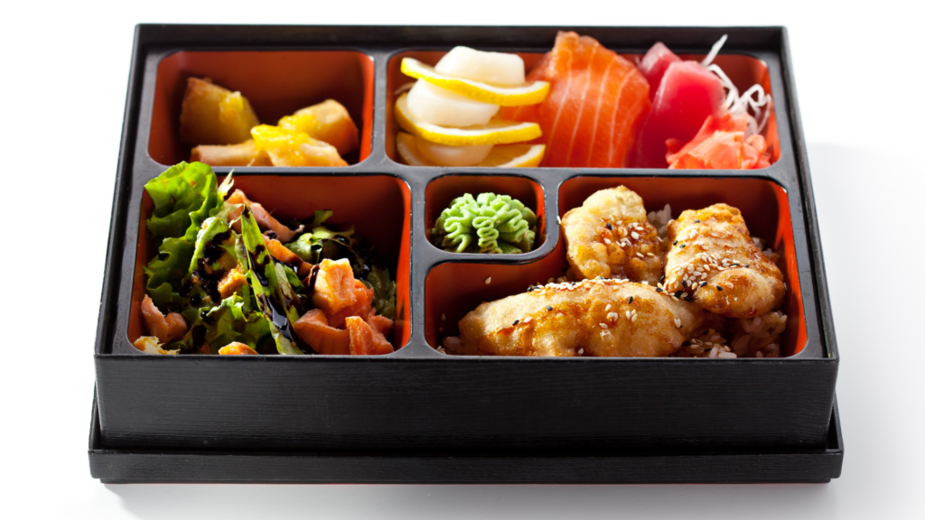
In web design, the Bento Grid mirrors this approach, focusing on simplicity, balance, and precise organization to build layouts that truly connect with users.
Clean Lines
The Bento Grid Design is all about clean lines. Just like a neatly divided bento box, this layout keeps clear boundaries between content elements. This minimalist style boosts visual clarity and adds a touch of sophistication.
Balanced Proportions
Balance is everything in Bento Grid Design. Each element, from image sizes to text blocks and spacing, is thoughtfully proportioned. This careful calibration creates a harmonious look that’s easy on the eyes and maintains a cohesive visual experience.
Seamless Organization
Like the artful arrangement in a bento box, the Bento Grid Design focuses on seamless organization. Content is logically and intuitively structured, making it easy for users to navigate. Whether it’s a project portfolio or a product gallery, this layout ensures users find what they need without hassle.
The Result
Combining these principles results in a visually appealing grid layout that goes beyond just looking good. Inspired by the elegance and precision of a bento box, the Bento Grid Design balances form and function. It showcases content beautifully while enhancing usability and user experience.
By adopting this approach, web designers can build websites that are not only visually stunning but also offer a seamless and intuitive user experience, much like opening a perfectly curated bento box. 😍
Website Examples of Bento Grid Design
Incorporating Bento Grid Design into your web design projects can elevate the overall user experience, providing both clarity and visual interest. The following examples showcase the flexibility and creativity that this layout style can bring to your designs. Each example highlights different approaches and techniques, demonstrating how this design trend can be adapted to suit a wide range of content and purposes.
1. Procreate

The Procreate website effectively employs bento grid design to present information in a clean, organized manner. The homepage features distinct sections, each with its own compartment, showcasing different aspects of the product, such as tools, gallery highlights, and tutorials. These sections are visually separated but maintain a cohesive flow, making it easy for users to navigate and absorb information. The use of varying compartment sizes within the grid layout enhances the visual hierarchy, drawing attention to key features and updates, while maintaining an overall balanced and harmonious look.
2. Apple

The Apple Card webpage uses bento grid design to create a visually appealing and organized layout by dividing the page into distinct sections, each highlighting different aspects of the card. Varying compartment sizes within these sections, such as large images paired with smaller text boxes, establish a clear visual hierarchy and draw attention to key information. Consistent margins, padding, and alignment maintain balance and harmony throughout, enhancing the user experience by making it easy to navigate and absorb information.
3. Aaply

The Aaply webpage uses bento grid design to present its content in a structured and visually engaging manner. The site is divided into distinct sections, each addressing different aspects of the app, such as features, benefits, and pricing. Within these sections, varying compartment sizes and elements, like images, text boxes, and icons, create a dynamic visual hierarchy. This organized layout enhances user navigation and ensures that key information is easily accessible, contributing to a cohesive and user-friendly experience.
Bento Grid Design in WordPress using Beaver Builder
Now that we’ve introduced the concept of the Bento Grid Design, let’s dive into creating our own example using Beaver Builder’s Box Module:
If you’re new to Beaver Builder, don’t worry – its intuitive drag-and-drop interface makes designing straightforward. Consider watching this video from our Box Module Basics Online Course to get a quick overview of how to use the Box Module’s grid feature to create a colorful photo grid:
How to Create a Bento Grid Design with the Box Module
Beaver Builder’s Box module simplifies creating a Bento Grid Design with its drag-and-drop interface, flexible customization options, and advanced layout controls. The Box module allows you to effortlessly add and arrange various content types—such as text, images, and icons—within individual boxes.
With its robust Grid and Flex settings, the module provides precise control over alignment, spacing, and positioning, ensuring a cohesive and visually appealing layout. This combination of user-friendly design tools and powerful customization capabilities enables you to quickly and efficiently create dynamic Bento Grid Designs that enhance the overall aesthetic and functionality of your website.
Let’s take a look at how to build this colorful grid design using Beaver Builder’s Box module:
Step 1: Drag and Drop the Box Module
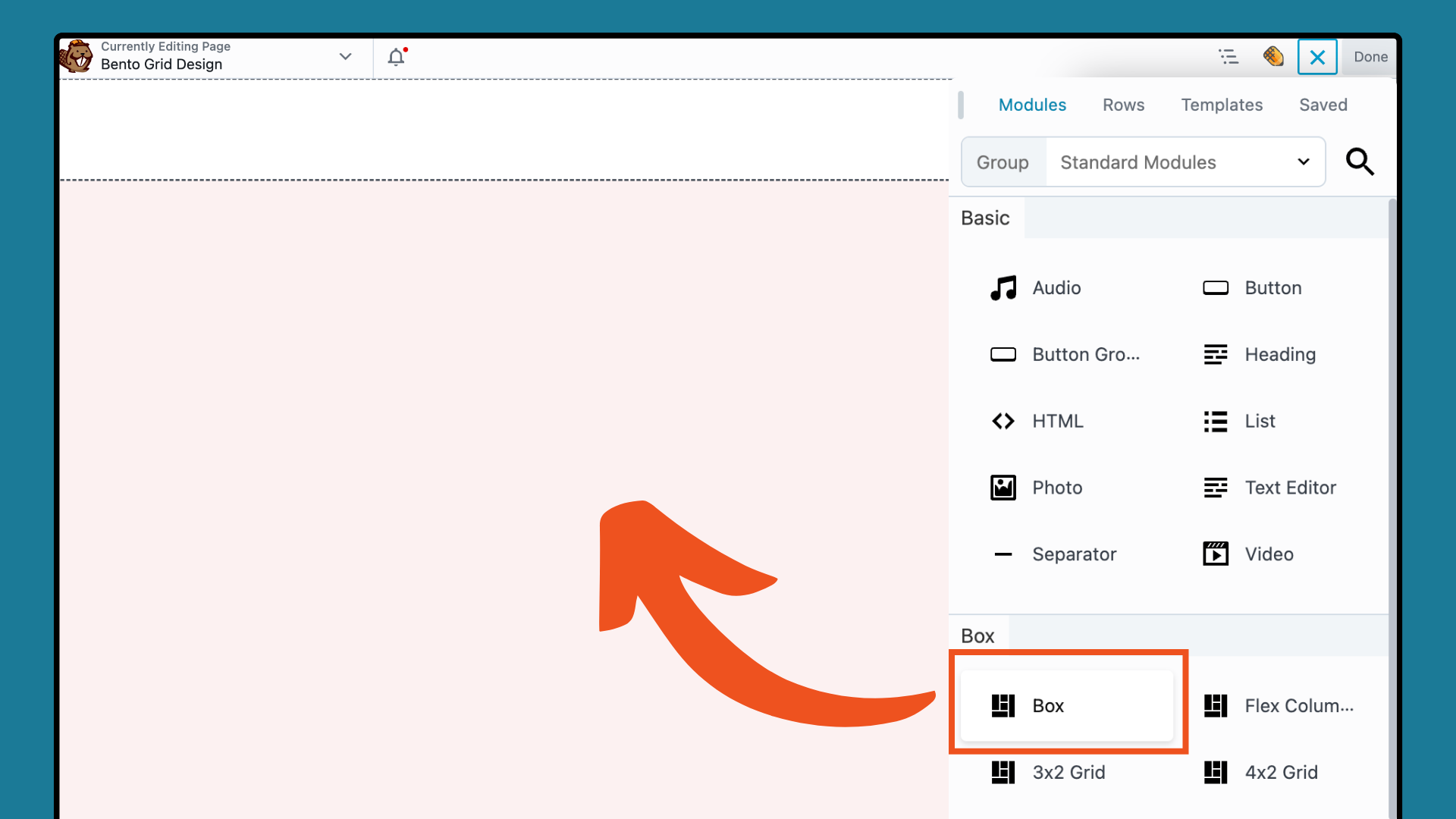
Begin by opening WordPress and launching Beaver Builder to get started. Click the “+” icon in the upper right corner to open the Content panel, then drag the Box module onto the page:
Step 2: Configure the Grid Layout
Set up your grid layout by adjusting the row and column settings. In the Box Module settings popup, go to the CONTAINER tab and set the Display to Grid.
This action will display the CSS grid options. For a 4×2 grid, set the Columns Number of Tracks to “4” and the Rows Number of Tracks to “2” as shown here:
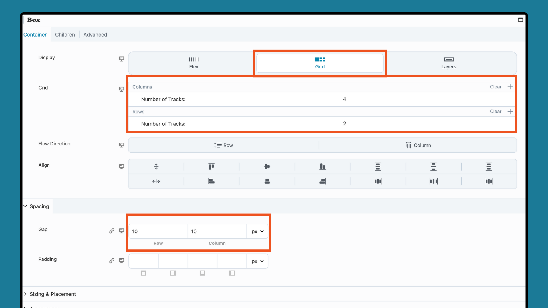
Next, in the Spacing section, you can increase or decrease the Gap and Padding to refine the layout. Keep in mind that you can always make adjustments later as your grid begins to take shape.
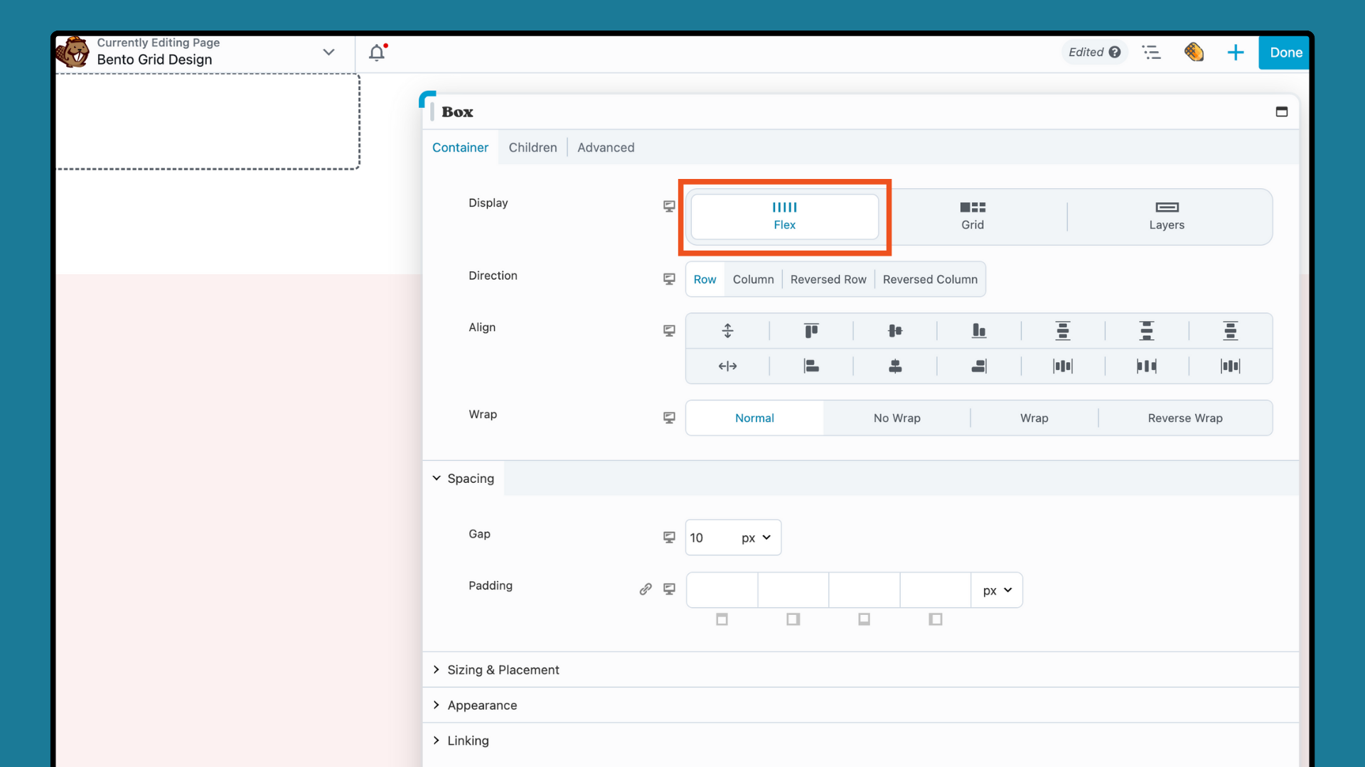
Now, we will add our Flex children containers to form a structured grid, mirroring the compartments of a bento box. Drag a Box module onto the page and drop it inside the grid Box module. In the popup settings box, ensure that this box is set to Flex:
Then, navigate to the Outline Panel, right-click on “Box: Flex Row” and select DUPLICATE. Repeat this action until you have created 4 copies, representing the number of containers you want to display:
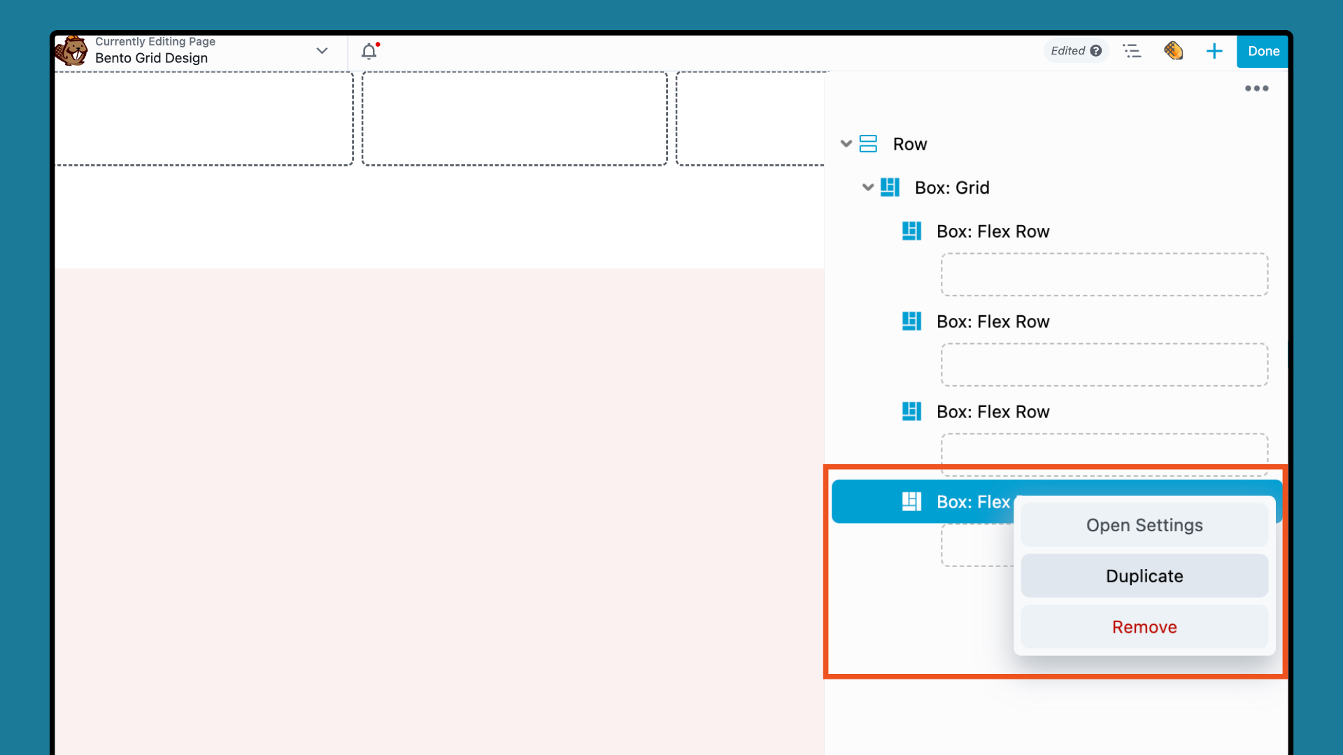
Now we are ready to adjust the appearance of each Box and add content.
Step 3: Customize Each Flex Box Module
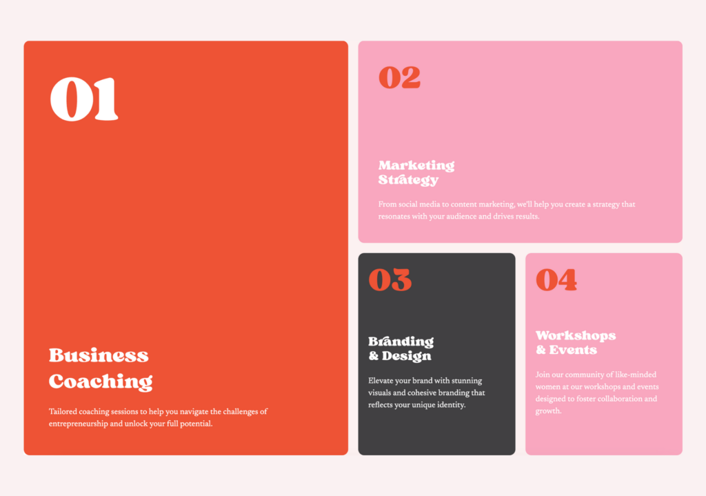
Each Box module serves as a container for content. In this step, we will customize each Flex Box module. We will work from left to right and top to bottom, starting with the orange 2×2 container on the left:
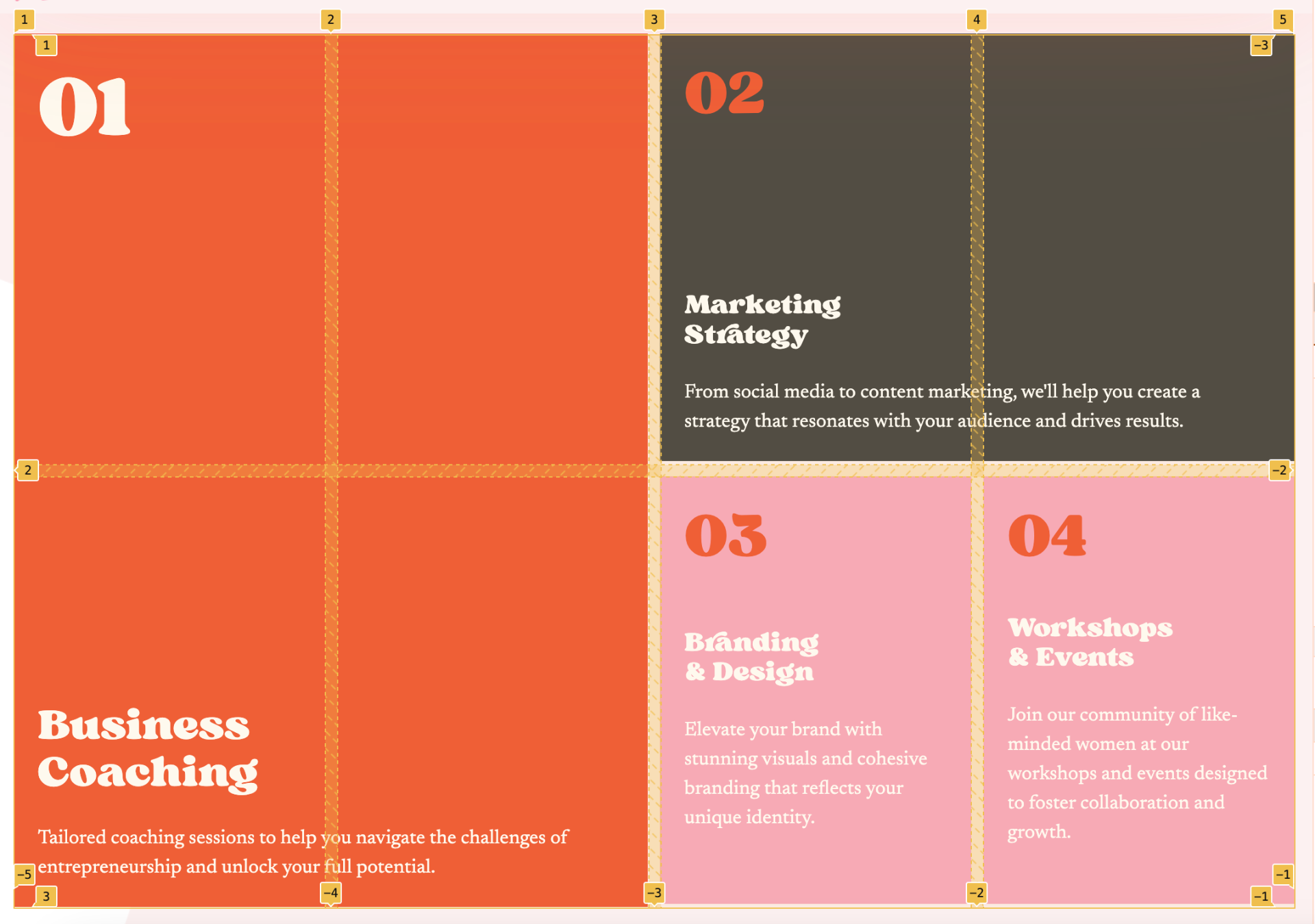
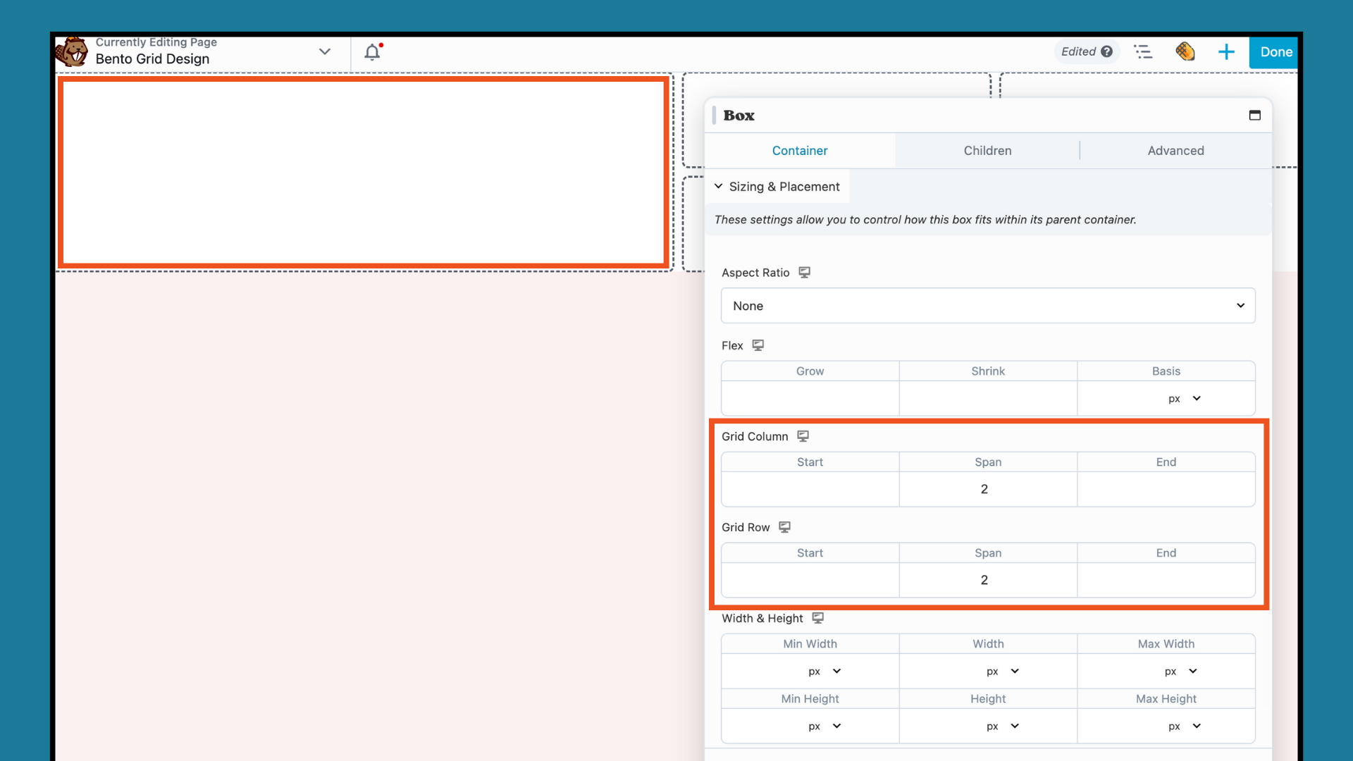
To achieve this look, click on the first Box module to open up the settings popup. Under the CONTAINER tab, scroll down to Sizing & Placement. Increase the Span to “2” for both the Grid Column and Grid Row in order to achieve a 2 x 2 box like this:
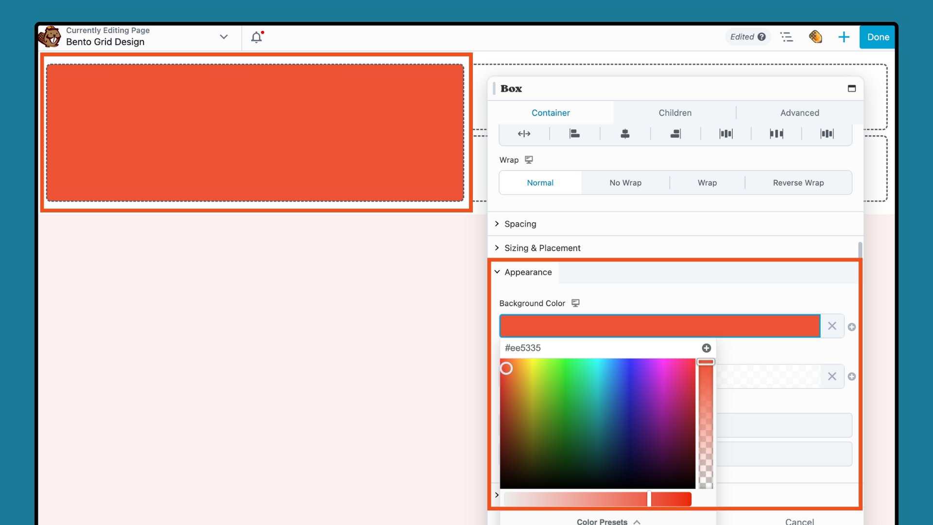
Next, scroll down to the APPEARANCE section and click to add a Background Color:
Drag the Heading and Text Editor modules into the Box module, and add your desired content into each module. To arrange them as shown below, adjust the Flex settings (Direction, Align, Wrap) in the Box module popup:
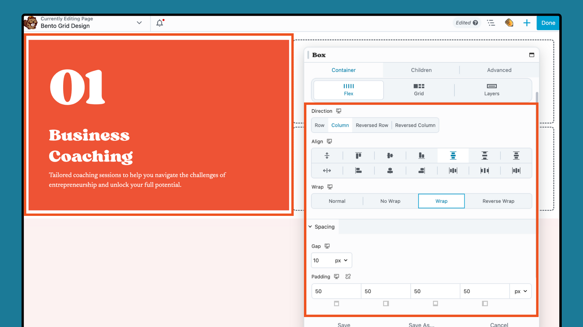
Once you have finished with the first box module, click on the next Box module. Create a 2 x 1 grid by setting the Sizing & Placement to “2” for Grid Column and “1” for Grid Row:
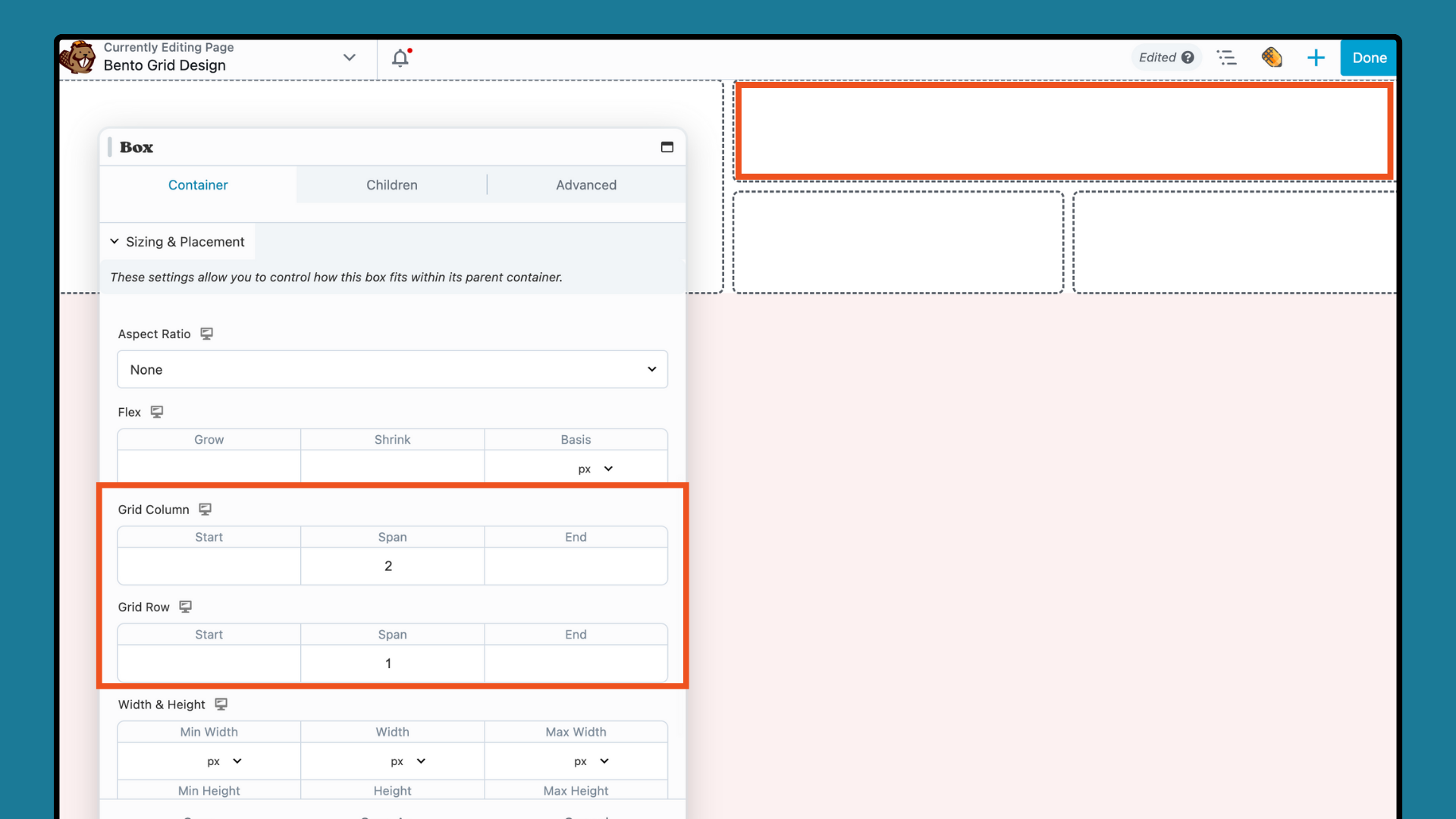
Then, just as you did with the first box, add a background color, a heading module, and a text module. Adjust the Flex settings for each additional box module to create a visually appealing and balanced layout.
Step 4: Ensure Responsive Design
The next step is to ensure your grid design adapts well to different screen sizes. Use Beaver Builder’s responsive tools to maintain the Bento Grid’s visual integrity across various devices.
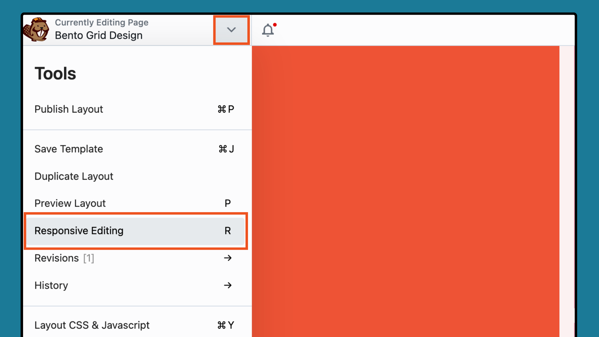
Open the Tools menu by clicking the arrow in the top bar of your editing screen and select Responsive Editing from the dropdown. Alternatively, use the keyboard shortcut “R”:
The Responsive Editor offers a precise preview of your layout across various devices. You can view the design at different sizes using the Width and Height options or the Drag Handles:
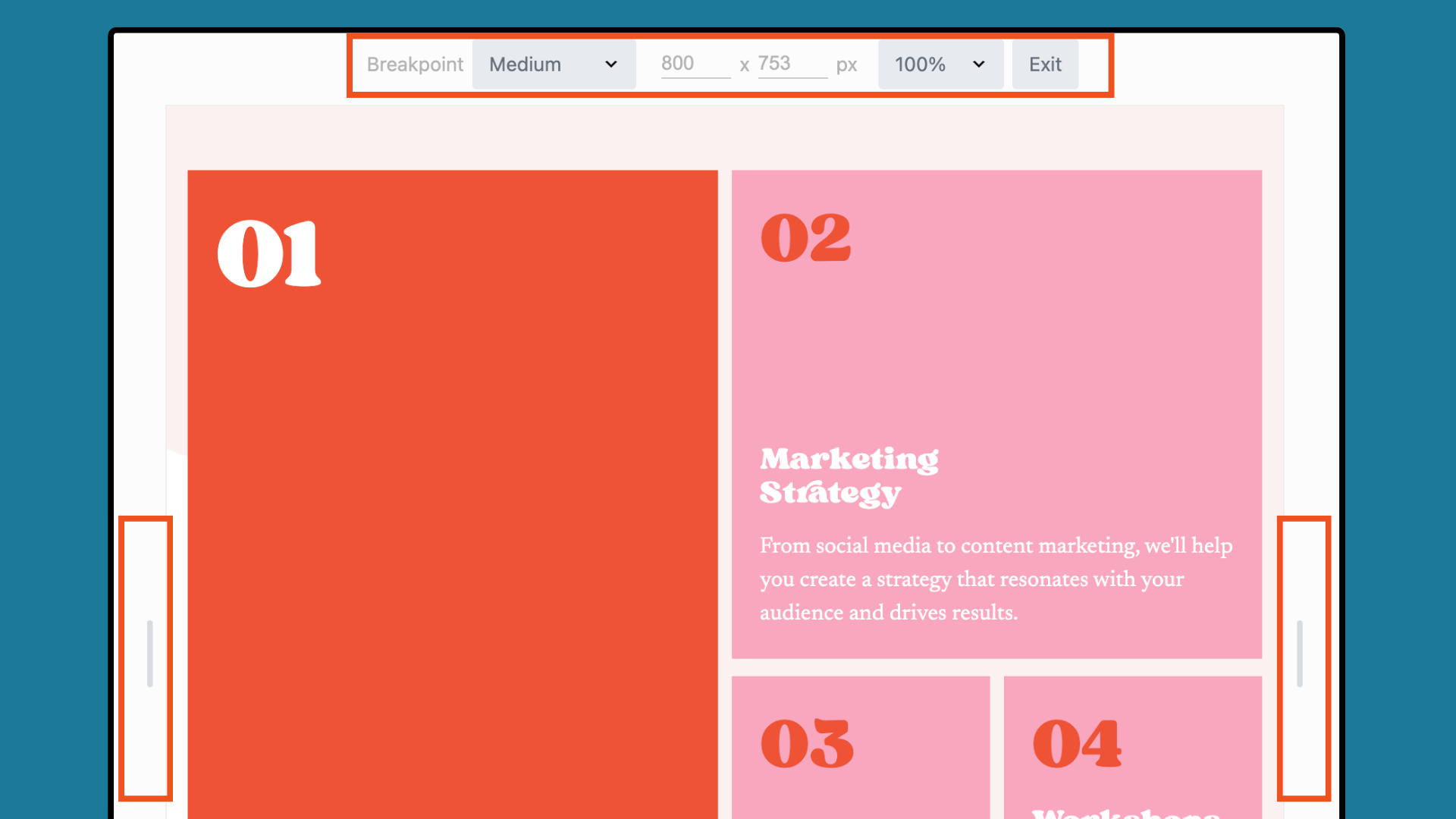
Note that the Responsive Editor does not create separate layouts for each device size. Instead, you can adjust your design for each device using the Visibility options and Responsive Toggle.
Step 5: Enhance with Interactive Elements (optional)
Depending on your design objectives, you might want to incorporate interactive features like hover effects, clickable links, or animations within each Box module. While some enhancements may require basic coding skills, others are straightforward to implement.
For example, the Box module’s Linking settings let you add a link to the entire box, which includes all child modules within it:
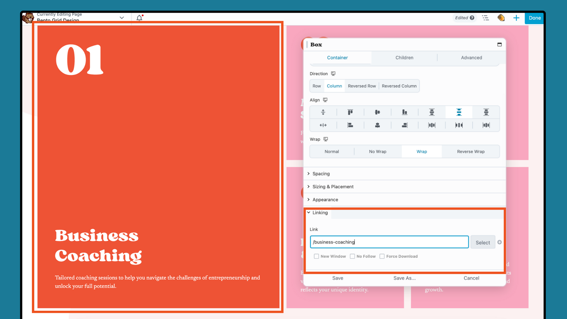
Finally, once your design is finished up, click DONE and then choose SAVE DRAFT or PUBLISH to save or post your work.
By following these steps, you can effectively create a visually organized and engaging Bento Grid Design using the Box module, perfect for enhancing your WordPress website projects.
Conclusion
In summary, mastering Bento Grid Design in WordPress with Beaver Builder’s Box Module unlocks limitless potential for web creators. By blending Japanese design principles with Beaver Builder’s user-friendly interface, you too can present your content in a flexible and visually striking way.
Want more Beaver Builder Box module tips?
- Enroll in our free online course for the box module (free): Box Module Basics: Build Better Layouts with Flexbox + CSS Grid
- Check out Joshua Long’s Beaver Builder Intermediate course (paid): Beaver Builder: Intermediate Crash Course
Related articles
How to Push Content to the Bottom of a Box in Beaver Builder (Flexbox Solution)
How do you get a button to stay pinned at the bottom of a card? It’s a common problem where…
Build Beaver Builder Sites with AI
Building a WordPress website still involves many repetitive steps such as writing copy, structuring layouts, generating images, and refining design…
Build Dynamic WooCommerce Archive Pages with Beaver Builder’s Loop Module and ACF
Default WooCommerce archive pages are functional, but can be clunky. They give you minimal control over layout, and displaying custom…
Join the community
We're here for you
There's a thriving community of builders and we'd love for you to join us. Come by and show off a project, network, or ask a question.
Since 2014
Build Your Website in Minutes, Not Months
Join Over 1 Million+ Websites Powered By Beaver Builder.

