What’s New in Beaver Builder 2.7?
The Beaver Builder 2.7 update is already here! So, you might be wondering what new features to expect from our page builder.
Beaver Builder 2.7 will introduce a new responsive editing interface, visibility UI, and per-node code edits. You’ll also be able to select multiple post types and integrate ACF Blocks Pro.
In this post, we’ll introduce the new Beaver Builder 2.7 update. Then, we’ll show you some of its new features. Let’s get started!
Table of Contents:
An Introduction to Beaver Builder 2.7
At Beaver Builder, we’ve created a user-friendly page builder plugin that makes it easy to build and customize WordPress pages. No matter your skill set, you can quickly design your website with our drag-and-drop visual editor, pre-designed page templates, Global Settings, and much more:
Beaver Builder is already a valuable tool for both beginners and web developers. However, we’re consistently updating our software with improvements and bug fixes.
In Beaver Builder 2.6, we added usability improvements to the front-end and back-end of our visual editor. This update introduced reusable blocks, micro page templates, and a Google Fonts preview. Plus, you can import and export Global Settings and add new breakpoint values.
Just when you thought Beaver Builder couldn’t get any better, we’ve launched a new update! Beaver Builder 2.7 brings a new responsive editor for previewing mobile device views. We also replaced the breakpoint dropdown menu with more user-friendly icons.
When you update to 2.7, you’ll be able to customize the code settings for specific rows, columns, or modules. We also make it possible to select multiple post types. Finally, Beaver Builder 2.7 fully integrates with ACF Blocks, giving you access to an advanced content editing experience.
5 New Features and Updates You Should Know About in Beaver Builder 2.7
As this is our first update of 2023, let’s dive a little deeper into Beaver Builder 2.7. This way, you’ll know all of its main features and bug fixes before installing the new version.
1. Updated Responsive Editing
In previous versions of Beaver Builder, you could use the responsive editing mode to resize pages for different screens as well as view and edit your designs on mobile devices and tablets. Beaver Builder 2.7 includes the following new features to make your designs even more precise on all device sizes:
- The Beaver Builder UI is now in an iFrame making responsive previews of different device sizes 100% accurate.
- It also now includes the site header and footer in the preview. Previously, it was only the layout.
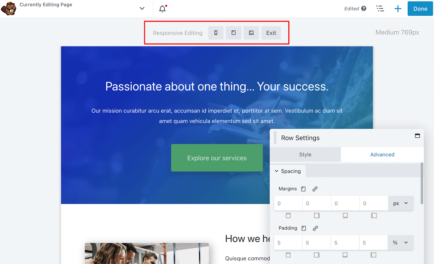
By upgrading to Beaver Builder 2.7, you’ll have access to advanced responsive editing options. First, you can view the page in four different sizes: extra large, large, medium, and small:
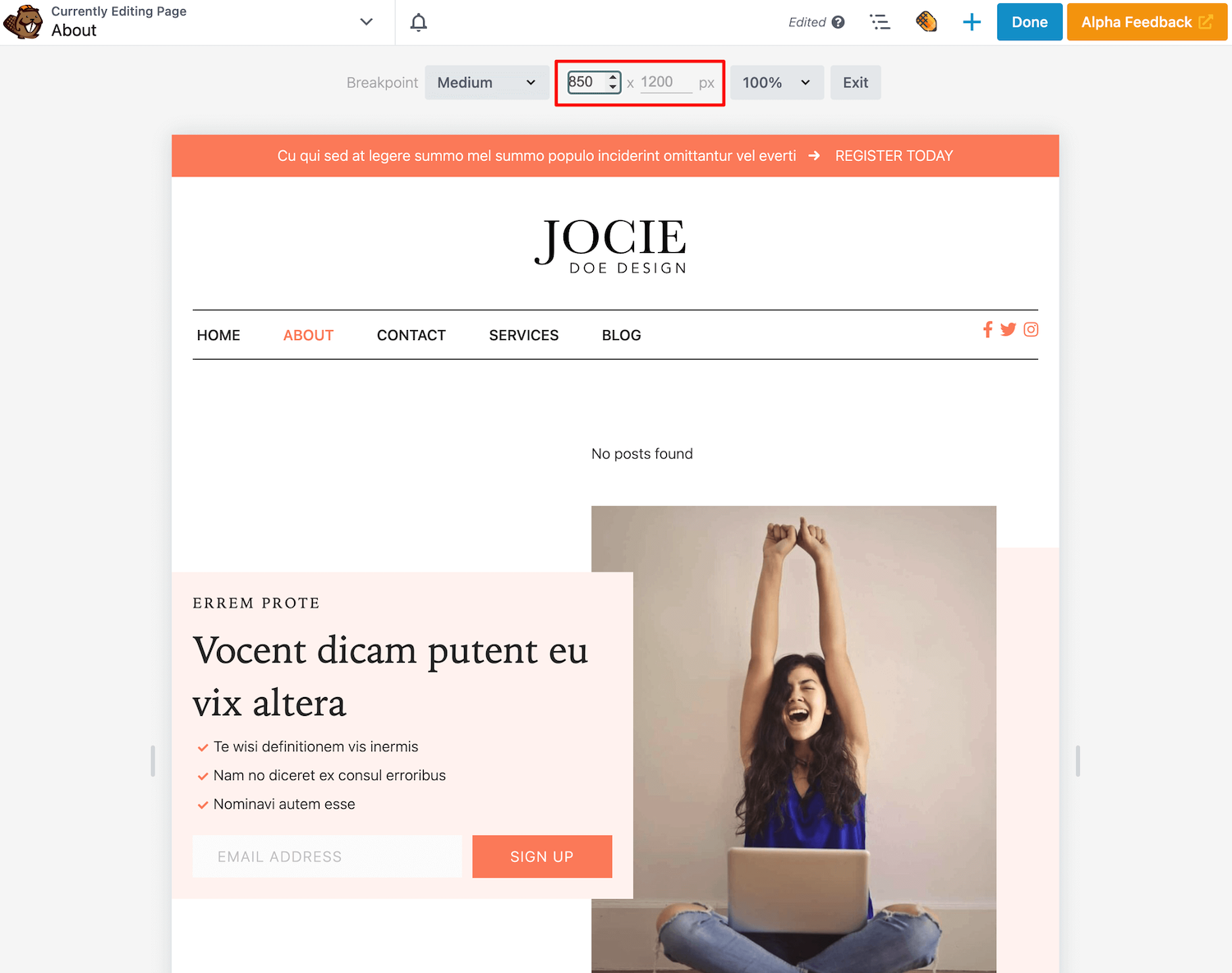
Additionally, the responsive editor enables you to set a custom height and width. Just enter a specific combination of pixels, and the editing screen will automatically update:
Next, there is a dropdown menu for changing the zoom. This setting will allow you to view the editing screen at 100%, 75%, or 50%. Alternatively, you may choose Fit to Window:
To further customize the editor, we have added resizing arrows on the bottom and sides of the screen. These elements can provide much more flexibility while you’re designing the page:
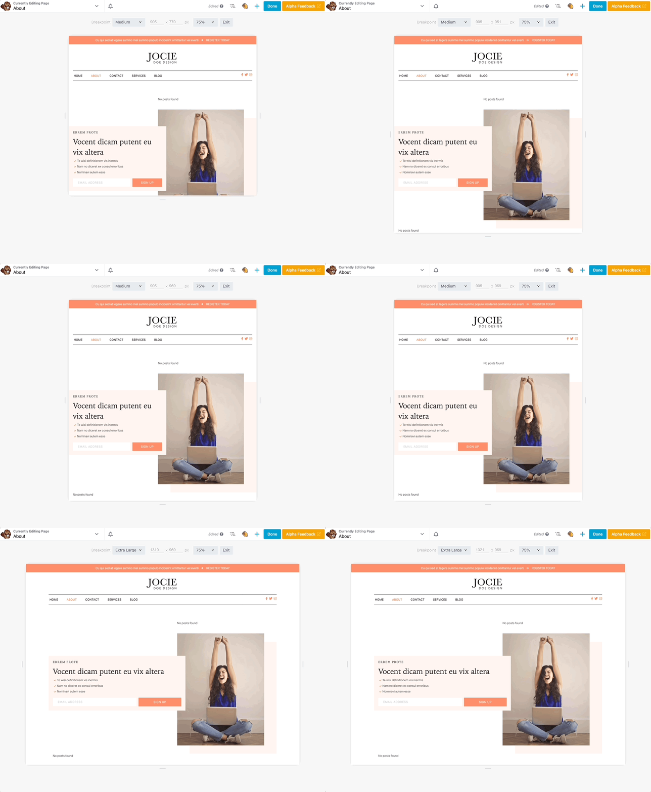
Beaver Builder now makes it easy to accommodate various device sizes. Using our new editing features, you can ensure every page of your WordPress site is responsive and mobile-friendly!
2. Visibility UI
Beaver Builder already supports custom breakpoints for different screen sizes. This means you can set the pixel width that changes the responsive behavior from large to medium to small devices.
When you’re defining breakpoints, it’s important to keep these default values in mind:
| Large | Medium | Small | |
| Default breakpoint value for the browser width | undefined | 992px | 768px |
| Browser width range | 993px and higher | 769-992px | 768px and lower |
For example, most iPads have a landscape orientation of 1024 x 768 pixels, while portrait would be 768 x 1024 pixels. In this case, the landscape orientation suits a large device, and the portrait value would fit a small device.
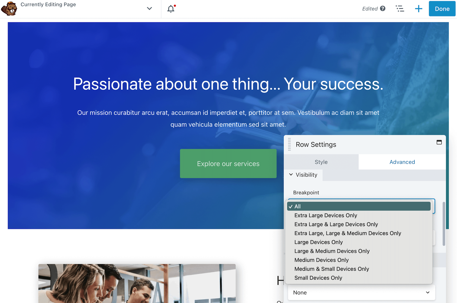
In Beaver Builder, these breakpoint settings are under Visibility in the Advanced tab. Using a previous version of our page builder, you’ll see options like Large & Medium Devices Only or Small Devices Only:
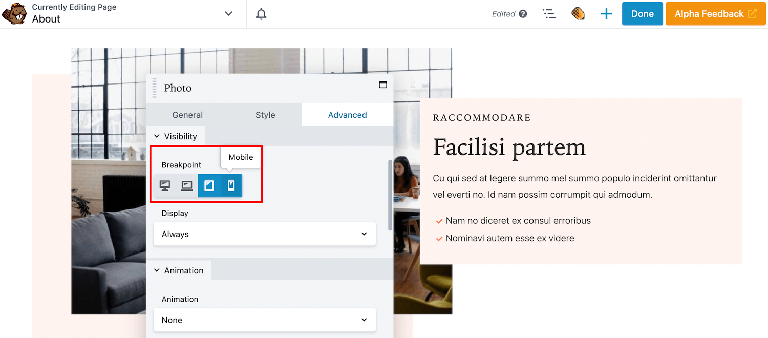
Beaver Builder 2.7 updates this setting with user-friendly icons. Instead of choosing from a large dropdown menu, you can simply select or de-select certain device size icons:
This simple change makes it easier to customize which rows, columns, or modules are shown on different screens. Using Beaver Builder 2.7, you can customize the visibility of your layouts quickly and easily!
3. Per-Node CSS and JavaScript
So far, we’ve discussed how Beaver Builder 2.7 updates some pre-existing settings to make the interface more user-friendly. However, we are also introducing some brand new editing options!
For example, you can now edit the code for specific nodes. Each row, column, and the module includes a CSS and JavaScript editor in the Advanced tab.
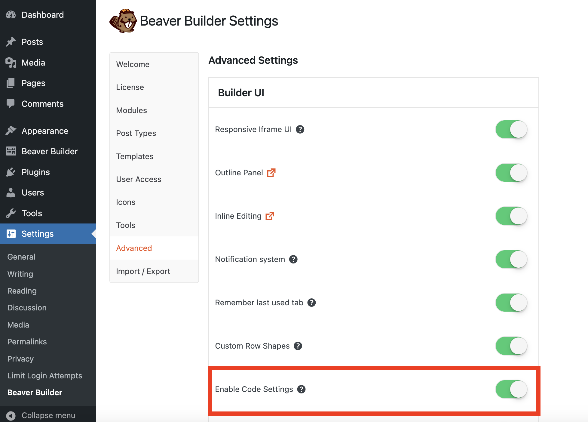
Even after updating to 2.7, you’ll need to enable per-node CSS and JavaScript. Since this setting is disabled by default, navigate to Settings > Beaver Builder > Advanced. Then toggle on Enable Code Settings:
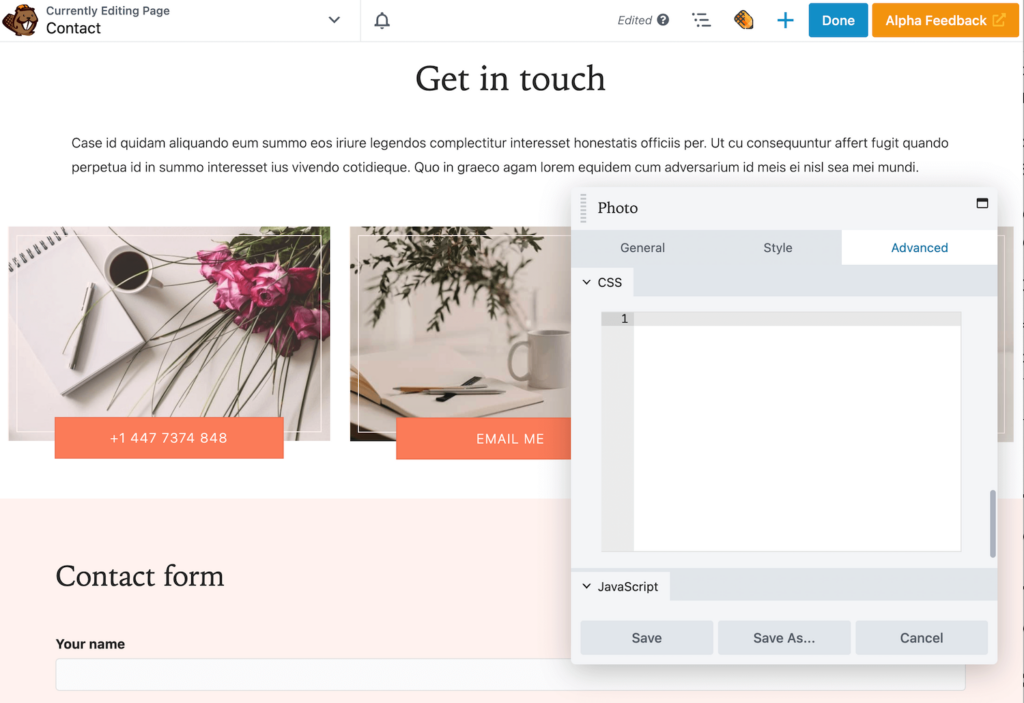
After this, open the settings for the specific module, row, or column you want to edit. Click on the Advanced tab and scroll to the bottom. Here you’ll see the new CSS and JavaScript editors:
You can add custom CSS and JavaScript directly to individual rows, columns, or modules using this feature. Then you’ll see a code icon attached to the node in the outline panel:
This feature will give you more control over your site’s appearance and functionality. As you’re adding per-node CSS and JavaScript, keep in mind that all coding will be scoped to the node you’re working on.
4. Multi-Select Post Types
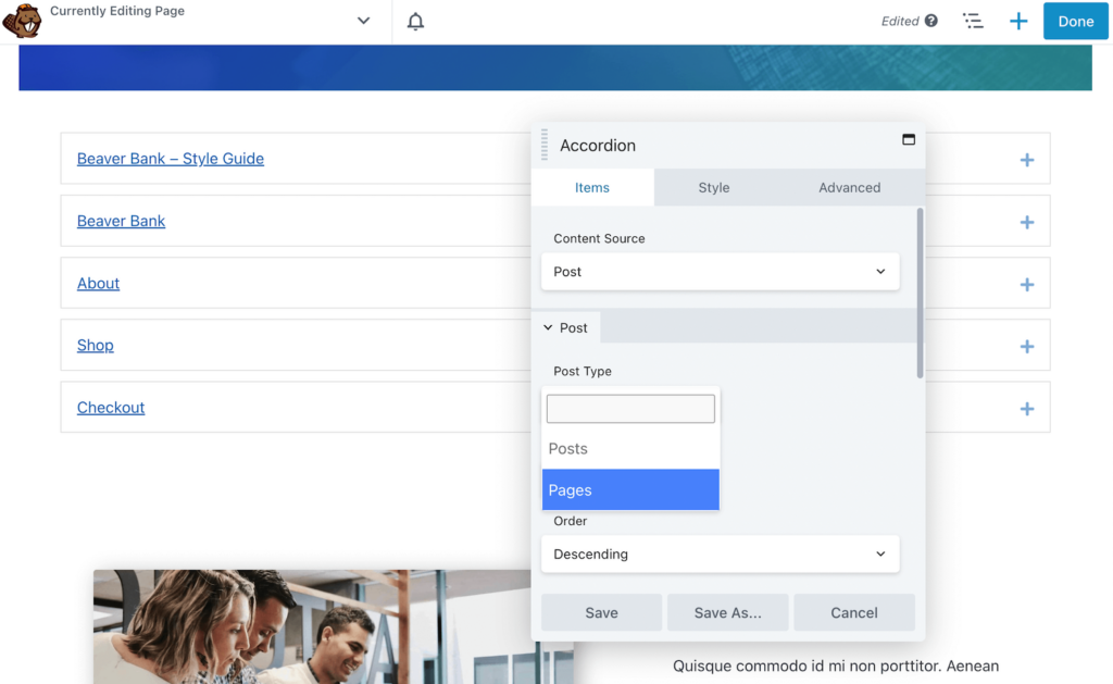
In Beaver Builder 2.7, we’ve also improved the Accordion module. Essentially, an Accordion displays a list of items with expandable sections. Previously, this module could include your posts or pages, but not both at the same time:
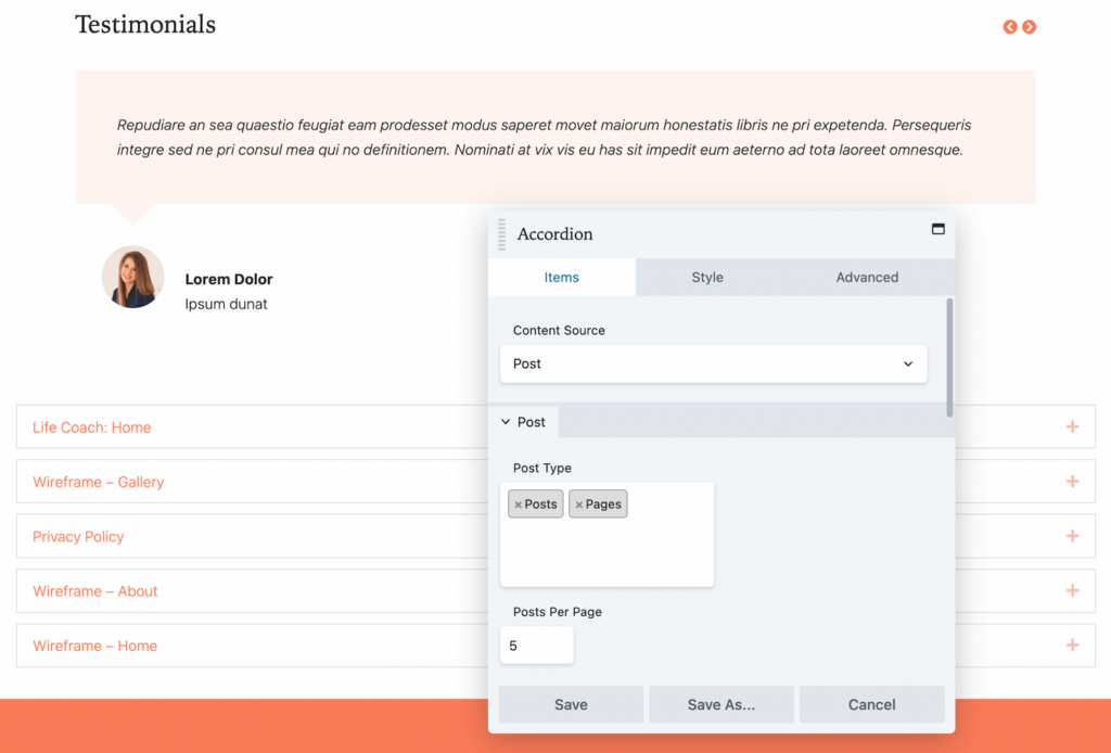
With Beaver Builder 2.7, the new Accordion module supports the multi-selection of post types. After inserting the module, choose Post as the Content Source. Then, you can select both Posts and Pages as the Post Type:
To display the right content, be sure to filter the results with categories and tags. Like with the older version of Beaver Builder, you can still customize the order and number of items shown.
5. ACF Blocks Integration
If you want to start using custom blocks in both the Block Editor and Beaver Builder, we have a solution! Our 2.7 update fully integrates with ACF Blocks:
ACF Blocks enables you to create custom block types. Once you register a new block, it will be available to insert into a WordPress post or Beaver Builder page. This will keep your web design consistent throughout your website.
To get started, you’ll need to register a block with ACF Blocks. In a block.json file, add details about your custom block:
{
    "name": "acf/bb-example-acf-block",
    "title": "ACF Example Block",
    "description": "An example ACF block that can be used in Beaver Builder.",
    "category": "bb-example-acf-blocks",
    "icon": "admin-appearance",
    "script": "file:./js/scripts.js",
    "style": "file:./css/styles.css",
    "supports": {
      "jsx": false
    },
    "acf": {
        "mode": "preview",
        "renderTemplate": "template.php"
    },
    "beaverBuilder": {
        "group": "ACF Blocks"
    }
}
After this, open your theme’s PHP file. Then, you can configure the output for the block’s content:
<?php

$heading = get_field( 'heading' );
$content = get_field( 'content' );

?>
<div>
	<h3><?php echo $heading; ?></h3>
	<p><?php echo $content; ?></p>
</div>
Now you’ll need to load the block using functions. This will make the custom block available in ACF:
add_action( 'init', function() {
	register_block_type( 'path/to/block.json' );
} );
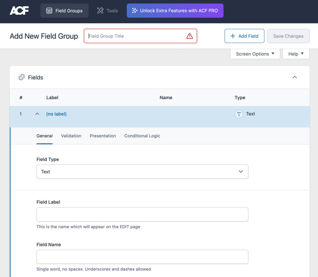
Finally, go to Custom Fields in WordPress and add a new field group. You can use any ACF fields, but be sure to select Block as the location:
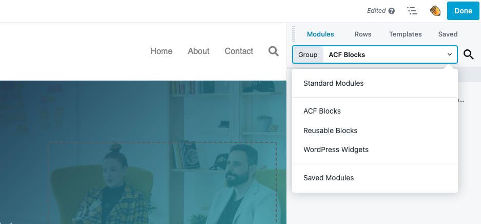
Once you’ve created your custom block, you can start using it! In Beaver Builder, group the available modules by ACF Blocks:
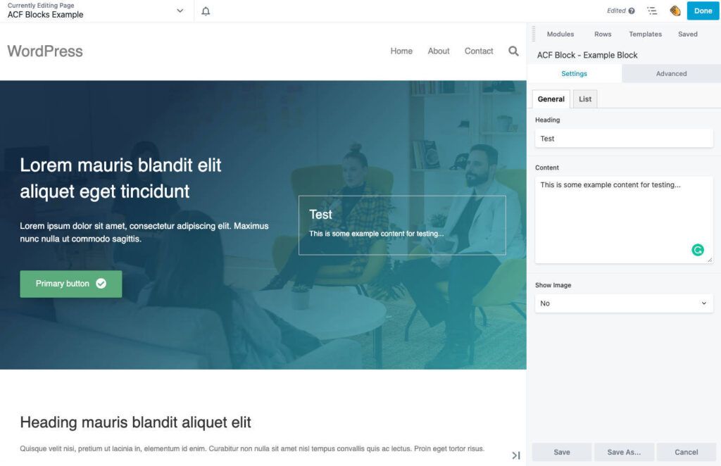
Then, simply insert your block. Just like a Beaver Builder module, you’ll be able to drag and drop it onto pages and customize its settings:
Using this integration, you can create reusable blocks that work in the native WordPress editor and Beaver Builder. This enables you to standardize the design content on your posts and pages.
Conclusion
By upgrading to Beaver Builder 2.7, you’ll have access to a more responsive, flexible version of our page builder. Now, you can customize pages for mobile devices, add coding for specific nodes, and much more.
To review, here’s what you can expect from Beaver Builder 2.7:
- Updated responsive editing.
- Visibility UI.
- Per-node CSS and JavaScript.
- Multi-select post types.
- ACF blocks integration.
People Also Ask
What Is the Latest Version of Beaver Builder?
Beaver Builder 2.7 is the latest version of our plugin. It supports integration with ACF Blocks Pro, multi-selection of post types, and per-node CSS and JavaScript. You’ll also find responsive editing improvements that make Beaver Builder more accurate and easier to use.
What Does Beaver Builder Do?
Beaver Builder is a page builder that can visually customize your WordPress website. Our plugin includes drag-and-drop content modules, pre-designed page templates, white labeling, and advanced settings. These features make it a flexible tool for both beginners and developers!
Related articles
Beaver Builder Favorite Features & Why We Love Them
Ever wondered what features the Beaver Builder team loves the most? 🤔 We asked our team members to share their…
Beaver Builder Dev Update: The Road to 2.10 and Beyond
Greetings, Builders! It’s been a busy stretch since our last dev update, and we’re thrilled to bring you up to…
Beaver Builder 2.9 & Themer 1.5: Multi-Layer Backgrounds, Enhanced Color Picker, Loop Module
We’re excited to introduce Beaver Builder 2.9, also known as “Coyote”, packed with exciting updates designed to simplify workflows and…
Join the community
We're here for you
There's a thriving community of builders and we'd love for you to join us. Come by and show off a project, network, or ask a question.
Since 2014
Build Your Website in Minutes, Not Months
Join Over 1 Million+ Websites Powered By Beaver Builder.
 Beaver Builder
