
Beaver Builder 1.9 Shasta – Columns in columns, improved responsive settings, and more!
We’re thrilled to announce Beaver Builder 1.9, Shasta, coined from the gorgeous Shasta Dam in our home state of California. Shasta brings the #1, most-requested feature to Beaver Builder: columns in columns (CinC). Along with CinC, we’re introducing a revamped editor with more accurate dragging and dropping, the ability to drag and rearrange columns, responsive settings for margins and paddings, new templates, and a whole lot more!
1.9 Shasta Preview Video
First things first, a lot of the updates this time around are much easier to show than to tell. Justin put together a nice little screencast highlighting many of the changes. It’s worth a watch.
If videos are your thing, be sure to check out this Shasta preview video by Matt Mederios (you know, the guy who does the Matt Report Podcast). Matt is super bright and has a long history in the builder space from his product, Conductor. He has a unique perspective backed with tons of experience.
Introducing Parent and Child Columns
If you’re wondering what “columns in columns” actually means, don’t worry. It’s a bit difficult to wrap one’s head around without a visual example.
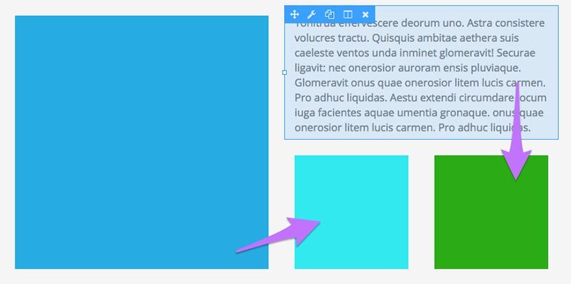
It’s always been possible to have, for example, an image in one column and text in another, but notice the teal and green squares underneath the text blurb—this layout has never been possible without some CSS trickery.
As mentioned, CinC has been one of the most-requested features since we first launched. We genuinely do our best to listen to your feedback and implement your ideas. It took a long time to implement CinC because we couldn’t quite figure out an elegant way to pull it off. As you can see in the video, we finally worked out the kinks with a “parent” and “child” column dynamic that we’re extremely proud of.
Draggable Columns
Another big request has been the ability to duplicate and drag columns, similar to how it’s possible with individual modules. We’re thrilled to announce draggable columns are coming too.
In order to pull off draggable and parent/child columns, we’re introducing a slick new UI feature. In Shasta, you’ll be able to drag a column (and when available, a parent column) right from the column settings menu.
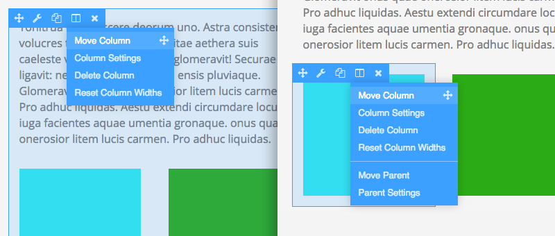
On the left is a standard column menu and on the right is a child column menu. On the example to the right, notice that you can edit settings or move both the child and the parent by clicking and dragging right from the menu.
This is an innovation we’ve never seen before and, along with some major improvements to the drag and drop accuracy, it makes for a very fluid building experience. Of course, you shouldn’t just take our word for it. Give it a shot. We hope you feel a lot like this beta tester did…
After you work with @BeaverBuilder 1.9 for a while, going back to the 1.8 behavior is such a downer Share on XIt’s hard to put into words how nicely the new UI “feels.” You’ll have to give it a shot and let us know if you agree.
New Content Page Templates

In Gordon (v1.8), we introduced several new landing page templates. In Shasta, we’re giving some love to our content page templates. Landing pages are, presumably, the first page a visitor sees when they get to your site (think homepages). Content pages are the inner pages of a site, like an about, contact, or pricing page.
There are 12 new content page templates available in 1.9 each with a fresh, minimalist design. Our hope with all our templates is that they’re either a starting place to kickstart your creativity or a ready-to-go design that just needs some minor tweaks before going live.
Responsive Margins, Paddings, and Borders
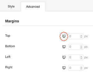 From day one, Beaver Builder layouts have always been responsive and we’re introducing a feature to make it much easier to build for smaller screens.
In Shasta, you can now adjust margins, padding, and border sizes depending on the size of the device. Originally, we added 4 extra text boxes to the settings panel. While this was functional, it wasn’t very pretty. In another UI epiphany, the team created a button to toggle between the different views.
A lot of the code for this feature was submitted by outside sources. Thanks so much to Jessie and Oliver for their help! We’re always thrilled to receive pull requests for Beaver Builder’s codebase. If you’re interested in contributing, please shoot us an email.
Open a Lightbox from a Button
Last but not least, we’re adding the ability to generate a lightbox pop-up from a button. There’s a new Click Action setting in the button module that adds a lightbox option along with the option to open a URL. You’ll be able to add a custom text, HTML (include shortcodes), or a video and that content will automatically display in a lightbox when the button is clicked. Pretty sweet!
You can read more about the lightbox feature, and all the new features in Shasta, in our Knowledge Base post. To check out bug fixes and minor enhancements, check out the Changelogs.
Alright! I think that’s about it.
We’d love to know what you think about this upcoming release, and or, if you have any trouble with the beta, please send us an email or leave us a comment below. This update is evidence that we’re listening and take your feedback very seriously. Please don’t hesitate to let us know your thoughts. Enjoy.
27 Comments
Related articles
Beaver Builder 2.9 & Themer 1.5: Multi-Layer Backgrounds, Enhanced Color Picker, Loop Module
We’re excited to introduce Beaver Builder 2.9, also known as “Coyote”, packed with exciting updates designed to simplify workflows and…
(UPDATED) New White-Label Beaver Builder Services!
A Note to Our Community We’re sorry if our new white-label services caused any confusion. We deeply value our agency…
LifterLMS and Beaver Builder Integration: Effortless Online Course Websites
Introducing the LifterLMS and Beaver Builder integration. Streamline your online course website creation by combining powerful learning management tools with…
Join the community
We're here for you
There's a thriving community of builders and we'd love for you to join us. Come by and show off a project, network, or ask a question.
Since 2014
Build Your Website in Minutes, Not Months
Join Over 1 Million+ Websites Powered By Beaver Builder.
 Free Beaver Builder Templates! Get started at




Woo hoo! I’m so happy to see the beta — one step closer to putting it on client sites. I loved the new responsive and column features in the alpha version so much that I installed it on a couple of personal live sites. Great job as always, you guys!
Thanks, Andrea! 🙂
I understand this version will allow for a youtube embed code to be launched in a lightbox after clicking a button. I was recently working with Gtmetrix.com and they said that handling videos in this way, where the embed code isn’t loaded until the user interacts with it can drastically improve page speed. Can you please confirm that your new lightbox video feature accomplishes this in version 1.9? Also, are there plans to have the title slide of the video along with an overlayed play button show as an image instead of the button so it looks like an embedded video?
Hey Paul. That’s a good question. The markup is included in the initial page load, i.e., it’s not loaded via ajax. I would guess that the video only starts buffering once it’s displayed, but I am not 100% sure there.
We don’t have any plans to implement the title slide like you mentioned, but it’s a good idea. We’ll keep it in mind. All of our default modules can be overridden and customized. If you happen to work on something like this, let us know and maybe we can use your code?
Awesome… I love the updates. Makes things much more intuitive, and should speed up workflow for creating things, without having to click around so much.
I also love the customizations for different screen sizes. I’m a little bit unsure if this is something that should be handled by the builder rather than the stylesheet, but it definitely gives a user the ability to make often needed changes without having to jump into code.
But here’s where I can see that feature really becoming useful. Using it with columns, and especially columns within columns!
The number one reason that I do a custom template rather than using a page builder is because of the way columns break down for each screen size. Usually you’re limited to the built-in way that the builder chooses to do this, but it’s not always the best way.
Here’s an example:
There are several cases where I’d like to have 6 columns on desktop, Which turns into 3 columns on tablet, and then 2 columns on a phone. Usually, it would jump from 6 columns right down to 1 column, which obviously isn’t ideal in all situations.
Normally, I would do this custom using bootstrap, because it’s the easiest way I’ve found. This also makes it easy to prioritize what falls on top as the screen size drops down to one column (like text on left image right for two column, but always making image on top for one column).
But if I could control all that through the builder, I’d love it even more than I do already. Heck, I haven’t used it for a while, so maybe it’s already possible.
I’ll have to check into it and do an official feature request. Thank You!
Awesome! Thanks, Dan. It’s usually best practice to put as much of the styling in a CSS file as possible, but for many folks it might not be practical.
Great stuff! One feature I would love to have is a CSS box on a module or column for when I quickly need to add something simple but not supported in the style interfact such as text-shadow, for when I am using a title over a background area and the title cannot be easily distinguished. I use text-shadow and a few other things to help make a title or text pop from a full width image background. I know you can add the layout css at the top but it is just a thought for ease of access having the ability to submit quick CSS code from the module / column popup interface.
Cheers
Hey David. Thanks for the suggestion. I think the best bet would be to give the element a class or an ID and keep the CSS as central as possible. It’s not the best practice, but I’ve created “helper classes” like .text-shadow in my CSS file, then popped the class on headings/etc. where I needed to add shadow. That might work for ya?
Installing it now! These features look awesome and can’t wait to get my eyes on the new templates.
So does the lightbox only open from a button? Can to be triggered by an image link? Oh how that would be sweet!
Wow! Beaver Builder just keeps getting better! Thank you to the entire Beaver Builder team for these enhancements. I’m just starting on two brand new client websites and Beaver Builder is going on both!
Thanks, Pete! Glad to hear. We appreciate the support!!
Congrats on releasing this amazing update, guys! And thanks for mentioning me in the post 😉 I’m glad I could help a bit.
I would like to ask if you have an ETA for Beaver Builder 1.9 Lite Version? I would like to update my themes demo content using new responsive spacing feature.
Thanks!
Hey Oliver. Good to hear from you and thanks right back-atchya! 🙂
I believe Justin usually pushes out the repo update a few days/weeks after we launch the premium version updates. You might want to ping him on Slack for a confirmation, but expect that it will be out pretty soon.
Cool. Thanks for the answer, Robby!
Is this new version out? I’m not seeing the update notification in my plugins!
Hi, David. It is out for the premium versions, but not for the lite version. That should be out very soon.
If you don’t see the update, there’s a “Check Again” button on the updates page you can try. If all else fails, you can do a manual update or shoot us a support ticket. 🙂
Robby,
I seem to be having some issues with the lite version. I want to make my rows full width and put a background on them, when you save the changes, the changes do not take affect. Is there a something i should be doing differently to make this work?
Hey Angela. We should have another update out that fixes a few bugs. Let us know if you’re still having this issue after updating to 1.9.2 🙂
(and sorry for the trouble)
This is a wonderful update, and thanks for the mention!
I cannot wait to begin using this in production. There are so many use cases that just became so much easier. If we could just get global columns, I could completely replace the sidebars and widgets and do everything in the front-end.
I also seriously love the responsive ui switches you added. That is so much easier to use than the first-draft controls I submitted (and frankly it’s just cooler). I am really impressed!
I continue to be really happy we chose this framework to build out our sites.
Hey Jessie! Thanks again for the help. 🙂
I like the global columns/sidebar idea! We’ll definitely keep that one in mind. We have some cool stuff cooking for 2017 as well…
This is great, thank you very much !
Oops: The first link in the text (Open a Lightbox form a Button) gives a not-found page.
Ah! Thanks for the heads up! All fixed now. 🙂
This is so cool!!!!
Thank you to the entire Beaver Builder team for these enhancements.
The new columns within columns feature is fantastic. Will you be adding the ability to duplicate a parent column and all its contents anytime soon (or save them as a module)? That would really make this feature extra useful. Thank you!
Thanks, Annjanette! We don’t have anything planned, but we’ll keep it in mind for a future update. I know it’s a bit of a workaround, but you can duplicate and save rows. It might be quicker to duplicate a row and remove the extra columns instead of trying to duplicate modules. Hope that helps. 🙂
Please add more custom templates for content pages and posts.. everything else is quite awesome. 🙂