
Beaver Builder 1.6.4, Featuring a New Color Picker, Full Height Rows, the Number Counter Module and More!
I’m excited to announce that version 1.6.4 of the Beaver Builder plugin is now in beta and ready to take for a spin! If you haven’t already, head on over to your account area and download a copy of the beta to test it out.
Here’s a look at the details of what we’ve been working on and what to expect in the beta.
Beaver Builder 1.6.4
A New Color Picker and Saving Color Presets
The old color picker served its purpose, but it was a bit complicated and had a few bugs. The new color picker (pictured below) was built on Automattic’s Iris color picker, so you know it’s going to be legit. After all, the core WordPress color picker is built on it as well!
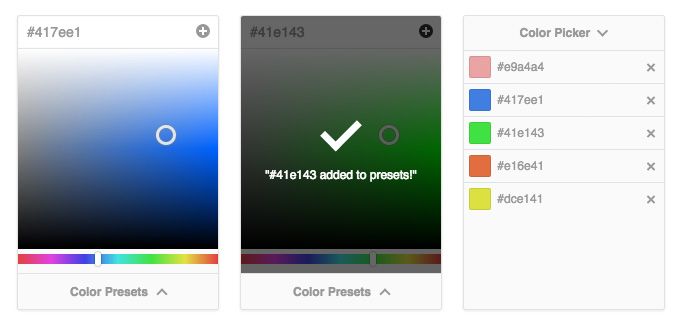
The new color picker has a much cleaner interface with one input for the hex code, an area to adjust saturation/brightness, and a slider for the hue. In addition to that, it also has a new feature that you don’t typically see in color pickers on the web. The ability to save presets!
Saving a preset is easy. Pick the color that you like, click the plus icon and a message will appear telling you that your preset has been added. To use a preset, click the Color Presets button at the bottom of the color picker and a list of your presets will slide up. Once the presets pane appears, you can either click on a preset to choose it, or click the delete icon to remove it from the list.
Full-Height Rows
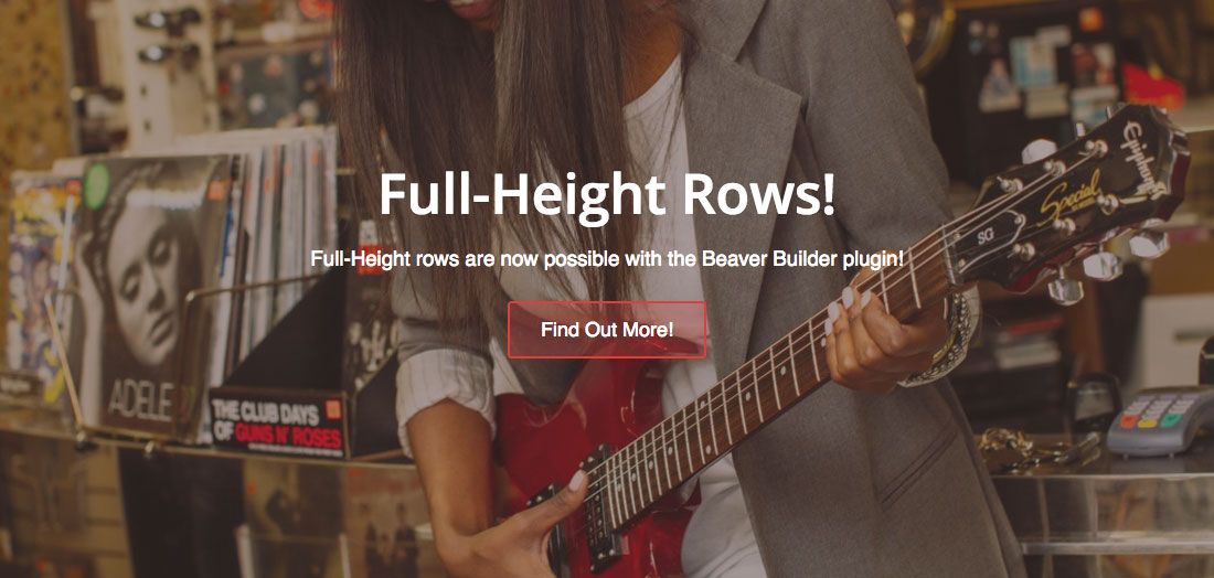
If you’ve ever wanted to create a row that fills the height of the browser window, full height rows are for you! To make a row full height, open up the settings for a row and change the new Height setting to Full Height (as pictured below). It’s that easy!

The new Height setting for rows.
With the Height setting set to Full Height, the height of your row will automagically adjust based on the size of the browser window and your columns will be centered vertically.
Equal Column Heights
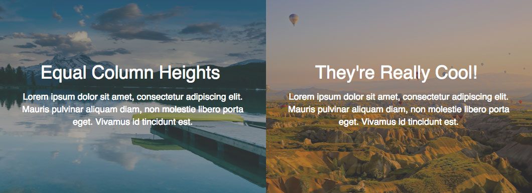
In addition to full height rows, it’s now possible to make a group of columns all have the same height. That is a really useful technique if you have multiple columns that have a background (as pictured above). To make a group of columns have equal heights, change the new Equalize Column Heights setting to Yes in the column settings (as pictured below).

The new Equalize Column Heights setting for columns.
With Equalize Column Heights set to Yes, the height of your columns will always be the same, regardless of how much content is in them!
The New Column Settings Dropdown

Working with columns in Beaver Builder has always been somewhat limited. As of today, that is no more! When clicking the settings icon for a column, you will now see a dropdown (as pictured above) that has a number of new options including the ability to edit, delete, and insert columns whether they have modules in them or not.
Clicking Insert Column Before will insert a new column before the one that is highlighted, while clicking Insert Column After will insert a new column after the one that is highlighted. Up to 12 columns can now be added to a row with this new feature!
The last option in the list, Reset Column Widths, allows you to reset the width of all columns in a group so that they are equal. That comes in handy when used in tandem with the next feature in this post, resizing columns by dragging…
Resizing Columns by Dragging

Another highly requested featured on our UserVoice page that made it into this release is the ability to resize columns by dragging. You now have the ability to drag the left or right edges of a column or module until you are happy with the new width. When you resize a column this way, you’ll also see two indicators appear (as shown above) that tell you the new width of the columns being resized.
Draggable, resizable columns are coming to @BeaverBuilder! https://i.imgur.com/56p7iJW.jpg Share on XUI Enhancements
While relatively minor, we did make a few small changes to clean up the UI that you may have noticed in the screenshots above. Specifically, we cleaned up the action icons in the row, column, and module overlays by slightly decreasing the font size, tightening up the spacing, and dropping the module name.
That was done in an effort to make things look less cluttered as we had fewer action icons when we first designed those overlays (duplicate and column settings didn’t exist). Additionally, all of the icons in the module overlays tended to get bunched up and drop to a second line in smaller columns. Even though that can still happen on much smaller columns, it looks a lot nicer now that the module name has been dropped.
The Animated Numbers Module
While we were busy working on enhancements to the core builder, we also decided to sneak in a new module. That module is the Animated Numbers module and it’s pretty cool! Just enter a number and watch it animate from zero to the number that you entered when the module is scrolled to on the page.

In addition to an assortment of styling and text settings, the Animated Numbers module allows you to display just a number, a number surrounded by an animated circle, or a number in an animated bar.


If you don’t want to display percents, no problem! You can also choose to display standard numbers and enter a total that will be used to calculate the animation percent. For example, doing that would allow you to enter the numbers 250 and 500 which would animate the text to 250 but the circle or bar to 50%. That feature of the Animated Numbers module makes the type of data that you can animate almost endless!
The New Font Setting
Last but not least in this release is the new font setting. This is a special setting that developers can use to display font-family and font-weight selects (as shown below) in their modules with built-in support and live preview for Google fonts.
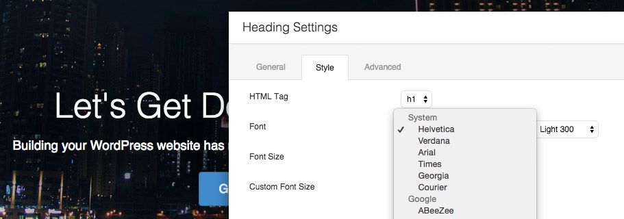
While we generally feel that something such as the font family should be decided by the theme, we did add this new setting to the Heading module as it makes sense to have it there to create one-off headings. We’ll be monitoring feedback to see if it makes sense to add this setting to other modules, but keep in mind, if you’re setting the font-family in Beaver Builder modules all of the time, you’re probably better off setting it in the theme instead.
A Huge Thanks to Favolla!
I want to give a shout out to the team of Diego and Thaís at Favolla for all of the amazing work they did to help make this release possible. While we were putting the finishing touches on the Row/Module templates update, they we’re working away on many of the features that you see here. Did I mention that they recently got engaged? 🙂 It’s safe to say that those two are on a roll!
When Will This Be Available?
If you haven’t heard, Robby and I will be at CaboPress next week learning from some brilliant individuals in the WordPress community. We’re really excited about how that experience will help us grow as a business and shape our vision of Beaver Builder’s future. As such, this beta period will probably be longer than the typical two weeks that other releases have seen. Baring any major issues, I’m expecting it to launch the week of October 5th.
What’s Next?
While we’ve already completed a lot of the items on our last roadmap post, there’s still much to do! I’ll probably do another roadmap post sometime soon, but in the meantime, here’s what we’re currently working on…
- The Countdown module
- Enhancements to the Pricing Table module
- Refactoring Beaver Builder’s front-end AJAX API (hint: this is a precursor to undo/redo and partial refresh)
- Refreshing our current lineup of templates and adding new ones
Over to You
What’s your favorite part of this update? Mine would probably be the new color picker or the column enhancements. Be sure to let us know in the comments below! And as always, don’t hesitate to let us know if you have any feedback or if you run into any issues.
103 Comments
Related articles
How to Push Content to the Bottom of a Box in Beaver Builder (Flexbox Solution)
How do you get a button to stay pinned at the bottom of a card? It’s a common problem where…
Build Beaver Builder Sites with AI
Building a WordPress website still involves many repetitive steps such as writing copy, structuring layouts, generating images, and refining design…
Build Dynamic WooCommerce Archive Pages with Beaver Builder’s Loop Module and ACF
Default WooCommerce archive pages are functional, but can be clunky. They give you minimal control over layout, and displaying custom…
Join the community
We're here for you
There's a thriving community of builders and we'd love for you to join us. Come by and show off a project, network, or ask a question.
Since 2014
Build Your Website in Minutes, Not Months
Join Over 1 Million+ Websites Powered By Beaver Builder.



That’s awesome Justin. Ironic that this morning I was working on custom CSS to create a full-height row with absolutely positioned content.
A few questions:
Does the full-height row have a fall-back for older browsers? Does it also calculate it’s height with other page elements in mind? Example:
.awesome-masthead {
min-height: 600px;
min-height: calc(100vh – 300px);
}
Anyway, great update. Still crossing my fingers for post / archive templates. Being able to set specific heights on structural elements (rather than having to use padding / margins) would be great as well!
You guys rock.
Thanks, Desmond! We didn’t worry about older browsers since flexbox has pretty good support these days and it degrades gracefully. We’re not doing any special calc stuff either, but that’s great feedback. We’ll be starting work on the post / archive templates stuff later this winter! 🙂
Great to hear — I’m looking forward to it (I know you guys are working hard). Where do we report bugs for the beta by the way? Unless my cache didn’t completely clear, I think I might have found a few.
You can report bugs in the forums here… https://www.wpbeaverbuilder.com/support/q/beta-test-version-1-6-4-of-the-beaver-builder-plugin/ Let us know what you run into!
Amazing stuff. Again. Blows my mind that this stuff is being developed by such genuinely awesome human beings as you guys. Thank you again! It makes my entire work flow an absolute JOY to work.
Thanks, Jay! We really appreciate the kind words. It’s an absolute joy on our end to be doing this! 🙂
Awesome new features. Always working with a project that need Full Height Rows.
I have the same question with @Desmond. Want it full on the top, minus the header height.
Btw, thank you for these new features. Keep up a great work!
You’re welcome, Ros! I’ve made a note to discuss that feedback.
Great news!
I loved the row and columns improvements. Now to be nearly perfect just need to allow columns inside columns as suggested here https://wpbeaverbuilder.uservoice.com/forums/270594-general/suggestions/6694111-columns-inside-columns
Great work guys! You Rocks!
I’m really excited to be part of this community!
Regards
Hey Marlon! Thanks for the feedback. We’d love to make columns in columns a reality. We’re still working out the best way to implement the feature. Unfortunately, I don’t think we’re going to have an option any time soon, but we are thinking about it and doing our best to make it happen!
Fantastic, I’m just gobsmacked again. I think my favourite here is Equal Column Heights. Thank you.
You’re welcome, David! Thanks for sharing your favourite new feature. 🙂
Awesome new features guys! The full height rows will be very usefull to us in upcoming projects.
The one thing I see “missing” in it that I almost always saee in sites that use full height sections like that are navigation “arrows” at the bottom and top center of the screen to go from one section to the next. Is that something that is planned too? Thanks! 🙂
Stéphane, I’m glad to hear that full height rows are going to be useful for you. Page navigation like that isn’t planned, but that’s something that you could add to our UserVoice page so we have a record of the idea. Thanks! https://wpbeaverbuilder.uservoice.com
Done! https://wpbeaverbuilder.uservoice.com/forums/270594-general/suggestions/9759117-previous-next-navigation-for-full-height-rows
Thank you 🙂
Hi Justin , very good ! Have you any estimate of when 100 % will be available and safe for us to use on production sites these new features ?
Thanks, Rafael! We’re shooting to have this released the week of October 5th as long as there aren’t any major issues that come up during the beta period.
These new features are awesome!!!
My work gets easier and easier with each BB update!
Thanks! That’s great to hear. 🙂
Yay for color picker presets and equal height columns!! Thanks, your team is amazing.
You’re welcome, Skyler! We are jazzed about those features as well.
Fantastic release everybody! Great work!
Thank you for having the vision, listening to all the great feedback, and most of all for making BeaverBuilder the absolute best solution for site building on WordPress.
Thanks, Ed! You’re absolutely welcome!
Equal height columns, color picker, font settings and the column enhancements were all on my most wanted list – so thanks for that. I didn’t have the animated numbers on my list but I am upgrading a site right now that has static graphics, in the same style. Now I can wow the client with this new feature when I deliver the project.
With my meager css skills beaver builder and Firebug I’m able to create better designed sites faster that I imagined.
Keep up the great work.
Thanks again for a really great product.
Thanks, tevye! I’m glad to hear that we’ve knocked a few features off of your most wanted list. 🙂
Awesome stuff guys. Beaver Builder just keeps on getting better!
Thanks, Colin!
Thanks Guys,
Certainly the color picker and equal height columns are my favourite (so far)
I’m finding some odd behavior with the color picker – I seem to have to go back and save a color twice before it ‘sticks’ and actually saves to the preset?
Also are the color picker presets global across the whole site?
Thanks, Dave
You’re welcome, Dave! Thanks for sharing! Can you tell me what browser you’re using that’s having the preset issue? Presets are indeed global across the whole site.
Hi Justin, I was using FF on Windows-7 – I’ll try Chrome in the morning…
Dave
Colour presets not showing up in other modules or not saving in Safari on Mac
Thanks, Brendyn! We are aware of that issue and will be updating the beta with a fix this week.
Justin I have to say ….every time you guys release a new update i get goosebumps. My investment just seems to be paying for itself again and again and again. I did training with a client the other day on how to update their website with beaver builder and what normally takes me 2 hours via skype took me 30min. I was amazed and the client was super excited. I just have to say that you guys rock….I will be downloading the beta and playing with it. 🙂
Thanks, Geoffrey! That’s really great to hear! Appreciate you testing out the beta as well.
The font setting in headers needs to default to using the theme and then give the option to set a font – just tested it on a staging site and the headings that all matched the rest of the theme were instantly changed to helvetica. That’s not an expected behaviour I wouldn’t think for existing users 😉
Other than that it seems like a handy feature.
@Brendyn having the same issue here. Should be option for default. My default value is set from the theme. All changed into helvetica and now I have to change them all to the one that I want
In regards to the heading font type you guys added isn’t there a way to have it as default from the theme?
Based on a few reports, it looks like we have a bug there. We’ll get that fixed so it defaults to the theme.
WOWzers what an update. Lots of things I’ve hacked around/been waiting for! Great work – love it.
Thanks, Chris!
I. Love. Beaver Builder.
<3 <3 <3
Super guys, great new features that were needed. Thank you!
Just awesome, Justin!!!
hi,
not a customer yet but i tried the demos and following your blog for updates, as well as researching reviews and other builders to make an informed decision.
i must say i am convinced !!!
it seems you guys are designing and building this plugin/theme builder just for me.
it all seems very intuitive and well thought out.
i love the very simplistic and clean experience.
i cannot stress enough on “SIMPLISTIC”.
at the end of the day most end users and site/business owners are not developers and it needs to be as easy as possible to use.
EXCELLENT product !!!
Hi Randall! Thanks so much for the kind words. We really appreciate it. Glad we can make you happy 🙂
Will fixed height columns be available for grids too? That would be a most useful feature since the grid layout can look a bit messy with grid items having different heights if you have several rows in the grid being displayed. It would be nice to have all of a grid’s rows and columns stay lined up both vertically and horizontally.
Hi Steve,
Are you asking about the grids in a module, or something else?
Thanks!
Yes, specifically the grid layout in the Posts module.
Thanks, Steve. We’ve had a few others make that request and will be looking into it.
That would be great, Justin. I know there are others in the Las Vegas WordPress community who’d appreciate this feature too.
This is like Christmas for BB users !!! All the things I have dreamed of ever since I started using this amazing plugin/theme! Thank you guys so much for always making BB better and better! My own favorite part of this update is the width resizing by dragging! Very excited about all the other features too !!!
That’s really great to hear, Carlos! You’re very welcome!
The stats look great, gang. Guess I don’t need to update my own module any longer. Really pumped about the columns and color pickers too. This is a beast of an update.
Thanks, Kathy! Let us know if there’s anything that you have in your module that you think we should consider in ours. We’re still making adjustments to it based on feedback, but it’s pretty close to what the live version will look like.
[…] For information on this update, you can find Justin's post over on the Beaver Builder Blog. […]
Nice update guys! Love the equal columns! Thank god!
Haha! Thanks, Mel!
Great work Justin and team.
Great enhancements. My favourite one being the Full Height Rows.
Cheers,
Thanks, Michael!
Fantastic! Please consider adding some minor styling options to the Testimonials widget. A. Allowing a border. B. Allowing photo to be cropped or at least displayed into a circle and then positioned to the right or left of the testimonial.
Fantastic improvements! I also had few problems with the color picker. How far off is the ETA?
Thanks, PeeWee! We have some big changes/fixes to make, so it’s taking a littler longer than expected. I’m hoping for 2-3 more weeks at the most.
We are looking forward to the release, great job!
I am now testing the Beta version and I’m not sure where to report bugs, here? The color picker doesn’t work on my safari (Version 8.0.4 (10600.4.10.7)). When I click on a color box to active the color picker it opens on the far right side for a second and then disappears. Has anyone else reported that? let me know if you need a screencast video for you to see if you haven’t. Other than that I have not found any other issue. This release is amazing, I’m very happy with it!
Thanks, Carlos! We’re aware of the Safari bug and working on a fix for that. Feel free to post bug reports here if you find anything else… https://www.wpbeaverbuilder.com/support/q/beta-test-version-1-6-4-of-the-beaver-builder-plugin/
folks – apologies if I’ve missed it – but does the new colour picker update/rewrite allow for alpha transparency – love the latest beta release – super strong as ever!! 🙂
Color pickers accept a hex color code and those don’t do alpha, so that would have to be contained in a separate setting. If there’s something you think needs an opacity setting, let us know and we’ll look into it. Glad to hear you’re liking the update!
Justin, have you guys seen this on git? https://github.com/23r9i0/wp-color-picker-alpha
That’s pretty cool! Unfortunately, it would still require a really larger rewrite since all of our modules accept a hex code and that gives you an rgba value.
No problem at all Justin – thought screenshot 2 showed a #hex version being inputted – keep up the great work! Hope the beta version is coming along fine
Absolutely the best update you guys have made so far – the new section options work really well.
Btw have you considered to add some options to the menu in case the full-height module is used? Although it can be done in CSS, it would be awesome to have the following options:
1 – Make full height section align to top of the browser window instead of the header wrapper and in the same situation make the header wrapper transparent.
2 – Hide the “big menu” to begin with and when scrolling reveal the small fixed menu as usual.
3 – Just show a big fat hamburger icon on top of the full height header at all times.
I think those options would be rather nice and look good with the new full height section option.
Enjoy the weekend
Thomas
Thanks, Thomas! 1) I’ve added that to our list of header layouts we will be adding to the theme at some point. 2) I think you can already do this with the theme. Just set the header layout to none but keep the fixed header on. 3) You might already be able to achieve this with the Menu module and some CSS. Not really sure though. Thanks again for the feedback!
Thanks for your answer Justin
1 – Super
2 – Oh I see, but that is a global setting right? I was more thinking of a pr. page option instead.
Best regards
Thomas
Now we need a well done video module. That will be ultra helpful.
Hey Chris! Would you mind sharing your thoughts on how the video module could be improved?
Hey Guys,
Love the new features announced in 1.6.4. These are great enhancements that address some key things I came across during my most recent project. Looking forward to the production release.
Keep up the great work!
John C.
Forgot to ask a question.
The screenshot showing equal height columns indicates that content is vertically aligned in the middle. In “real life” content seems vertically aligned to the top, or am I missing out on something?
It is vertically aligned at the top unless the content has a similar height as in the screen shots. Do you think it should be vertically aligned middle?
There could be an option for it, because sometimes that is nice.
Sorry forgot to reply on this one Justin.
But as mentioned an option would be great, as the alignment really depends on the content.
Columns with a lot of text would normally look best top-aligned, where small amounts of content can look really good aligned in the middle.
(See link for a description)
https://dl.dropboxusercontent.com/u/611936/equal-height-columns.jpg
Regards
Thomas
No worries and thanks for the examples! What you’re saying makes perfect sense. We’ve already released the beta, but we’ll look into how best to handle this in the next update.
Gotta tell you I’ll be able to use equal height columns as soon as the update hits. I was just sitting down to solve the problem manually when I stumbled across this post. Pretty sure my client can now wait till the end of the week — it’ll certainly be less expensive for them.
I’m totally impressed with the other features you’re putting together here too. Buying the agency version was the best decision I’ve made in years.
Other than columns in columns (which I appreciate is a big project) this release resolves literally every must-have issue I’ve had to work around manually in the last half-dozen sites I’ve built.
Really impressed with the hard work you’re all putting into this plugin. Thanks!
Hi David! Thanks so much for the comment. We’re really excited about this release too. Many of features/enhancements we implement come directly from our Users/User Voice page. If you ever have feedback or a suggestion, be sure to leave us a tip!
How do I contact you other than forums and posts? My active subscription say On Hold???? What did I do?
David, we got your email! For the record (or anyone who is reading this), you can always get in touch with us via our contact page. 🙂
Ah yep, found that at the footer thanks! Didn’t think of looking below!!! 🙂
Hi My Great Guys!
I’m desperately and anxiously waiting for 1.6.4. with all the wonderful and beautiful new and enhanced features.
You’ve turned me into a BB fanatic and I just can’t stop loving it.
Keep up the great work.
You are the best!
Thanks, Charles! This will go live next week for sure 🙂
Thanks for the assurance.
Oh how I wish every WordPress user will know about Beaver Builder.
It’s made my work so simple and easy and BB is growing everyday with your effort and support.
There’s no day I don’t touch my BB and I keep loving it more and more.
Thank you very much.
Counting down till launch, can’t wait for this update.
Great new features here and loving the flexibility within columns, Only feature I have left on my wish list is the ability to use BB within the childtheme to customize the header and footer areas. Sometimes the standard header sections don’t fit within my designs and i have to swap out to another theme. Keep up the great work.
Font option in the heading module is great! I’ve been using it but like you guys mentioned, global heading style should be managed in the customizer and make use of the module font option when you need to make exceptions, for that reason, the font option should be initially set in “default”, this beta version has some font selected already and I have to set it to default every time I add a new heading module. Hopefully the official released version comes with this fixed. Also I think its a great idea to extend it to other modules too 😉 hope this feedback helps!
Carlos, can you try downloading the beta again? I believe we did fix that so you might be on an older version of the beta. Let me know!
Hi Justin, I know you mention here when there are beta updates, but for next time can I suggest you place a ‘Last Updated’ date next to the beta on the download page?
I got into the habit of downloading it every morning and checking out the zip file size 🙂
Cheers, Dave
Thanks for the feedback, Dave! This release has taught us that we need better version info for betas. Be on the lookout for that in the next beta.
I have updated to your latest bb-plugin but now I cannot choose colors whatsoever!! This is a bit frustrating. Using google chrome on a pc. Also google chrome was not showing things on a live page on a mac.
Can you try clearing your cache? Caching is an issue with our beta process that we’ll be correcting in the next beta. Let me know if that works!
This has worked. Thank you ever so much.
What is the ballpark timeframe for releasing 1.6.4 as stable? Days, weeks, or months? I’m still a couple months away from bringing my site live and I’m trying to determine if it’s worth the effort to try out the beta.
Hi Jason,
How about this Tuesday 🙂
(Mentioned in the forums a couple of days ago!)
Also the beta was updated fairly recently – like 3 days ago)
So it should be fairly close to the release version…
HTH, Dave
Perfect! Thanks!
I am proud to be a BB user. 🙂