Figma to Beaver Builder: Design and Build WordPress Sites
Curious about converting Figma designs into WordPress websites? A smooth design-to-development workflow is essential for saving time and delivering top-notch results. With Figma for design and Beaver Builder for site creation, you have two powerful tools ready to elevate your web design process.
In this guide, we’ll walk you through transforming your Figma designs into fully functional WordPress websites with Beaver Builder. Perfect for client projects or personal sites, this streamlined workflow ensures visually cohesive, high-performing results every time.
Why Figma and Beaver Builder Are a Perfect Match
Figma is a robust design tool favored by designers for its intuitive interface, real-time collaboration features, and ability to create pixel-perfect designs:

Beaver Builder is a user-friendly WordPress page builder that allows developers and designers to create responsive websites using a drag-and-drop interface without needing to write extensive code:
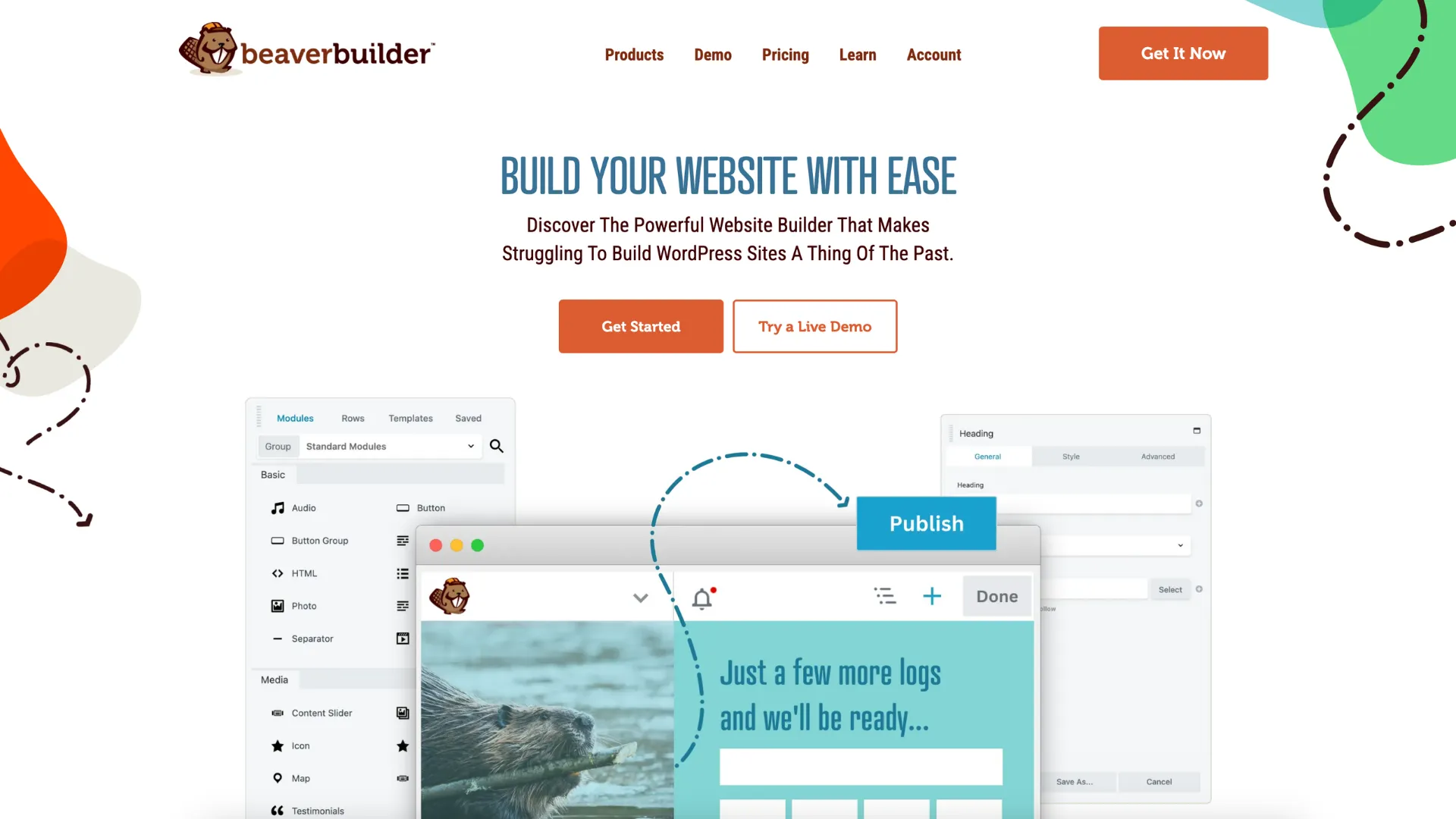
Together, these tools help you to:
- Maintain design consistency across platforms.
- Quickly translate visual ideas into functional websites.
- Save time by minimizing repetitive tasks.
- Improve collaboration between design and development teams.
This powerful combination bridges the gap between creativity and functionality, ensuring your designs not only look stunning but also perform seamlessly on the web. Ready to see how to bring your vision to life? Let’s get started!
Step 1: Designing in Figma
Start with a Wireframe
Before diving into high-fidelity design, start by creating a wireframe in Figma. A wireframe is like the blueprint of your website, outlining the basic structure and layout without getting bogged down in visual details. This crucial step ensures you have a clear roadmap for where essential elements like headers, navigation, sections, and footers will go:
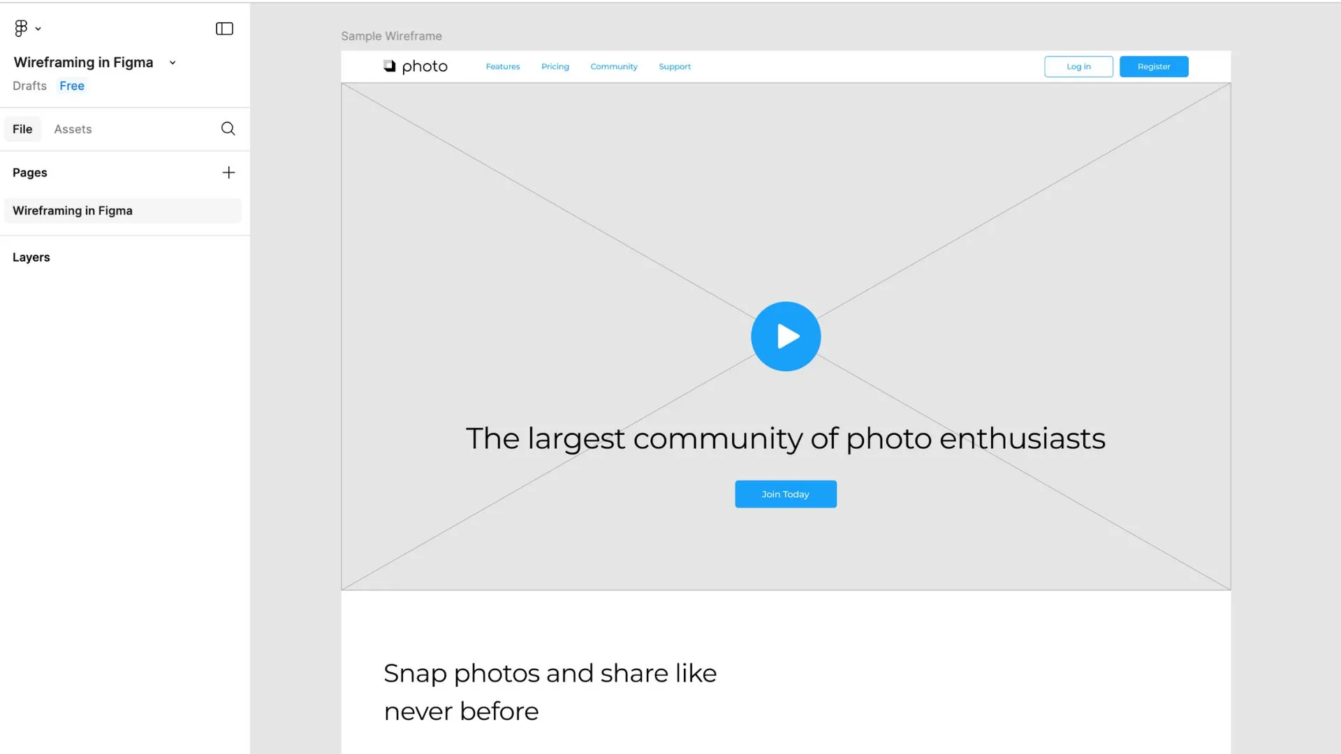
Leverage Figma’s grid and layout tools to keep everything neat and aligned, which will not only improve the visual balance but also simplify the process of translating your design into a functional website later. Consistency is key, so use grids to maintain proportional spacing and alignment across different sections.
As you build, take the time to name your layers clearly and descriptively—think “Header Nav,” “Hero Image,” or “Footer Links.” Organized layers make it much easier to tweak designs or hand off your work to a development team. By laying a solid foundation with a well-organized wireframe, you’ll set the stage for a smoother design-to-development workflow.
Build a High-Fidelity Design
Once your wireframe is approved, it’s time to transition into a high-fidelity design that brings your vision to life. This phase is where you add the visual details that make your website not only functional but also engaging and aesthetically pleasing. Focus on the following elements:
- Typography: Select font styles, sizes, and weights that align with your brand’s personality and enhance readability. For a cohesive look, define headings, body text, and accent styles in Figma’s text styles, allowing you to apply consistent typography across your design effortlessly.
- Color Schemes: Develop a color palette that reflects your brand identity and creates visual harmony. Use Figma’s color styles to save and reuse colors throughout your project, ensuring consistency across all pages and elements. Consider accessibility by checking color contrast to make your site usable for everyone.
- Imagery: Incorporate high-quality images, graphics, and illustrations that align with your content and resonate with your target audience. Pay attention to image dimensions and placements to maintain a polished appearance and optimize for visual impact. Use placeholders initially and replace them with final assets later for flexibility during the design process.
- Components: Leverage Figma’s components to create reusable design elements like buttons, cards, forms, and navigation menus. This not only speeds up your workflow but also ensures consistency across pages. Update a component once, and the changes will reflect wherever it’s used—saving time and effort during revisions.
As you build your high-fidelity design, test it by previewing how it looks and functions. A well-designed high-fidelity prototype will streamline the development process when you translate your design into Beaver Builder.
Organize Your Design for Export
A well-organized Figma file is essential for a smooth transition from design to development. By structuring your layers and assets effectively, you make the export process seamless and set the stage for efficient implementation in Beaver Builder.
Here’s how to ensure everything is in order:
- Group Layers Logically: Arrange your layers into meaningful groups that correspond to sections or components of your website, such as “Header,” “Hero Section,” “Services Section,” and “Footer.” This hierarchy makes it easy to locate specific elements and ensures your file is clean and intuitive.
- Label Layers Clearly: Use descriptive and consistent naming conventions for your layers and groups. For instance, instead of vague labels like “Rectangle 23,” use names like “Header Background” or “Call-to-Action Button.” This practice not only improves clarity but also helps developers understand the purpose of each asset at a glance.
- Mark Assets for Export: Select the elements you need for your website—such as images, icons, and logos—and mark them for export. In Figma, you can quickly do this by selecting an object and pressing Ctrl + E or enabling the “Export” checkbox in the design panel. Configure the export settings for each asset, specifying formats (e.g., PNG, JPEG, SVG) and sizes as needed.
- Optimize Naming Conventions: Adopt file names that reflect the asset’s purpose and location within your site. For example, use names like “button-primary.png,” “logo-white.svg,” or “hero-image-1920×1080.jpg.” Clear naming ensures that exported files are easy to identify and integrate into Beaver Builder.
- Double-Check Export Settings: Ensure all export settings, including resolution, format, and file type, are optimized for web performance. For instance, use SVG for scalable vector graphics and compressed PNG or JPEG for images to strike a balance between quality and loading speed.
By organizing your design thoughtfully, you’ll save time during the export process and minimize confusion when importing assets into Beaver Builder. A clean and well-structured design file sets the stage for a smoother workflow and better collaboration between designers and developers.
Step 2: Preparing Assets for Beaver Builder
Exporting Design Elements
Exporting design elements from Figma is a crucial step in turning your visual design into a fully functional website. Figma’s export tools are intuitive, allowing you to tailor your assets to meet your website’s specific needs:
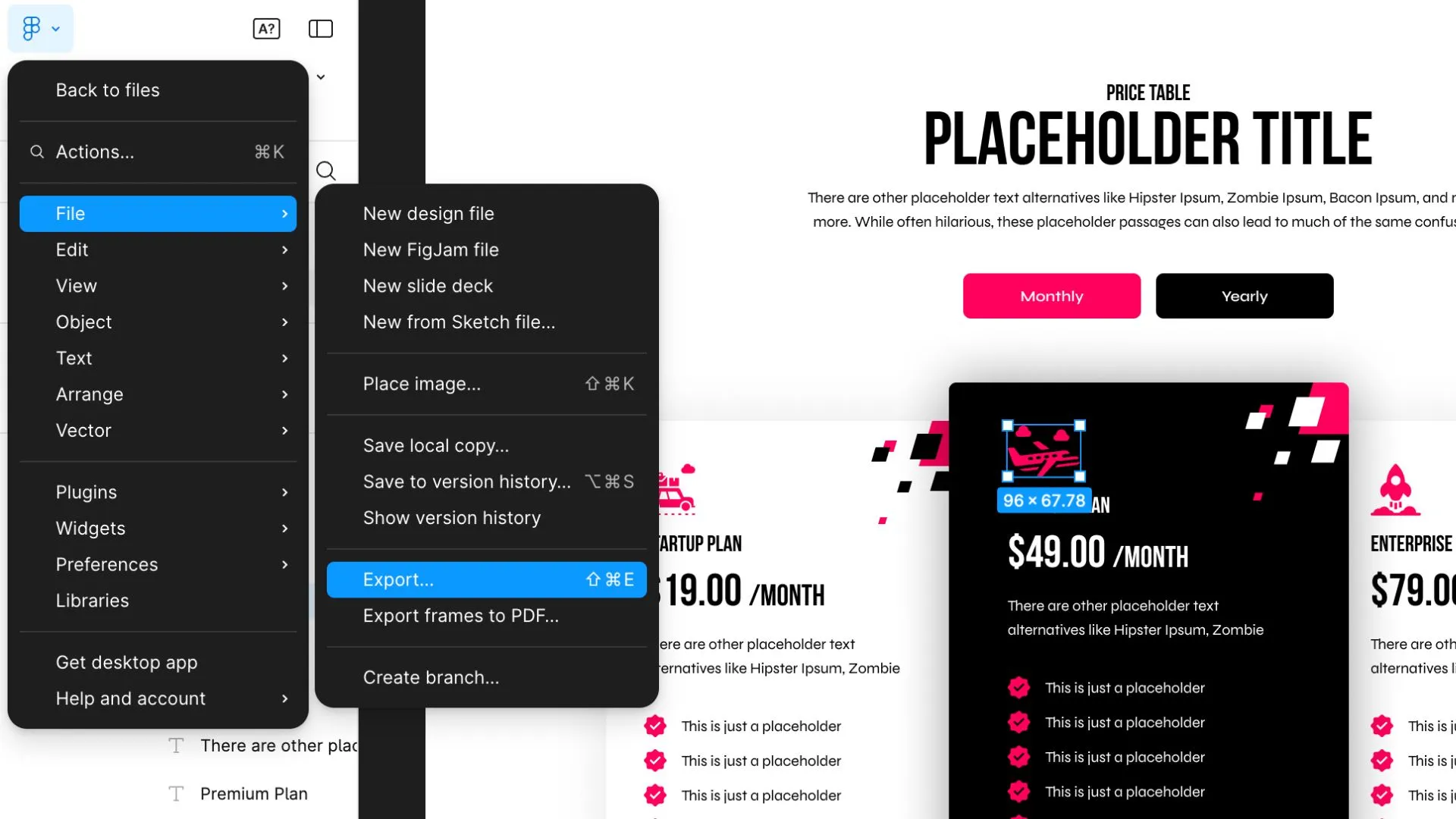
Here’s how to make the most of the export process:
Images: For photographs and other raster images, choose the appropriate format based on your use case:
- PNG: Best for images requiring transparency, such as overlays or logos on a transparent background.
- JPG: Ideal for background images or content where file size is a concern but transparency isn’t needed. Adjust compression settings to balance quality and performance.
- SVG: Use for illustrations or graphics with clean, scalable lines. SVG ensures that elements remain crisp at any resolution, making them perfect for responsive designs.
Icons and Logos: Export icons and logos as SVG files. This format ensures scalability without losing clarity, meaning your icons and logos will look sharp on all devices, from small mobile screens to large desktop displays. SVG files are also lightweight, improving page load times.
Backgrounds: For section or full-page backgrounds, export as high-quality JPG or PNG files. Use JPG for photographic backgrounds to reduce file size without compromising too much on quality. If the background requires transparency or fine details, opt for PNG.
By mastering Figma’s export tools and tailoring settings to your website’s needs, you’ll ensure a smooth transition from design to development while maintaining a polished, professional look for your site.
Collecting Design Specifications
Accurate design specifications are the bridge between your visual design in Figma and its implementation in Beaver Builder. Figma makes it easy to extract these details so developers can recreate your design with precision.
Here’s how to effectively collect and organize the necessary specs:
Typography:
- Identify the font families used throughout your design and ensure they’re accessible for web use (e.g., Google Fonts or self-hosted web fonts).
- Record font sizes, weights (e.g., regular, bold, semi-bold), and styles (e.g., italic, uppercase).
- Note line heights (leading) and letter spacing (tracking) to ensure text maintains the same visual flow as in your design.
- Organize typography specs into categories, such as headings (H1, H2, etc.), body text, and special styles like blockquotes or captions.
Spacing:
- Record padding and margins for individual components and sections. Consistent spacing is key to maintaining alignment and visual balance.
- Note gutter widths and column sizes if you’re working with a grid layout. This ensures proper alignment and structure in Beaver Builder.
- Define spacing between text blocks, buttons, and other UI elements to guide how content should flow on the page.
Colors:
- Use Figma’s color picker tool to identify and document the HEX, RGB, or HSL values for each color in your design. Include primary, secondary, and accent colors, as well as neutral tones like grays and whites.
- Create a color palette or style guide in Figma that categorizes colors by purpose (e.g., buttons, backgrounds, links). This simplifies application and ensures consistency.
- If you’re using transparency, note the alpha values (opacity) for layered elements.
By thoroughly documenting these specifications, you ensure that the final implementation stays true to your design while minimizing guesswork and revisions. Keep these details in an organized style guide or shared document to streamline collaboration with your team.
Step 3: Setting Up Beaver Builder
Install and Configure Beaver Builder
Bringing your Figma design to life starts with installing and setting up Beaver Builder on your WordPress site. New to Beaver Builder? You might be interested in our Where to Start? video: below:
Set Global Settings
Configure the Global Styles. This is where you’ll define the foundational design elements that will be applied across your site such as:
- Global Colors: Match the primary, secondary, and accent colors to your Figma design. Use HEX, RGB, or HSL values for accuracy.
- Typography: Set the default fonts, sizes, and line heights for headings (H1–H6) and body text. Ensure these match the type specifications outlined in your Figma file.
Choose a Compatible Theme
Beaver Builder works well with various WordPress themes. For optimal results, use a lightweight theme like Beaver Builder Theme or other compatible themes like Astra or GeneratePress. Customize your theme’s settings to align with your design. This includes adjusting header, footer, and layout configurations to match the structure outlined in Figma.
Beaver Themer for Advanced Theme Building
Beaver Themer allows you to create custom layouts for headers, footers, archives, and even dynamic content areas like blog posts or product pages. For instance, if your Figma design includes a unique blog post template with specific typography, featured image placement, and metadata styling, you can easily build this layout in Beaver Themer and apply it site-wide. This plugin ensures your site maintains a cohesive look while saving you time on repetitive design tasks.
With Beaver Builder tools installed and configured, you’re ready to start translating your Figma design into a fully functional, visually stunning WordPress website.
Step 4: Building Your Website
Start with a Blank Canvas
Begin by creating a new page in WordPress and selecting the Beaver Builder editor to start with a blank slate. This approach ensures that your page isn’t cluttered with unnecessary elements, giving you full control over replicating your Figma design. Once in the front-end editor, you can easily drag and drop elements like rows, columns, and modules directly onto the page. This intuitive interface allows you to see your changes in real-time, making it simple to adjust layouts and designs on the fly.
Recreate Layouts
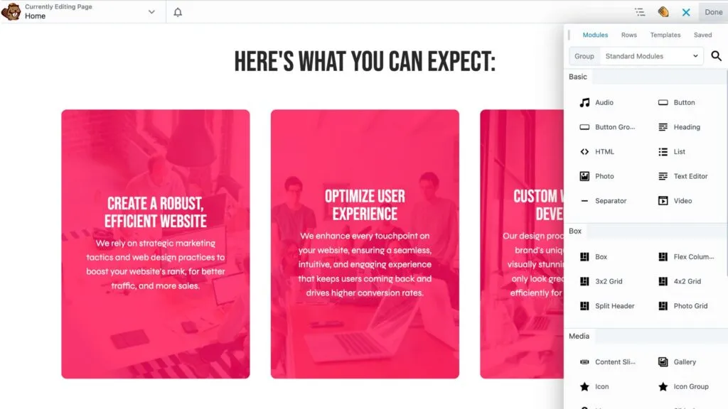
Match your page structure to the wireframes and high-fidelity designs from Figma. Use rows and columns in Beaver Builder to replicate grid-based layouts and adjust spacing to mirror your design specifications. Add modules like text, images, or buttons, and customize their properties to align with your Figma typography, colors, and styles. For example, if your Figma design includes a three-column feature section with headers, and text, you can use Beaver Builder’s Box, Heading and Text modules to recreate this seamlessly:
Fine-Tune Spacing and Alignment
Use Beaver Builder’s margin and padding settings to replicate Figma’s spacing exactly. Adjust alignment settings to ensure elements are pixel-perfect.
Leverage Saved Modules
If your design includes repeating elements, such as call-to-action banners or testimonials, save time by using Beaver Builder’s saved rows, columns and modules feature. You can create these components once, save them, and reuse them across multiple pages, ensuring consistency and efficiency.
Step 5: Testing and Refining
Check Responsiveness
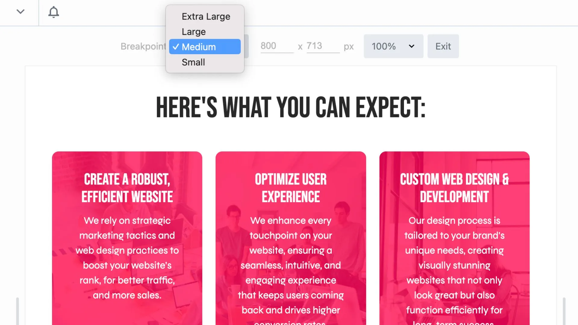
A great website isn’t just visually appealing—it must perform seamlessly across devices. With Beaver Builder’s responsive editing tools, you can easily adjust layouts for mobile, tablet, and desktop views. Toggle between device previews directly in the editor to identify any elements that need resizing or repositioning. Fine-tune font sizes, margins, and padding to ensure that your design maintains its integrity on smaller screens:
Test Performance
Speed and performance are critical for user satisfaction and SEO. Run your site through a tool like GTmetrix to evaluate loading times and identify areas for optimization. Optimize images by compressing them without sacrificing quality, using tools like TinyPNG or ImageOptim. Minify CSS and JavaScript files to reduce their size, and consider using a caching plugin to improve overall page load speed. Ensure that your site is running efficiently across various browsers and connection speeds.
Gather Feedback
Collaboration is key to delivering a polished final product. Share a staging link with team members, clients, or stakeholders to collect feedback. Use available tools designed specifically for managing web design clients such as Atarim to organize comments and address any changes systematically. This feedback phase is an opportunity to refine the user experience and catch overlooked details, such as typos, broken links, or inconsistencies in design.
By thoroughly testing and refining your site, you can confidently launch a polished, professional product that not only meets design expectations but also performs flawlessly across all platforms and devices.
Benefits of This Workflow
Following this streamlined workflow transforms your web design process, bridging the gap between creativity and functionality while delivering exceptional results:
- Efficiency: Save hours by avoiding redundant work.
- Consistency: Maintain visual alignment between design and build.
- Scalability: Use reusable modules and templates for faster project completion.
- Collaboration: Enable designers and developers to work in harmony.
By leveraging these benefits, you’ll not only enhance your productivity but also create a seamless experience for both your team and your clients.
Conclusion
Transitioning your designs from Figma to Beaver Builder is a game-changer for WordPress web design workflows. By leveraging the strengths of both tools, you can create stunning, responsive websites that bring your designs to life with precision and ease.
Ready to take your workflow to the next level? Try our Beaver Builder demo today and experience the difference for yourself!
Related articles
Beaver Builder Favorite Features & Why We Love Them
Ever wondered what features the Beaver Builder team loves the most? 🤔 We asked our team members to share their…
Beaver Builder Dev Update: The Road to 2.10 and Beyond
Greetings, Builders! It’s been a busy stretch since our last dev update, and we’re thrilled to bring you up to…
Beaver Builder 2.9 & Themer 1.5: Multi-Layer Backgrounds, Enhanced Color Picker, Loop Module
We’re excited to introduce Beaver Builder 2.9, also known as “Coyote”, packed with exciting updates designed to simplify workflows and…
Join the community
We're here for you
There's a thriving community of builders and we'd love for you to join us. Come by and show off a project, network, or ask a question.
Since 2014
Build Your Website in Minutes, Not Months
Join Over 1 Million+ Websites Powered By Beaver Builder.
 Beaver Builder
