The Ultimate Guide to Beaver Builder Modules
Our Beaver Builder plugin comes with a huge selection of modules to help you build and design your clients’ websites. While navigating all of the options can seem challenging, it doesn’t have to be. By keeping this comprehensive guide handy, you can unlock Beaver Builder’s full potential.
In this article, we’ll introduce you to our module system. Then we’ll go through each available module by category, explaining its purpose and suggesting some clever uses. Let’s dive right in!
An Introduction to Beaver Builder Modules
Beaver Builder is our powerful tool that helps you build beautiful pages on your clients’ WordPress sites. It does this by using content-based building blocks called modules. Each module is designed for a specific purpose, making it simple to tailor a page to your exact needs.
However, these modules are far from rigid. You can stick with their intended purposes, find new ways to leverage them, or even create a custom module so you can fully customize your experience with Beaver Builder.
You may not need every module for each page you build. Nevertheless, being aware of your options can be helpful because you’ll be able to include a wider variety of features if needed.
Familiarizing yourself with your options can improve your personal portfolio. You might find that having more tools at your disposal expands your potential client list.
The Ultimate Guide to Beaver Builder Modules
To help you navigate and understand your options more easily while using Beaver Builder, we’ve put together a comprehensive module list. All premium versions of Beaver Builder come with this set of modules. In the following sections, we’ll explore each module and explain helpful ways to use them.
Basic Modules
Let’s start with the basics.
Audio
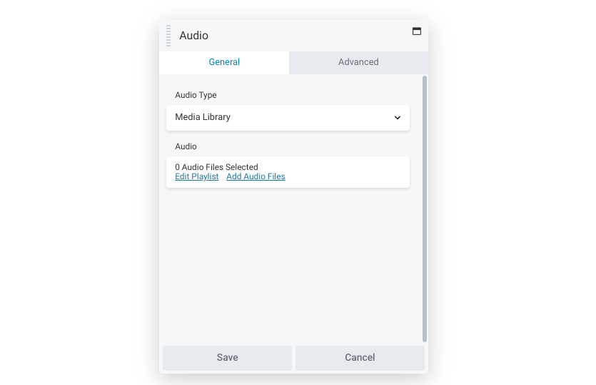
The Audio module adds a player for audio files to pages. This can include single clips or full playlists. Additionally, you can source these files from either your Media Library or an external source, which can be helpful if you’re trying to save space.
You also have full control over playback. You can choose from options such as autoplay, looping, or video information display:
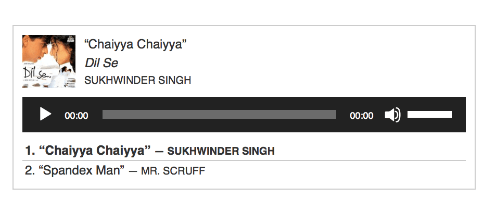
If you have a client who hosts a podcast, you’re probably already familiar with this feature, but remember that it works with more than standard music clips. You can also use it for other audio mediums, such as radio clips or even recordings of happy customers to personalize reviews.
Button
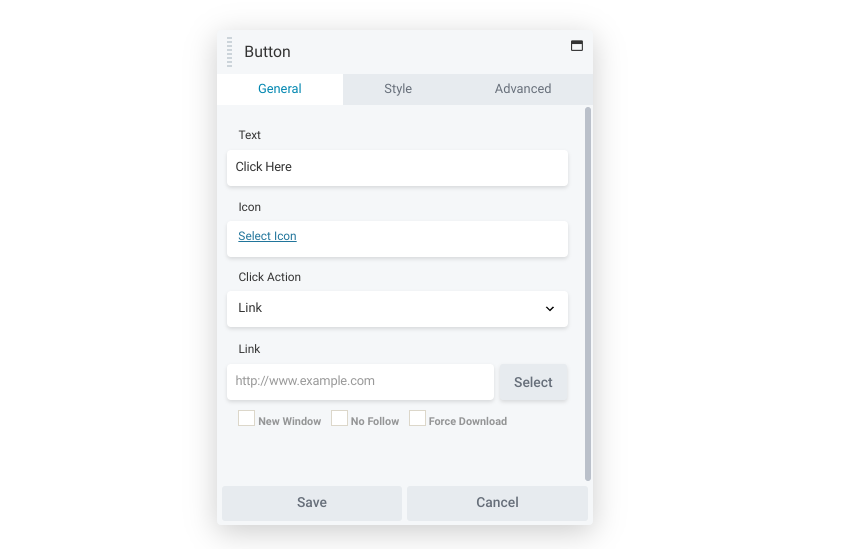
The Button module lets you create clickable elements and modify each button’s design to reflect its purpose. Display features include color gradients, changeable text, and multiple font options.
Buttons make it easy for visitors to interact with your content. With the right design, a button can be a flexible yet powerful tool. It can catch a user’s attention and provide them with an actionable suggestion:

The Button module has unlimited potential. You can try using it to send readers to another part of the website, or use it to highlight a partnered site or high-value link.
Heading
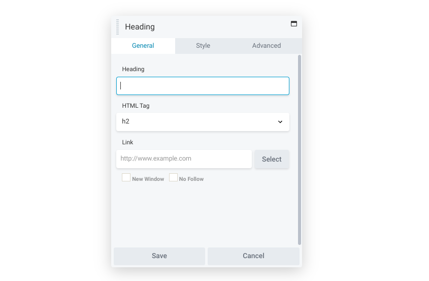
Headings are the unsung heroes of the internet. They organize content, communicate purpose, and provide readers with guidance. Therefore, the Heading module is one of the most useful modules to take advantage of.
This module makes the heading independent of the text, making it easier to move around than the native WordPress block. As such, it works particularly well with Beaver Themer, because you can create a field connection to display the correct heading in whatever location it occurs.
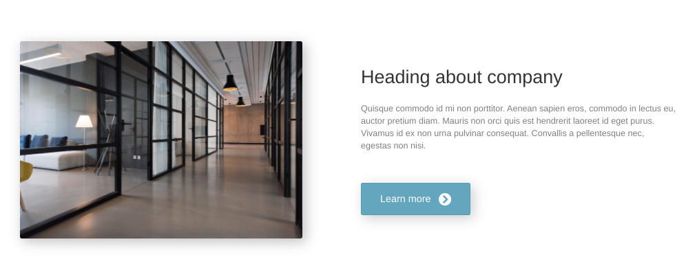
You can try using this module to focus visitors’ attention on an important paragraph. Alternatively, you could also use its flexible formatting to place headings on the side of the content. This opens up new possibilities, such as highlighting relevant quotes with creative design.
HTML
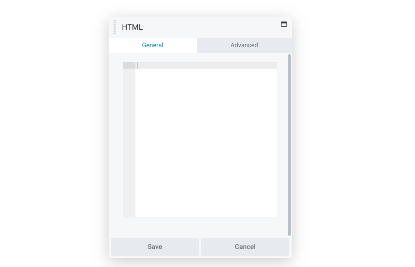
Beaver Builder makes page creation simple. Nevertheless, you may still want to add your own code from time to time. The HTML module can render all of this directly.
If you’re not a fan of WordPress markup tags, this module can be a game-changer. You can use it to add custom markup code with ease. The HTML module also works well to render shortcodes.
Icon
![]()
Icons are a subtle but important feature. These small pictures can catch a user’s eye, and the option to add text can make them more informative.
The Icon module helps you add these graphics one at a time. You can choose from a wide selection of standard icons, add your own custom sets, and fully customize the colors and placement.
You can also use icons to quickly communicate a link’s purpose. For example, the image below uses a turkey leg to signal a clear topic:
![]()
This module comes with a Screen reader text option. This setting acts like alt text so it improves accessibility. Consider using an icon anywhere you think a visitor needs a little bit of direction.
Photo
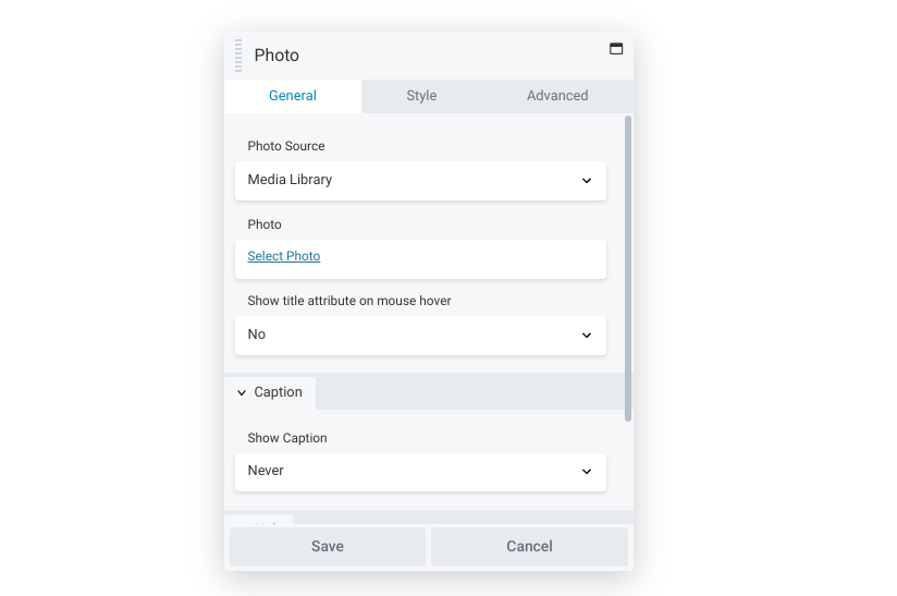
If you’ve been using WordPress for a while, photos likely aren’t new to you. The Photo module works similarly to the native function: it enables you to add single photos from your Media Library or custom URLs:
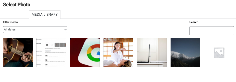
However, our module has a few advantages. For one, there’s a setting to display the image in a lightbox when clicked, which can be useful if you’re displaying high-quality photos.
This module also offers unique cropping options. You can display photos in shapes such as landscape, panorama, portrait, square and circle. If you use them strategically, you can establish a distinctive style for each site you build.
Sidebar
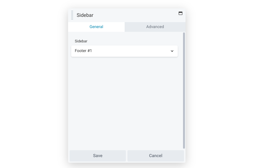
Navigation is essential to any site. You can use the Sidebar module to make browsing your content easier for your visitors. This module lets you insert any of your WordPress sidebars into your layout:
This module pulls WordPress widget information, so it has the potential to save you a lot of time. For example, you might consider creating a few sidebar templates. Then you can add, drag, and drop them as needed.
The sidebar module can also make transitioning from another page builder easier. If it uses widgets, you can simply add this module and move on.
Text Editor
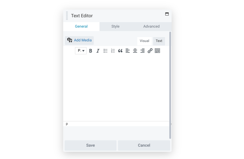
As you probably know, WordPress has its own text editor. Nevertheless, our Text Editor module has added a few improvements. You can use this upgraded version of the Classic Editor to create dynamic text areas.
For example, you have wider access to typography settings, such as font family, spacing, line height, and so on. This makes establishing a unique site style a breeze. Advanced features such as animations can also make your text pop.
Designing a page that fits a specific brand can be hard. However, subtle traits can be powerful. Therefore, using the Text Editor module can enable you to easily embrace a client’s particular style.
Video
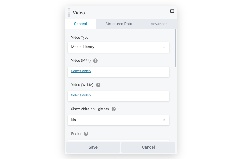
Using several types of media can add variety to a page. As such, you might want to consider the Video module. This module lets you insert a video from either your Media Library or a third-party platform.
In the example below, we inserted a video straight from YouTube:
This lets us save storage space while reaping the benefits of an informative clip. By the same token, this module can seamlessly introduce your client’s YouTube page to visitors.
Additionally, the Video module can boost your page rankings. Search engines make use of rendered HTML when analyzing sites. By opting for the Enable structured data function, you can manually optimize these values.
Media Modules
The following modules all focus on helping you communicate in dynamic ways. Consider using one of these modules the next time you need a more lively page.
Content Slider
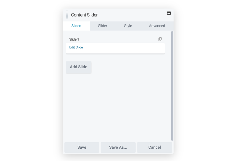
Sliders offer a simple way to display a variety of media. You can use our Content Slider module to do just that. This module lets you create rows with slider backgrounds and leverage features such as text and image overlays:

This module can serve multiple purposes. In the above example, it’s being used to communicate a company’s different locations. However, you could also use it for advertising services for clients with media-heavy focuses.
Furthermore, the Content Slider module can help humanize a page. You might consider using it to showcase team members, which can make visitors feel connected to the company.
Gallery
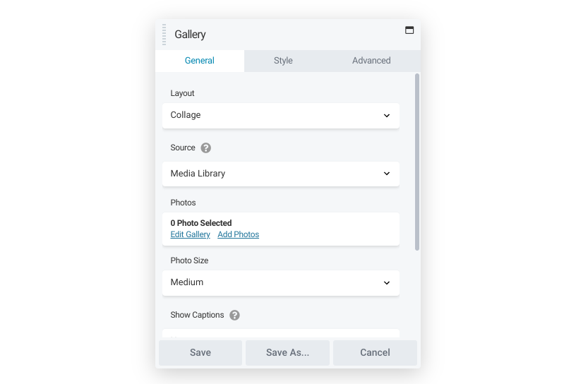
While the Content Slider showcases one media item at a time, the Gallery module can display many media items at the same time. This module can put together collages with ease:

However, this module goes beyond appearance. You can also set up how individual items are displayed when the user clicks a gallery image: a lightbox with navigation or the photo’s source page.
These options make the Gallery module versatile. You could use it to display product photos or promote related websites. Mastery of this module can be especially important if you work with image-heavy organizations, such as photography websites.
Icon Group
![]() As you might expect, the Icon Group module works the same as the Icon module. You still have control over size, placement, and color. However, this option enables you to insert multiple icons at once:
As you might expect, the Icon Group module works the same as the Icon module. You still have control over size, placement, and color. However, this option enables you to insert multiple icons at once:
![]()
You can use it to provide more in-depth indicators. The above image, for instance, could signify a restaurant that serves coffee, food, and alcohol. By contrast, a single icon may not be able to communicate that focus.
Alternatively, the Icon Group module can provide more formatting options. For example, you can use it to space multiple images uniformly and achieve a streamlined, professional look.
Another possible use could be for transactions. Many merchants accept multiple payment options, so you could insert this module to display them.
Map
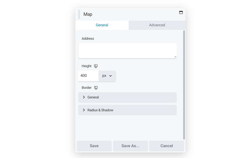
Navigation isn’t only important for website usability. Physical locations may also be in your client’s portfolio. The Map module can help provide visitors with accurate guidance.
You can insert this module and center the map on any marker you choose. Options such as the size and title are also adjustable:
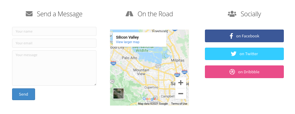
Perhaps the most obvious use of this module is to direct visitors to a brick-and-mortar store. However, it can also serve other purposes, such as orienting readers on a travel site.
Slideshow
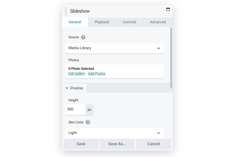 The Slideshow module can display several photos sequentially in a single space. It gives you control over dynamic features such as the type of transition and playback:

One way to use the Slideshow module is as a simple walkthrough. You could upload each step as a slide. After that, you could turn off autoplay. This can give visitors a straightforward yet interactive way to learn something new at their own pace.
Testimonials
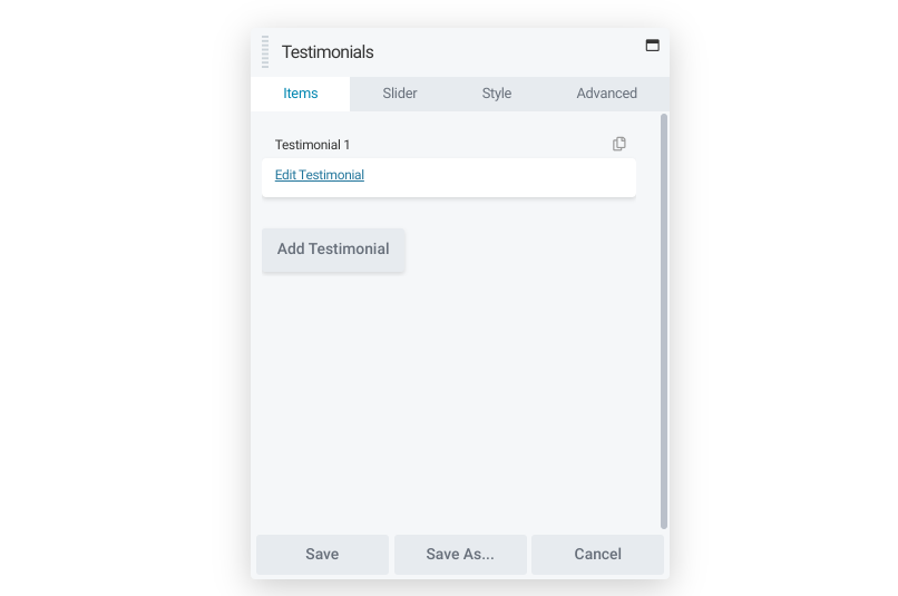
The Testimonials module also uses a sliding feature. However, it serves a distinct purpose: advertising the words of happy customers. You can choose the quotes and positioning, and even add an image to drive the point home:
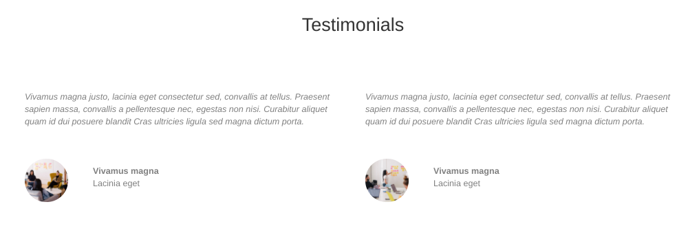
You also have control over how playback works. Manual control gives customers time to read each review so it could be a better choice for lengthier testimonials. On the other hand, automatic playback could work better for displaying a lot of positive feedback.
Actions
Sometimes, you may want to encourage users to take a specific action. Look no further than these modules to get the job done.
Call to Action
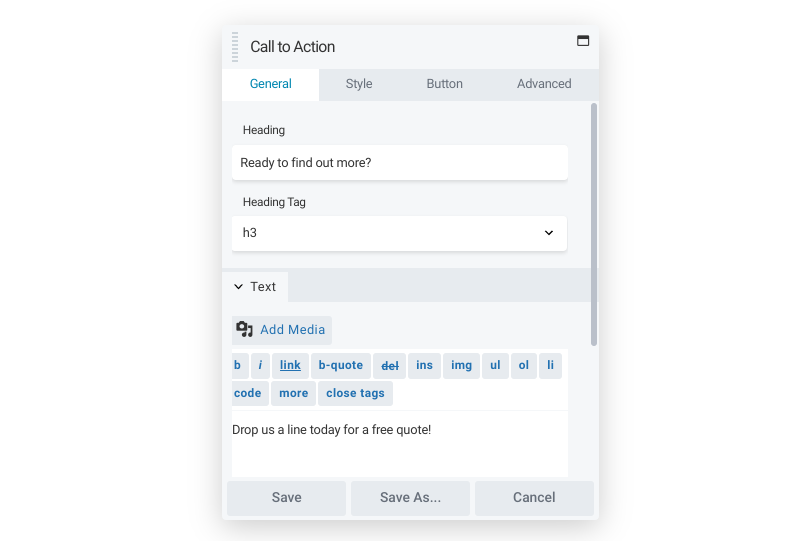 Calls to Action (CTAs) encourage visitors to engage with a brand. This could include buying a product or simply reaching out. You can use the Call to Action module to make any of these encouragements clear.
The module enables you to insert a heading to grab users’ attention. Then you can add a text portion to provide a little more information. Finally, you can create a button to attract clicks. All of these aspects can be styled as you like.
Since CTAs try to generate interaction, you can use this module to generate a dedicated space to make the call to action, so it’s more prominent than just a hyperlinked piece of text. You can also use a call to action to enhance landing pages.
Callout
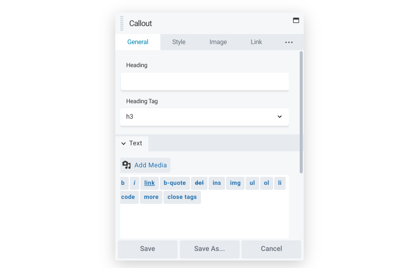
CTAs tend to be brief because they often focus on a single task. If you need a more detailed space, you can use the Callout module instead:
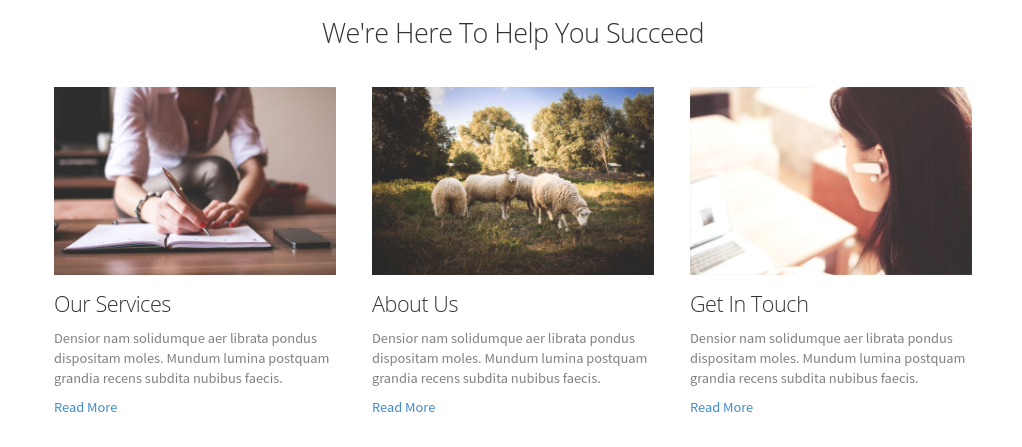
A major difference with the Callout module, compared to the Call to Action module, is that you can add a photo. For example, if you’d like to highlight an employee profile or a service the company offers, this module may be a better fit. You can still adjust the text styling as necessary, too.
The Callout module is an excellent way to feature a product of the week. The layout can make the chosen item simple yet prominent. You might also use it to digitize any physical advertising, which could make your client’s marketing more cohesive.
Contact Form
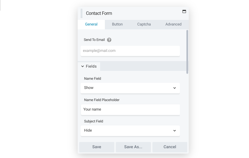
Most of your clients want you to be easy to reach. If it’s effortless to get in touch, customers on the fence may be swayed. The Contact Form module is an effective way to provide an accessible line of communication.
You have many choices regarding fields: name, subject, message, phone number, and email can sit alongside the message itself:
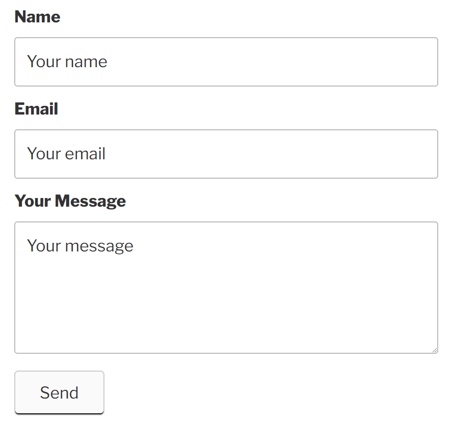
A standard form can help encourage inquiries. Alternatively, a more intricate one could cut down on junk submissions. If your client struggles with a lot of bot submissions, you can add a reCaptcha link to discourage spam.
Login Form
Site membership might be a priority for some clients. It can enable visitors to save favorite products or store payment information. If you want to make logging in to part of your site easy, consider using the Login Form module:
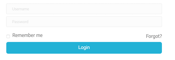
This module is straightforward. Visitors enter their usernames and passwords and choose if they want to remember that information. You can also link to a password reset page.
The Login Module is generally useful for any site that stores user information. However, it could be especially beneficial to membership sites. It’s a good idea to add this module to pages that are user-restricted as an easy way to gain access.
Menu
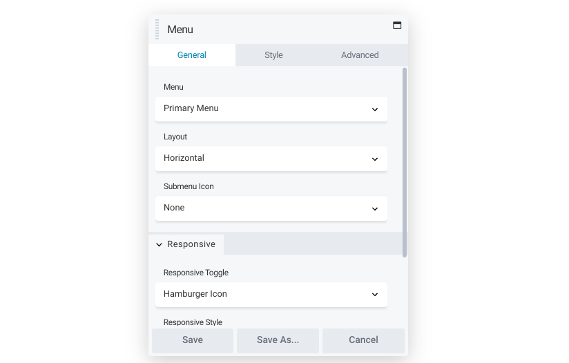
A site’s menu can be essential to proper navigation. Our Menu module gives you the ability to place any WordPress menu in the content area of the page, style the menu text and background, and choose how it will be responsive on smaller devices.
Once you have a menu set up, you’re free to place it wherever you need within the content area. For example, perhaps you want it near the bottom of the page so visitors can easily continue exploring after reading a page. Alternatively, placing it near the top could inform users of a site’s content immediately.
Like all modules, you can save a Menu module and reuse it in another layout or use a saved module as a shortcode. You might also consider specific uses for this module, such as a menu dedicated to a client’s social media accounts.
Search

The Search module provides your visitors with a quick way to search your site from within the content area on a page. It’s similar to a standard search bar but you have more layout options. For example, you can save space by only displaying a button that expands to a full search bar when clicked.
Design options are also numerous. For a dynamic touch, try enabling the Hover background color option. You could also expand the padding of the module to help make it more prominent.
The search results’ appearance is also within your control. You can
Subscribe Form
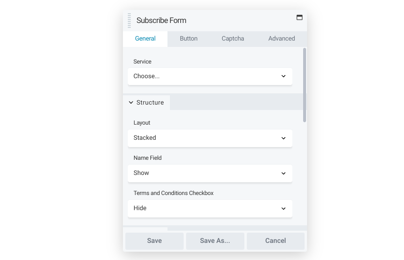 Email is a popular marketing channel. From special offers to informative newsletters, many companies choose to put together a mailing list. By adding the Subscribe Form module, you can help that list grow:
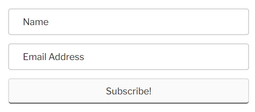
You can keep it simple like in the above example. Alternatively, you can vet submissions a little further. You might add a Terms & Conditions checkbox, or a reCaptcha field to limit spam.
This module integrates with an extensive list of over 20 mailing platforms. Once connected, you can collect and use email addresses through your client’s service of choice.
Layout
A well-designed layout can display a client’s content to its full potential. The following modules can help you create unique designs easily.
Accordion
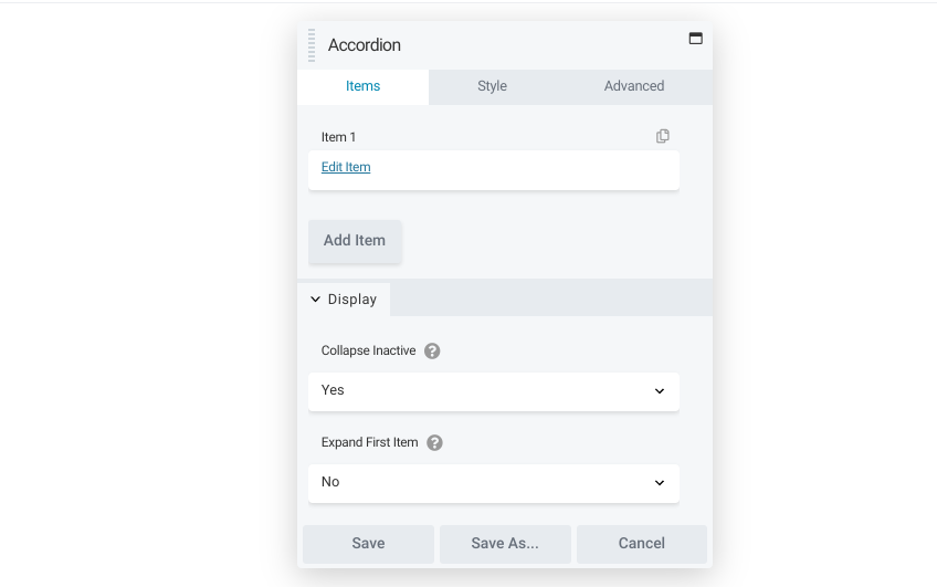
Pages that contain large walls of text can be intimidating and can make users feel like they need to hunt for critical information. Fortunately, you can use the Accordion module to make your pages easier to use:
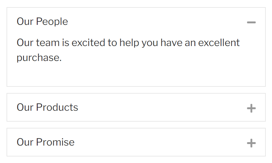
The Accordion module creates a list with discrete, expandable sections. Item sizes, labels, and content are all up to you. You can even add icons to illustrate each section’s purpose.
Accordion spaces can be valuable anywhere on your site that is text-heavy. Many site owners design their Frequently Asked Questions (FAQs) pages with accordion formatting. You could also use it as a simple way to self-pace a written walkthrough.
Pricing Table
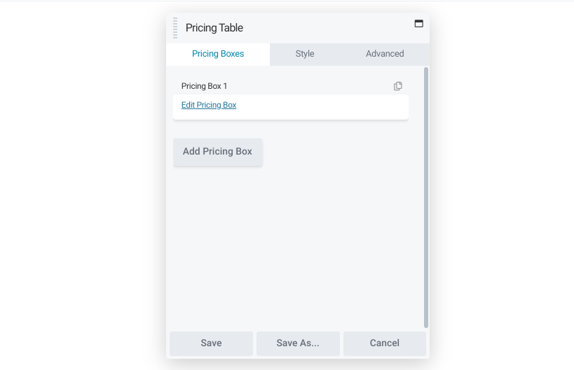
Comparison is important to some shoppers. They like to see features, options, and prices displayed side-by-side. If your client wants to provide this layout, look no further than the Pricing Table module.
This module lets you display pricing in a professional, streamlined manner. You can include a title, item features, and of course prices. You might also choose to adjust the color scheme to indicate different plan tiers:
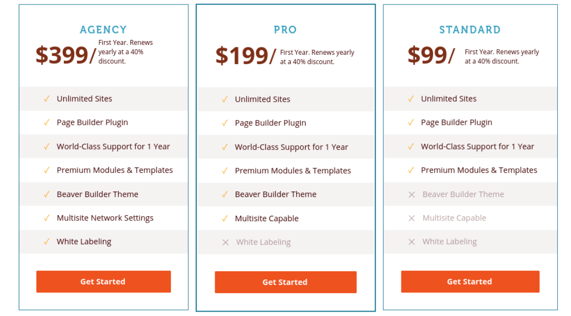
If your client only offers one pricing plan, you can still use this module to ensure that the formatting is appealing. You might also choose to include links, for example, if you’re trying to
Tabs
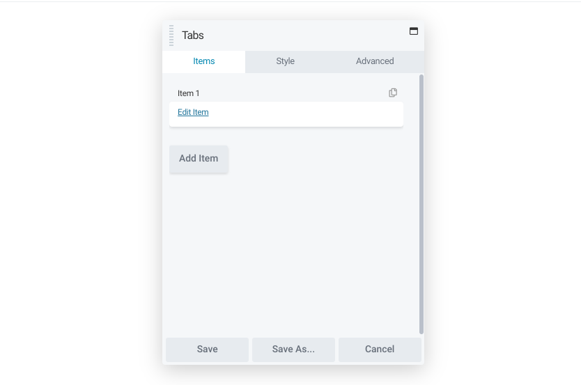
The Tabs module offers another way to assist content navigation. Whereas the Accordion module defaults to hiding all the text, the Tab module starts users off on a certain selection. Therefore, it can be ideal if you want to organize information while still making key details prominent.
You can choose from a vertical or horizontal layout, and adjust the border color of the tabs. If you’re trying to make the information pop, you can select a color that stands out against the design of the rest of the page:
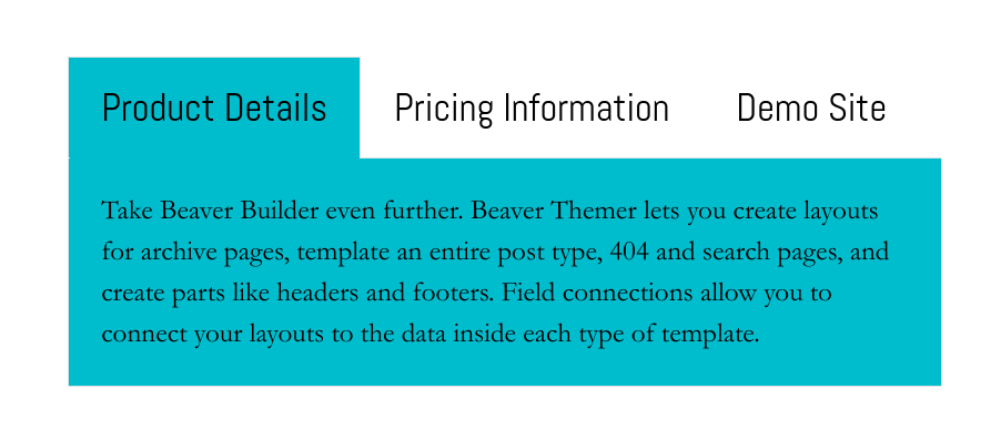
You could use the Tabs module to store different products or services in a single location. It’s also very useful for organizing help documentation because users can navigate between tabs without leaving their current pages.
Information Modules
Many organizations have facts and figures that they’re proud of. However, finding an effective way to display them can be tricky. In this case, you can use one of our information modules to accomplish this with ease..
Countdown
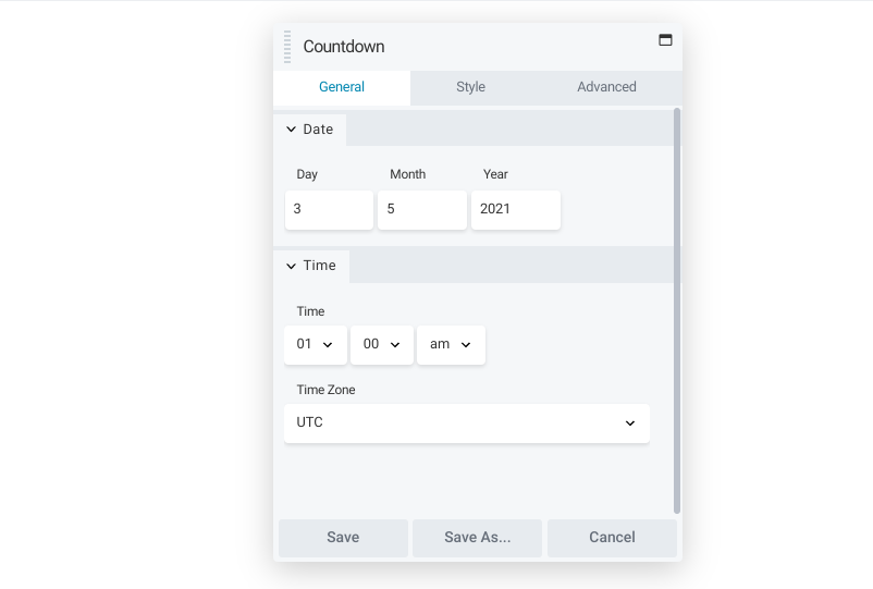
Whether you need to count down to a product launch or a meet-up, you can leverage the Countdown module to build buzz around your clients’ plans.
As you might expect, this element is fully customizable. You can select the timezone and style the layout and numbers.

Another way to use this module is to count down to the end of a sale. This can create a sense of urgency in your customer to make a purchase or simply investigate what your client is offering.
Number Counter
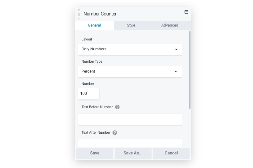
Your client might have metrics they’re proud of, such as their customer satisfaction rate. If you want to help them advertise their success, try using the Number Counter module:

Setting up a counter is simple. You can decide between a bar, a circle, or just the number itself. You can also make the number display as a percentage or a value and set the top limit to track a goal’s progress.
The ability to add different colors and text means you can use this module in many different ways. For example, you could track the progress of a fundraiser. You might also demonstrate possible savings, the number of customers, or the percentage of a project completed.
Post Modules
If you have a website in which posts make up the bulk of their content, it’s helpful to know all your options for showcasing this work. Here are a few modules that help.
Posts
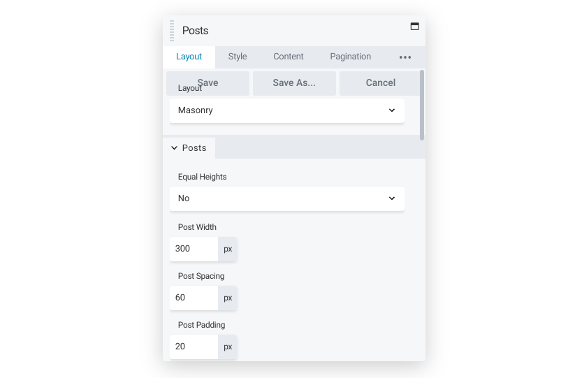
The Posts module creates post archives in a variety of layouts. The mechanics are simple, but the potential is huge, providing you with a versatile way to filter and display sets of posts:
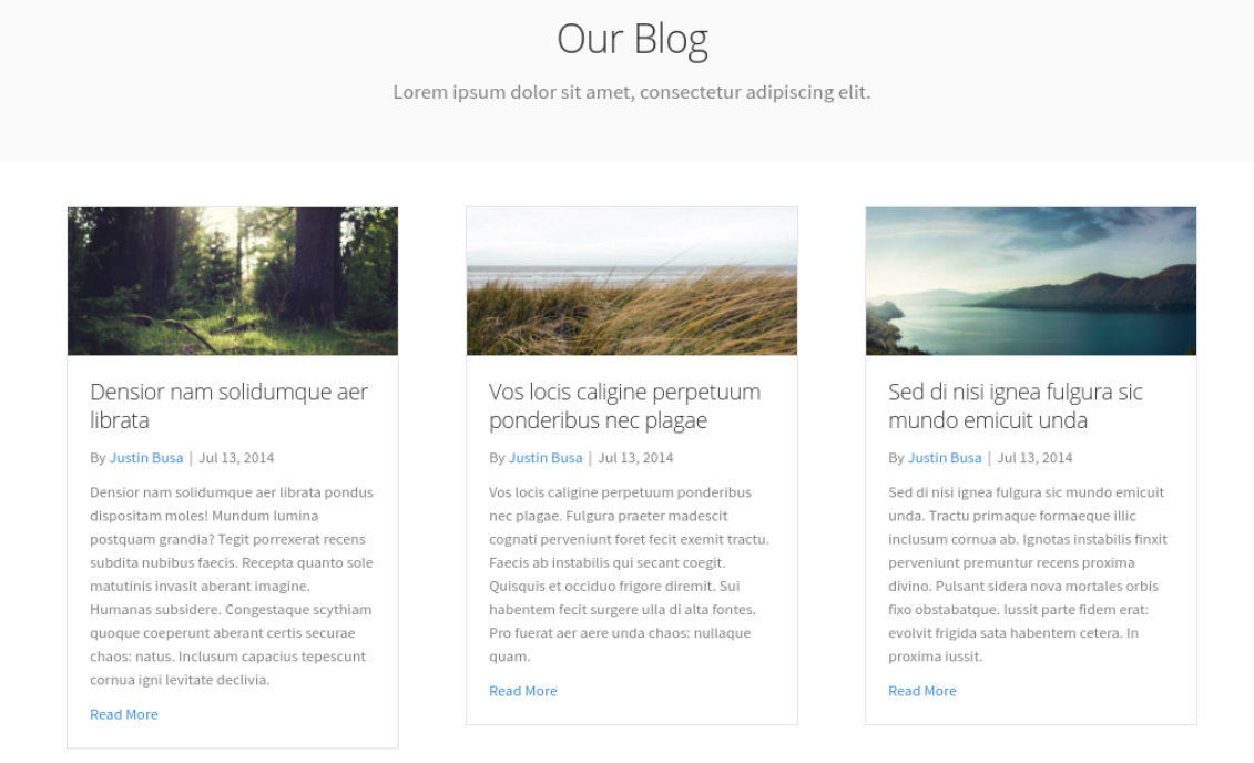
You can control the formatting, color schemes, and content. You can also choose from a wide variety of pagination options. There’s a Read more button that links to the full post or with a List layout you can opt to display the entire post.
Alternatively, you could opt for a more uniform look across a site to standardize the experience.
Posts Carousel
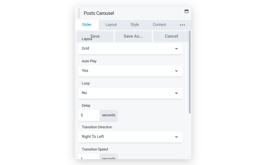
This module works similarly to the Posts module in terms of options. However, using the Posts Carousel will enable you to display a single row of posts with an option to animate the layout. Users can navigate quickly among posts for a better overall view of a site’s content.
If you use this module, you can display multiple posts in a truncated way. An effective way to use this module is by placing it at the bottom of articles. You can insert the module to promote related posts that the reader might enjoy:
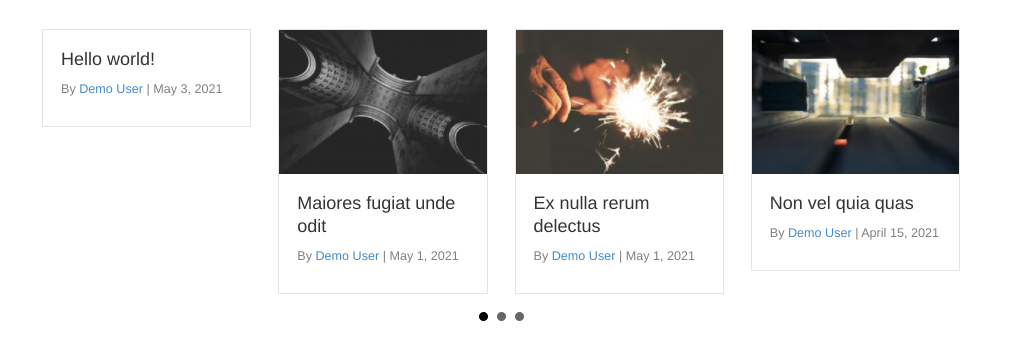
With all of the Posts modules, you can limit the display of posts to shared categories or tags. If your client feels that one category of posts isn’t getting the traffic they would like, the Posts Carousel module can be a perfect solution. You can place it on the front page to attract more attention.
Posts Slider
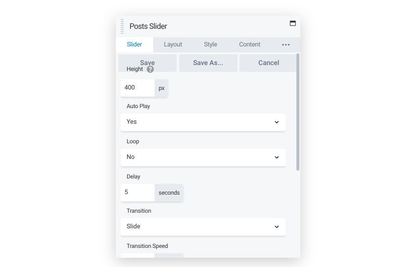
Finally, if you’re looking for a more dynamic way to showcase posts, you might want to consider the Posts Slider module. This offers you the same post formatting options of the previous two modules, but also includes a way to animate transitions, with a choice of fade-in or slider:
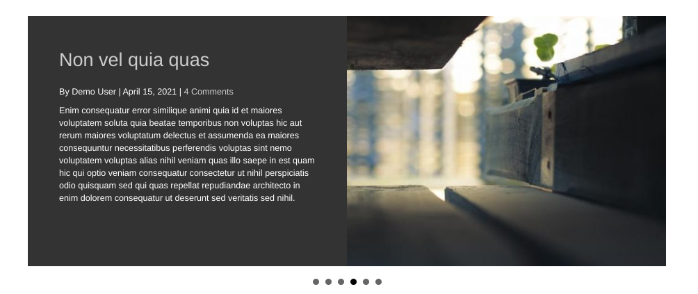
Like the Posts Carousel module, the animation adds energy to any page, and autoplay motions can catch readers’ attention quickly. A good use of this module is to highlight posts that visitors might otherwise overlook. Additionally, it is useful for advertising new product launches.
If you work for a client who has several regular contributors, you could add this module to each contributor’s profile page, filtering the content so that it only displays posts by that author as a sort of portfolio.
Conclusion
Beaver Builder can help you optimize sites for any client. However, the range of modules available can be a bit intimidating at first. Keep this guide handy to make sure you’re ready to create anything you can imagine.
Which module do you use most often? Let us know in the comments section below!
6 Comments
Related articles
Beaver Builder Favorite Features & Why We Love Them
Ever wondered what features the Beaver Builder team loves the most? 🤔 We asked our team members to share their…
Beaver Builder Dev Update: The Road to 2.10 and Beyond
Greetings, Builders! It’s been a busy stretch since our last dev update, and we’re thrilled to bring you up to…
Beaver Builder 2.9 & Themer 1.5: Multi-Layer Backgrounds, Enhanced Color Picker, Loop Module
We’re excited to introduce Beaver Builder 2.9, also known as “Coyote”, packed with exciting updates designed to simplify workflows and…
Join the community
We're here for you
There's a thriving community of builders and we'd love for you to join us. Come by and show off a project, network, or ask a question.
Since 2014
Build Your Website in Minutes, Not Months
Join Over 1 Million+ Websites Powered By Beaver Builder.
 Beaver Builder

RE: Audio file playlists module
Storing audio files in the media library slows down the website. It’s best practice to store audio files externally rather than in the WordPress media library. I don’t see an option to use the playlist using external URLs. Will BB address this in the near future?
Hi JD, Thank you so much for your question. I invite you to head over to our public feature requests board where you can submit your request. -> https://github.com/beaverbuilder/feature-requests
One more side note “comment” on this article. Thank you! The info is super helpful to share with content providers rather than duplicating efforts of creating documentation for them. However, please, please change the button on this page with text “click here”. That’s one help that hinders good practice.
Hi JD, Thank you so much for your feedback. We appreciate it. 🙂
Really good thank you!
Hi Rebecca, Thank you for the feedback!