
Beaver Builder 2.2 “Falcon” – New prebuilt rows, unit selectors, and much more.
From the early days of Beaver Builder, we’ve always embraced the philosophy that you, our users, are the best source of insight regarding the direction we should go with our product. We’re always listening and learning from your feedback and ideas. On a few occasions, some of the most highly-requested features have proven to be very challenging to produce. However, it’s always a fun day when we get to announce that we’ve solved one of those challenges and today is one of those days!
Beaver Builder 2.2 “Falcon”– named after the Falcon Dam in Mexico (and because Falcons are pretty sweet and we really like animal names) — is a designed-focused update that’s bringing several enhancements and modern front-end-design features to Page Builder.
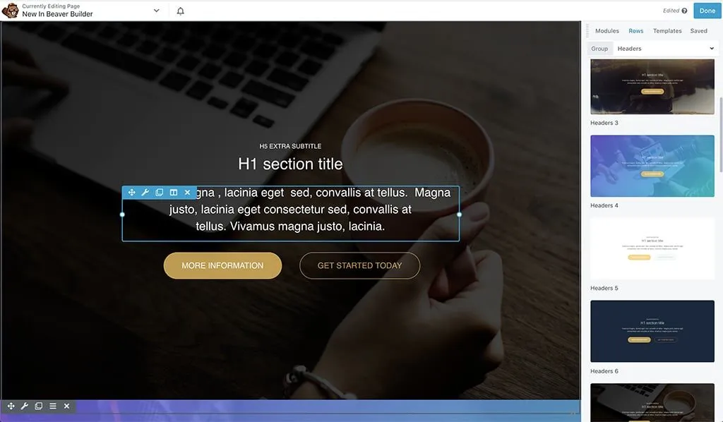
80+ New Prebuilt Row Templates
Back in April, Justin and I took a trip out to foggy London town for WordCamp London. We had an amazing time out there and, while this picture might not look it, one of the most productive meets and greets we had was with Paul Lacey and The Dickiebirds Studio crew.

Quite literally, on that computer screen pictured above, were the first iterations of the new row templates that are shipping in Falcon! To cut a long story short, Paul gave us a sneak peek of the project they were working on. Their UX and design work was fantastic, and we asked if they were interested in collaborating on some Beaver Builder templates.
In a genuine community/team effort, Falcon is bringing over 80 new row templates that can be mixed and matched for the creation of pages. Currently, Beaver Builder has a great selection of full-page templates that can be used as a starting place for new sites. Instead of creating more complete page templates, we opted for a more modular approach.
With the row templates for calls to action, pricing tables, teams, features, and much more, you can take an ‘al la carte’ approach to the next site that you build. Just pick and choose from the wide selection of designs and mash them up to create your own perfect page. Plus, many of the templates take advantage of the new design-focused features now available in 2.2!
Design and Aesthetic Goodies
Before Falcon, we put a lot of emphasis on improving UI/UX. In 2.2, we shifted gears and made significant improvements to the styling and design capabilities of Page Builder.
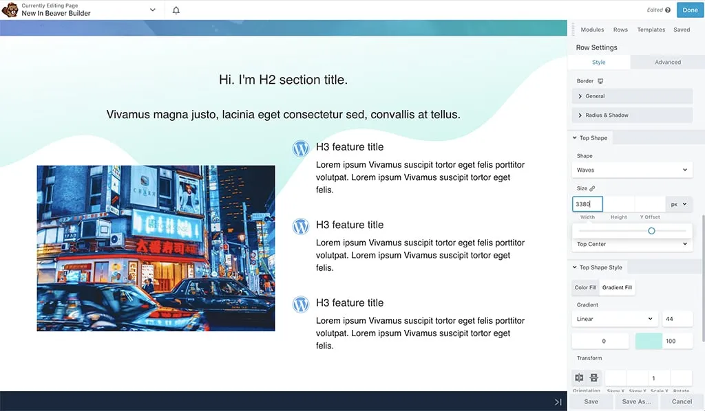
Row Shapes & Gradients
Nothing screams “bootstrap” or “page builder” like rigid, row-after-row designs. In Falcon, we’re making it easier to “break out of the box” through adding shapes and gradients to your pages. There are a handful of built-in shapes which you can use to spruce up your designs like waves, points, slanted edges, and several others cool tweaks. The shapes can be pinned to the top or bottom of any row, and we’ve added functionality to tweak and customize their appearance. Furthermore, you can add your own custom row shapes via a few simple code snippets.
Similarly, instead of just using solid colors you can now create and use gradients as backgrounds for rows, row shapes, and columns. When the gradient background option is selected a new set of toggles will appear where one can dial in colors, direction, and style.
New Animations
Also, we added a handful of new animation options for modules, rows, and columns. Previously, we used to recommend using animations very sparingly. However, we’re seeing very tasteful examples of animations being used to enhance the experience of a page or article, more and more frequently.
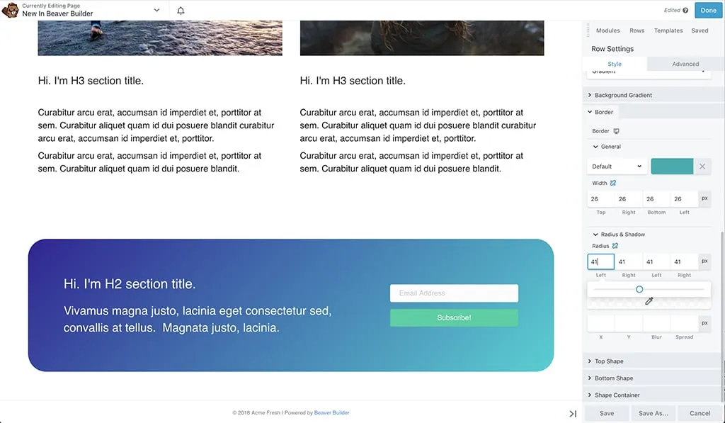
Border and Box Shadow Controls
Rounded corners and box shadows are now native features in Page Builder! Once again, particularly for box shadows, don’t overdo it. Remember, transparency is your friend! 🙂
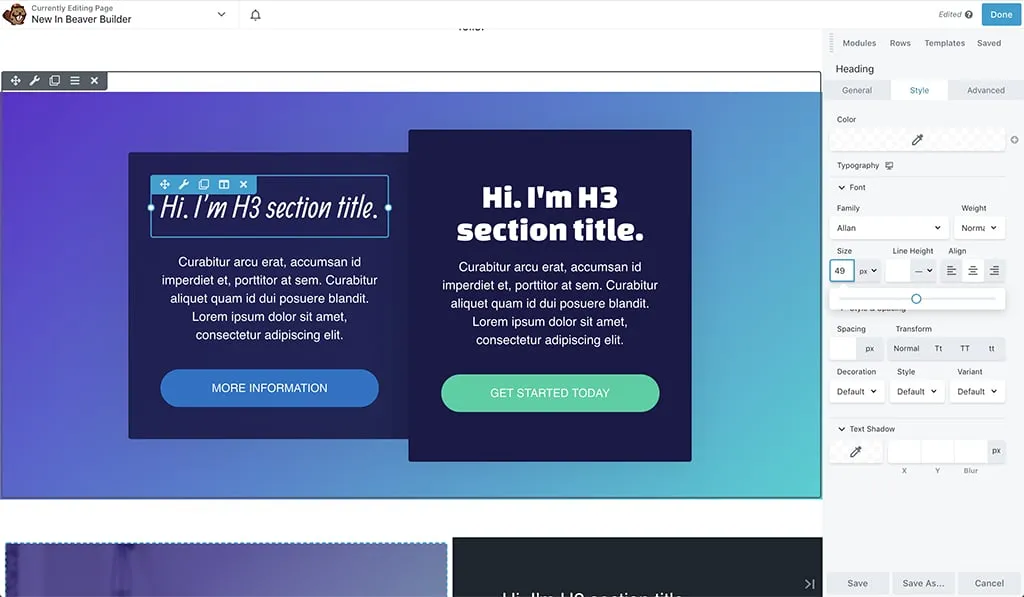
Typography Settings
Percent, Em, Rem, and Viewport-based Units
Here it is. This is big! Being able to use percentages and unit-types other than pixels has long been one of the most highly-requested features and I am genuinely thrilled to say it’s now possible! You’ll see new unit options available for all sorts of sizing and spacing options throughout Beaver Builder. Also, we snuck in the ability to link margin and padding values as opposed to entering each of the four values manually.
Quality of Life Improvements
As if all that wasn’t enough for you, you do not need to worry, there’s more! We made countless tweaks, improvements, and enhancements to several other areas like…
- Improved responsive editing mode
- An alpha slider addition to the color picker
- Row & column minimum height settings
- Ability to synchronize values for all dimension settings
- New features and improvements to over a dozen modules
- Global settings enhancements
- UI/UX tweaks and improvements
- and MANY more
Thoroughly Documented and Tested
Luckily, my work was cut out for me on this blog post as Nancy documented these changes for a collection of new articles in our Knowledge Base.
We have technical documentation that outlines things like changes to specific modules, how to use the new gradient options, working with and adding custom row shape art, including an overview of what unit options are available for what settings.
Also, we’d like to take a moment to thank everyone that installed and helped test the alpha and beta versions of Falcon. Your feedback and real-world usage are invaluable to our development team as they tackle bugs and compatibility issues. Thank you!
As always, you can find a list of the nitty-gritty details and bug fixes on our Page Builder Changelog.
What are you building with Falcon?
One of the most rewarding aspects of building a design tool is getting to see all of the creative ways the community uses it to produce different things! Often at times, we’re genuinely surprised to see folks using Beaver Builder in ways that we had never dreamed of during the development stages. Considering all of the design-focused features, we imagine this release will be no different.
So, please feel free to leave us a comment, send us a tweet, or post in the Beaver Builders Facebook group showing off your creations that leverage the new features. We’d love to see them.
Until next time. We hope you enjoy using 2.2 “Falcon” as much as we enjoyed working on it!
21 Comments
Related articles
Loop Module vs Posts Module: Which Beaver Builder Module Should You Choose?
Trying to decide between the Loop Module vs Posts Module in Beaver Builder? Both let you display posts or custom…
CommandUI and Beaver Builder Integration: Speed Up Your WordPress Workflow
If you build websites with WordPress, you know how important speed and efficiency are to your daily workflow. The good…
How to Use Beaver Builder Modules as Blocks in the WordPress Block Editor
With Beaver Builder 2.9, you get the best of both worlds—page building and block editing. Our latest release introduces Module…
Join the community
We're here for you
There's a thriving community of builders and we'd love for you to join us. Come by and show off a project, network, or ask a question.
Since 2014
Build Your Website in Minutes, Not Months
Join Over 1 Million+ Websites Powered By Beaver Builder.
 Beaver Builder




So awesome! Thank you. 🙂
Christmas comes early!!
Awesome job on this update everybody! Excited to try out the new row templates.
I wish you guy have video to show us some cool features on beaver
Fellas, once again, thank you for all your hard work. I’ve been playing around with 2.2 locally for a bit now and am super stoked with what you all have done. 2.2 is an awesome iteration in a very cool direction. I’ll wear my Beaver Builder hat extra proudly. Falcon for the win!
This is super exciting. I just wish I could go back to our first couple of websites and insist we go with Beaver Builder. I just love how fast, clean and wonderful the code is, along with being easy to create templates out of the designs. I think the more prebuilts you build, especially rows and sections over time, the better teh tool will become. And along with all that, the SEO benefits of beaver builder are my main favorite. ALL THAT JUICY Schema markup is to die for….. LOVE IT just for a video wrapped cleanly in video schema…. it’s the small things in life… right?
Thanks for all you do Beaver Builder team! LOVE YOUR THEME! THE BEST WORDPRESS THEME!
hello mate
please how can i set a small icon (favicon) with beaver builder ?
thanks
If you’re using the Beaver Builder theme, you can set a favicon in the Customizer:
https://kb.wpbeaverbuilder.com/article/206-add-a-site-icon-favicon
THANK YOU!
Sorry, I can’t express myself better 🙂 Additional question: any timeline for when the Lite Version will be update to 2.2 please?
needing a few WP5 polishes but working well otherwise. I use BB because I love how I can “hack” addons into by creating custom modules, However you guys really need to address the Pros of BB over Elementor, because I see them but a lot of people do not and I see alot of people I work with jumping ship. Please just a good old fashion brag post would go a long way
I completely agree with you.
Initially, I too got attracted because the way it is all over in the reviews and everywhere.
But not everything that looks precious or true turns out to be so.
I have experienced it for myself.
I agree.
I was one of the few that followed the hype of Elementor. After a lot of thought and countless hours of wasted time with Elementor, i have come home to BB and not going back
When can we expect some kind of undo button like CMD+Z?
It’s on our radar, but it’s still likely a ways out from being reality.
This has been promised for so long, and with every new version I look In vain for it, but it’s never there. In the meantime there it is in Brizy, Divi etc. I would happily forgo most of the last 10 new features just to get this one giant omitted. I love, love, love BB, but I hate, hate, hate the reactions I get when I have to explain to clients that there’s no real undo (revisions doesn’t come close).
In our defense, I don’t think we’ve ever promised per se. 🙂
Look, it’s been a challenge. I was writing a blog post in Beaver Builder for a personal website and accidentally deleted the row I was working on and lost 30 minutes of work/writing. I feel your pain. We’re hoping to crack the nut and make the feature a reality as soon as we can, but it’s not on the immediate roadmap because we’re still working out the best approach.
Thanks for replying, Robby 🙂
I do remember when it was shown at the Trello page as one of the items being worked on for version 2, I think it was. Not a promise, true.
But I do truly understand what a pretty gargantuan task it could be, as I looked into getting a plugin developed for it at one point and was well-dissuaded. 🙂
Even though I am yet to begin the journey with BB, I would love to see the Number Input Spinners.
Call me lazy, but it makes it easy to work, all without having to switch between the keyboard and the mouse frequently.
Hi Guys,
I just made an update and noticed that the opactity for overlay color is not available, which means the overlay color makes no sense anymore for rows cause if 100% it will hide everything behind – slideshow, video, image etc
Or maybe it has moved somewhere else?
Please HELP
thanks
Hey there. Opacity/transparency is now an option in the color picker. You can also use RGBA for colors in addition to hex values.
Thank you for a blog