Why Page Builders are Taking the World by Storm
You may see page builders as a fresh, welcome addition to the world of WordPress.
Or, you may see them as troublesome tools for cheaters and lazy wanna-be web designers.
Or, you may even see them as a downright pest.
However, the debate about the pros and cons of page builders goes way back, throughout the history of web design.
All the way back to the beginning of time… Almost. Dinosaurs were recently extinct; we’re all the way back in the previous millennium.
The year 1999.
Back then, there were no page builders. Yet, the debate was the same, disguised under a different buzzword.
In 1999, the buzzword wasn’t “drag and drop” – it was “WYSIWYG” – short for “what you see is what you get”.
You see, Adobe had acquired an HTML-editor called GoLive CyberStudio.
Adobe being a company of the 80s, they quickly rebranded it Adobe GoLive, Bateman style.
And just like Patrick Bateman had a competitor in Paul Allen, Adobe GoLive had a rival: Macromedia Dreamweaver.
Dreamweaver was powerful, but more traditional in its approach to building websites. GoLive on the other hand: was innovative!
Among its many cool features, GoLive had a layout grid.
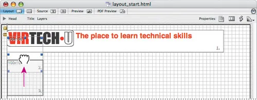
Adobe GoLive’s drag’n’drop layout grid [image source]
In fact, the more a website resembled a printed brochure the better. The same was true for Flash-based websites. Only difference being: on Flash-sites the elements were animated.
If you weren’t a cool cat down with GoLive, Dynamic HTML, Dreamweaver, Flash, et al, the alternative was a GeoCities’ish page, typically made in Microsoft Frontpage or Netscape Composer, with few formatting options other than aligning each element left, center, or right. Except if you were using tables for layout. More on that in a minute.
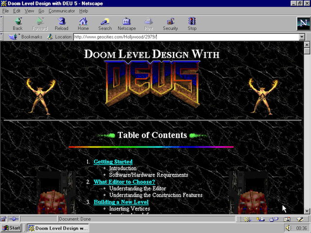
Indeed: horrendously hideous times. Replete with tacky animated-GIF buttons for email links:
![]()
Back then people WANTED email. No talk about “inbox zero” nor declarations of “email bankruptcy”… Nah, rather, it was like:
“Please, PLEASE will someone please email me?! I have an “animated pigeon” email-button! How can you resist??”

… And an “Under Construction” animation was a procrastinator’s dream come true: it could solve all cases of design and development stress:)
![]()

What happened to GoLive?
Riding the wave of Flash’s success, Macromedia’s Dreamweaver won the popularity-contest.
Thinking “if you can’t beat them, join them” Adobe acquired Macromedia in late 2005, letting GoLive die a slow but certain death by neglect, until early 2008 when Adobe finally announced admitted that sales and development of GoLive would stop – in favor of Dreamweaver.
Sadly so.
I enjoyed GoLive far more than Dreamweaver. It was a visionary, modern web design tool – its Layout Grid just a small part of its appeal.
Curiously, Adobe also chose to kill Fireworks, a Sketch-like app tailor-made for creating web graphics, in favor of good ol’ Photoshop. Fireworks was a brilliant app, yet Adobe always treated it like an unwanted stepchild from their Macromedia-acquisition.
Adobe does as Adobe does I guess…

Anyway… Back to “WYSIWYG” and “drag & drop” web design:
I remember vividly how GoLive was criticized for the bloated code that came as a result of using its Layout Grid editor (it did better than Microsoft Frontpage, though). Lean, fast-loading code was as important back then as it is today.
The proposed alternative back then? Manual labor, aka hand-coding.
Today’s proposed alternative? Avoid page builders, code your layouts by hand. Or be satisfied with WordPress’ single content area. Viable? Maybe… Or (Maybe) Not.
Table-based web design (those were the days…)
As web designers we then began slicing our graphics into pieces, to place them inside table cells. That was the “table-based layout” era of web design.
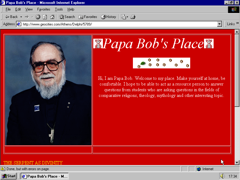
Ahh, those were the days, huh? Papa Bob forgot to hide the table borders, but doing so could yield a design as spiffy as this:
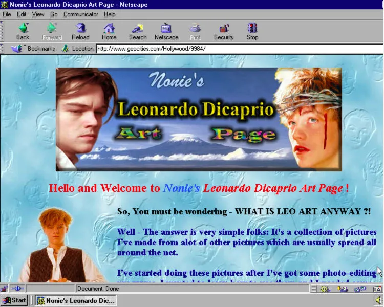
See how that image of Leo is left-aligned? Cool eh?
If you’re too young to have experienced table-based web design: don’t worry. It really wasn’t all it’s cracked up to be. More like… a book-chapter you’d skip;)
Oh! And not to forget:
Frame-based web design
Oh the endless joys of frames and iframes… From the times when Michael Jackson was black, Mom was still a little boy, coke was clean and white as snow, and… well, you get the idea:)
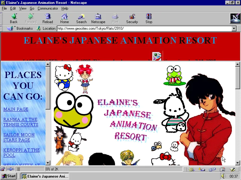
Ahh, those frames in this Japanese anime website. They’re really somethin’… they could walk around like they’re bigger than Prince, right?
Oh, and Java Applets! Remember those? Not to confuse with JavaScript, they where tiny executables, that could twist an image. Or put a live ripple reflection effect below an image. Horrible stuff, really. But remember: we didn’t have page builders back then. We were starving for ways to make our websites interesting and beautiful.
Not that a Java Applet would help with any of those two, but… times were different… back then… ahem…
I won’t subject you to a real Java Applet. They could make browsers unstable. But this lil’ GIF-anim is quite Java Applet’ish:

Parallax beats Java Applets anytime, anyplace. Agree?
Enter a lustrous Zen Garden blooming with beautiful CSS
The ugliness came to an end, with CSS Zen Garden.
CSS Zen Garden sparked a wildfire of “semantic” web design. At first, only purists adopted “XHTML” and strict separation of content (XHTML) and presentation (CSS) but it soon became widely accepted as the standard way to develop websites (until HTML5).
With the semantic separation of content and presentation, came a subtle, welcome reformation of web design aesthetics. Why? Difficult to pinpoint the exact cause, but (IMO) websites generally got simpler, and a whole lot nicer to look at, in the following years.
“Believe it or not, there was a time when CSS was not taken that seriously as an aesthetic function of a website. Dave Shea went about to change that perception with the CSS Zen Garden, a site showing off different CSS designs that could be wildly beautiful, fun, functional, or all of the above. A fertile ground to demonstrate new concepts, this site has become a massive source of inspiration for designers who are looking for new ways to use CSS.”
Alec Rojas, 20 Years of CSS
Dave Shea’s plan worked: encountering and perusing the CSS Zen Garden examples changed my outlook on web design. I was in awe. Decided to learn CSS, and quickly did so, with a great CSS tutorial that’s still online to this day.
Alas, while CSS Zen Garden helped popularize “semantic” web design – and reform web design aesthetically with a focus on simplicity and elegance: non-techies still couldn’t design their own page layouts without writing HMTL and CSS, i.e. more coding.
So while web designers basked in the glory of pure CSS designs, non-techies were still out of luck.
What I’m getting at with the above history lesson, is this:
Ever since the World Wide Web went mainstream in the late 90s, web designers, their clients, and average “Janes” and “Joes” alike, have craved well-designed, graphically interesting websites – done easily and quickly.
Page Builders – the Second Coming of WYSIWYG
Cue soundtrack: “Joy to the World” with Three Dog Night.
FFWD a few years, and along came powerful WordPress theme frameworks and flexible super-themes like Headway, PageLines (incl. its incarnation “DMS” – Design Management System), Divi, among many others.
And, of course: WordPress page builders – most notably Visual Composer.
Its monumental market-adoption made the need for page builders crystal-clear, as it took off, in 2013.
Since then, quite a few other (and better, IMO) page builders have entered the stage. Beaver Builder being one of the most popular, and for good reason.
Drag & Drop Web Design – Finally for Real
In light of the above history: page builders are a blessing – one of the seven wonders of modern web design.
We’re fortunate to finally have the “WYSIWYG” / drag & drop tools we’ve been waiting for, since the last millennium!
Finally, the future has caught up with our expectations:)
How about you? Are you on the page builder fanwagon – or still on the fence? Share your comment below!
18 Comments
Related articles
CommandUI and Beaver Builder Integration: Speed Up Your WordPress Workflow
If you build websites with WordPress, you know how important speed and efficiency are to your daily workflow. The good…
How to Use Beaver Builder Modules as Blocks in the WordPress Block Editor
With Beaver Builder 2.9, you get the best of both worlds—page building and block editing. Our latest release introduces Module…
7 Pro Tips for Using Multi-Layer Backgrounds in Beaver Builder
Beaver Builder 2.9 introduced a powerful new design feature: Multi-Layer Backgrounds. This update gives you more creative control over rows,…
Join the community
We're here for you
There's a thriving community of builders and we'd love for you to join us. Come by and show off a project, network, or ask a question.
Since 2014
Build Your Website in Minutes, Not Months
Join Over 1 Million+ Websites Powered By Beaver Builder.
 Beaver Builder


I’ve been a beaver believer for several years now! Gawd, I love them!
BB allows me to work quickly on web design for clients while also leveraging their site into their core business strategy. It has been a great tool to expand my business offerings as a freelancer.
Thanks for the post – it was a great history lesson.
Now on to fight the FCC in their attempt to kill net neutrality….
Oliver, thank you refreshing my internet newbie days 🙂 CSS Zen garden, netscape navigator, frontpage, geocities, go live! wow, it all seems so yesterday and yet it feels old.
As far as pagebuilders are concerned, I think they’re fantastic. A good way to start for any individual, small business and in many cases even multi-million dollar businesses. Marketers in general love these tools.
Hey Mayank
Indeed it does feel recent – and at the same time distant, in our minds:) And it’s fascinating to realize the building blocks (HTML, JS, CSS) are more or less still the same – it’s what we *do* with those building blocks that’s changing:)
CSS Zen Garden – such a brilliant idea. Really helped show the world what CSS could do.
What do you think is next for web design (and WordPress) in 5 years? With Gutenberg and all…
=)
Hey JJ – you’re welcome – domo arigato! *bows humbly*
“Beaver Believer” … gosh I like that one! Hadn’t thought of it:) I luv such alliterations :o)
Omg I forgot about frames! What a trip down memory lane. I still remember the exhilaration of writing my first working html pages circa 1996 in Notepad. The resident geek decided to leave for a bigger company and told me he would train me up as I had the right apititude for the work. I remember struggling with frames but finally getting it. Then Dreamweaver felt like cheating. I don’t even remember learning CSS feels like i just picked it up by Osmosis. I remember Css garden and feeling in awe of what could be done. And now after years of hand coding my own client theme I decided enough was enough and I embraced Beaver Builder 2 years ago. I’m a much happier and productive web designer and my clients love their drag and drop sites. Excited to see what’s next!
great article! Thanks for diggin up all those screen grabs from years past. Geocities. brings back fond memories of my childhood!
You’re very welcome Jeff:) I get nostalgic too:)
Love this article! I well remember those early days of Web design and development. I think today’s page builders are a great tool, especially in the right hands. Beaver Builder has certainly made my work easier. I wish my first commercial site were on the Wayback Machine 🙂
Thank you for loving it:) Warms my inner writer’s heart:)
PS: Too bad it’s not in the Wayback Machine. It can be great fun looking at one’s old websites. Most often, I’m amused by the amount of redesigns I used to do. Strange, as it was much more time-consuming back then, before CMS’s came into the picture (with template engines).
Nah, forget dreamweaver, “real programmers” in…1994 (!!!) use Hot Dog Pro.
Here’s a screenshot (it’s so old the software was in black & white).
http://www.fast-consulting.com/images/workbook.gif
Time to add “streaming Audio” with the newest coolest thing called RealAudio and “streaming video” with VivoActive and this new vector animation thing called “Super Splash” and NOW we are in business.
Alright old farts jokes aside, I like your article because it brought me back to 1994-5 when I started editing HTML with (Web Edit 1.0) and Hot Dog pro and then Dreamweaver came in.
I always sticked to code but with Wordpress today, it’s not a little wave, it’s a freakin WYSIWIG Tsunami and just like Adobe with Dreamweaver, if you can’t beat them, join them so I dropped hardcoding and jumped into the WP bandwagon with Avada.
Now I realize that this was a mistake because you could only do 1 website with that license and if you did 100 then you had to buy 100 licenses (OUCH). Also, I discover today a thing called “code locking” meaning that when you uninstall Avada, you lose not just the builder but the theme too and now your site is just a bunch of shortcodes on a white page (at least on my Mosaic Browser here).
With GeneratePress and other themes, you can install and uninstall Beaver builder without losing your website so that’s a big plus for web designers and that’s why I moved to BB.
Now if you excuse me, I have to reinstall my Eudora email software because I just installed my new Win 3.1 yyyyay! Time to go in Gopherspace and see what the latest BBs talk about.
Hehehe, that’s a lotta old school rhetoric right there:) Good fun:)
RealAudio… Had totally forgotten about it. Mentioning it, you sent shivers down my spine. Good riddance 😀
Thanks for your comprehensive history, Oliver. I’m there with you having started the Dreamweaver Meetup group 10 years ago. In some ways, the term WYSIWYG needs to be retired. In my mind, it’s more about who will be first to crack the code in making web design/development accessible to a broad-based audience. Beaver Builder is the best thing I’ve seen to date. Designers love it because they can design. Developers use it because it short cuts a lot of code creation. It does not eliminate the need for either skill set… it just makes both skill sets more agile and creative. In short order, BB will not be a page builder. It will be an indispensable digital toolkit.
Hey Stephen, thank you for commenting. Good points on designer- and developer-use of Beaver Builder!
Very fun read! But what about page builder “lock in”? Some page builders can be (intentionally?) a nightmare to switch from (yes, you Divi).
Lock-in of course undermines one of the main features of WordPress, being able to fairly easily change themes and plug-ins if your needs change or when something better comes along.
… or when your theme developer crashes and burns like Headway Themes.
Hey Scott!
It’s a tough task to switch between page builders. That’s a big problem. As you point out, developers can go out of business, necessitating a switch.
Fortunately, history doesn’t stop here. Gutenberg is a step in the right direction: getting things more standardized. Exciting times ahead! How will page builders adapt? Time will show:)
A superb short history of web design.
WordPress is experiencing “sea change” moment caused by the success of page builders and market competitors like Wix and Squarespace. Gutenberg is going to wreak financial havoc on businesses already heavily invested in customized WordPress sites. They won’t have the funds to redesign for Gutenberg. The perceived need for individuals to build their own websites without the help of professionals should be more carefully examined. And that is what is driving a lot of the WordPress change…lowest common denominator users being able to build their own website.
Hey Frank
Thank you for commenting:)
Gutenberg will be good for WordPress in the long-term, if executed right. Matt’s State of the Word keynote-speech (and the demo) was reassuring. Joen on the Gutenberg developer-team is reassuring as well. He’s a very skilled, very experienced digital designer. He’s Danish (like me) so I know his work from way back.
Ordinary people building their own websites isn’t a trend we can reverse. Nor should we. It’s a good thing:)
It is a challenge for web designers / freelancers. But websites built without Gutenberg won’t stop functioning. Gutenberg may be a seismic shift, but it’ll be a slow shift:)
Oliver