
4 Ways to Use Beaver Builder to Elevate Your Agency’s Websites
A truly functional website should be easily updated by all your agency team members. Beaver Builder makes building sites a simpler, smoother process for our dev team and makes it easy for the content and marketing teams to continue doing updates down the road.
Beaver Builder is consistently ranked in the top five page builders and has been around long enough to have its own ecosystem with plenty of third-party add-ons.
In this article, we mention Ultimate Addons for Beaver Builder (UABB), a premium, plugin that additional modules packed with extra design features.
Learn how our marketing agency uses Beaver Builder to design high-quality, highly functional sites.
How to Use Beaver Builder To Build More Professional Websites
#1: Enhance Ecommerce UX
Our client came to us looking for a site like Amazon… and we did our best to deliver! Beaver Builder helped us build out a clean, modern ecommerce experience for them.
Category Slider
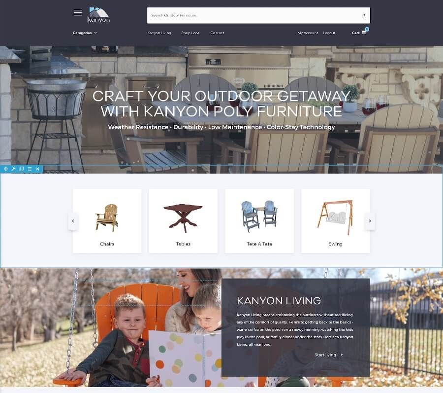
The category slider pictured below is a UABB Image Carousel module. This allows the client to feature popular types of products and helps them move inventory.
Dynamic Menu Based on Screen Size
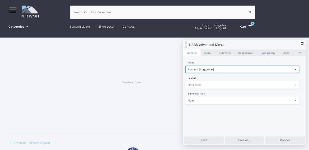
The site uses a UABB Advanced Menu to create a more dynamic menu that adapts to the user’s screen size, allowing them easy access to their account, cart, or more information about the brand.
This screenshot shows some of the Advanced Menu module’s settings.
Off-Canvas Menu with Beaver Builder
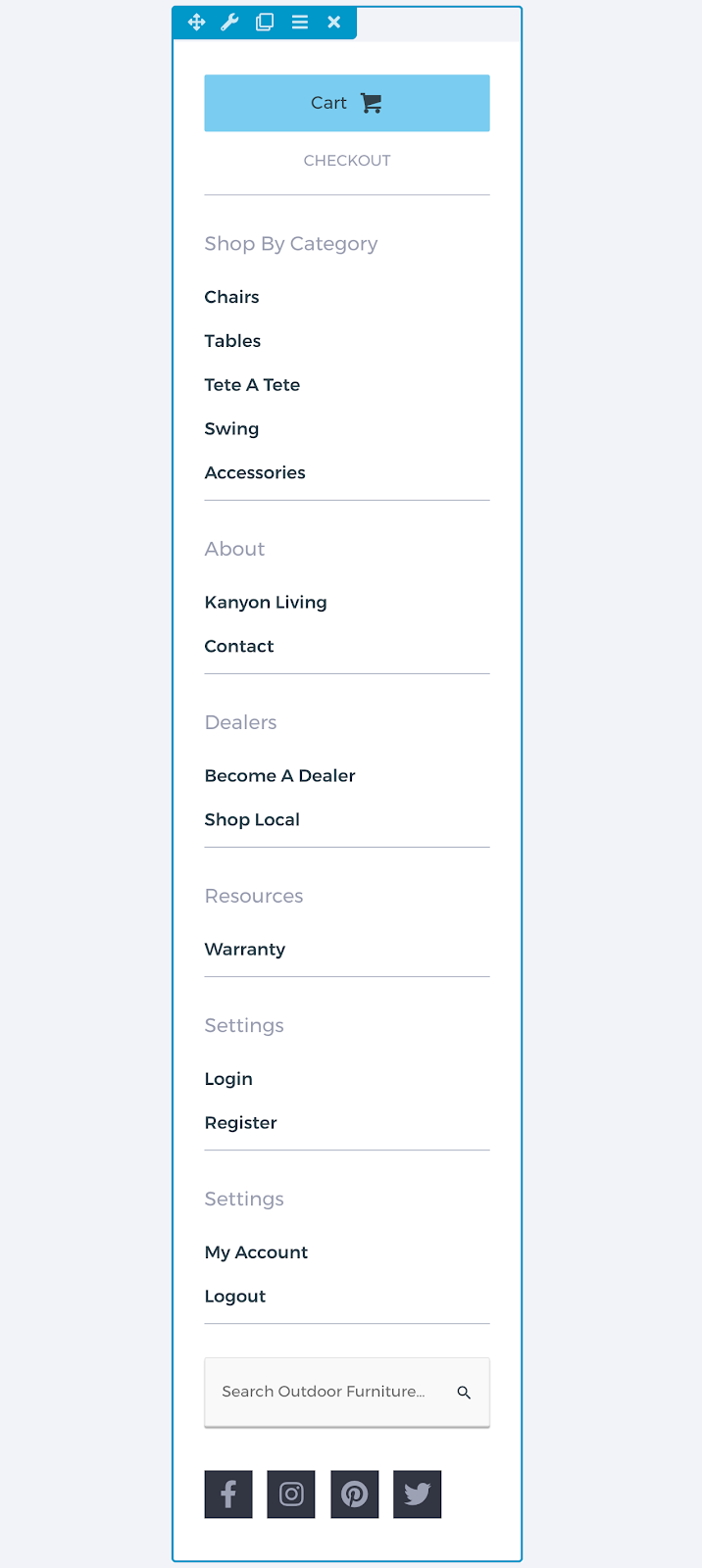
Finally, the site uses an off-canvas menu to feature various categories and other pages shoppers look for, shown in this screenshot.
#2: Create A Tailored Brand Experience
You can also use Beaver Builder to elevate your site by creating a more tailored brand experience. This prevents your site from looking templated and blending in with your competitors.
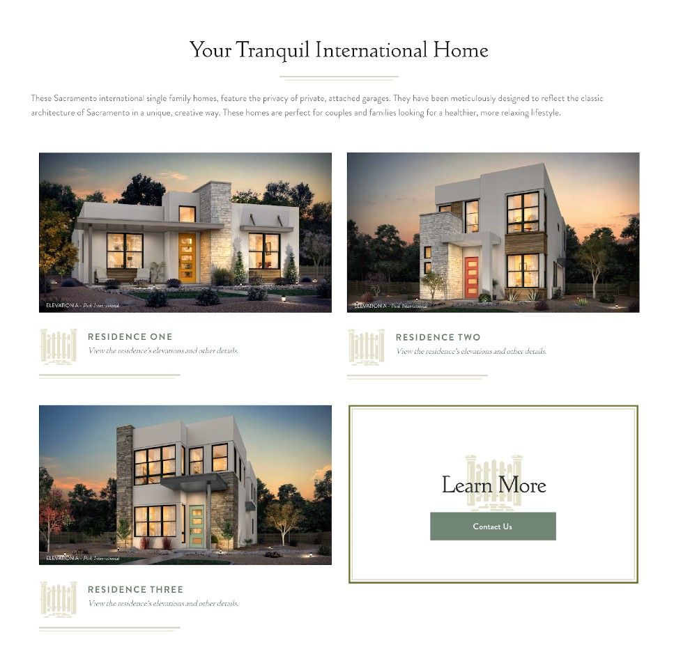
Here’s how we used Beaver Builder to create a tailored, elegant brand experience for a home builder’s new community.
Differentiate Products With A Grid Layout
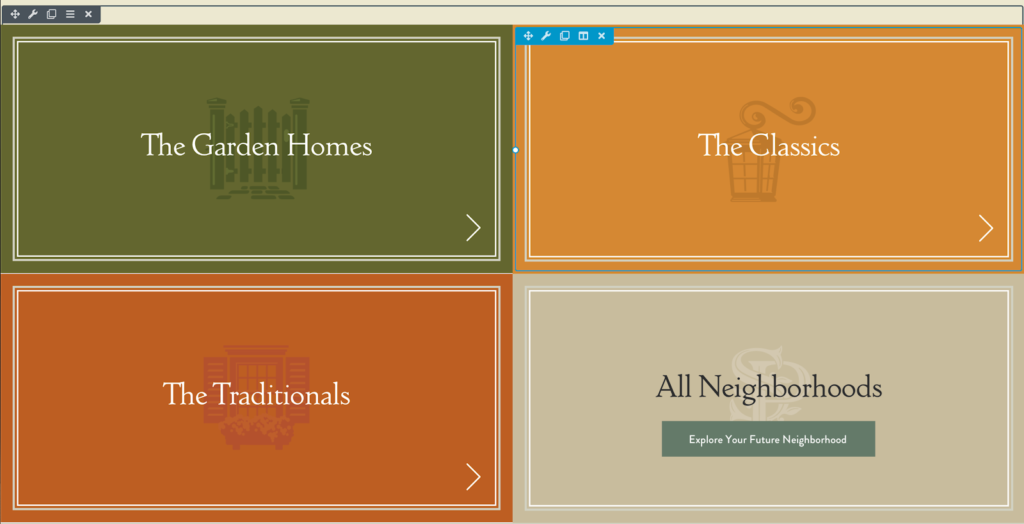
Branding each neighborhood within the masterplan community helps give each a unique identity and differentiates this client from their competitors.
We did so by creating a grid layout using simple UABB Photo modules showcasing the sub-brands in question.
Dynamic and Offset Margins
Dynamic and offset margins also create a unique experience for the site’s users. The offset effect below is achieved by adjusting the column settings to use 25% padding on the left.
Responsive Grid Layouts Allow For Expansion
Finally, a responsive grid layout is used throughout the site to allow for expansion as needed. As new home models are added, it’s easy to add another row consisting of a UABB photo module and an infobox.
The final “learn more” is responsive to the width of the row, ensuring that no row is left with an odd number of items.
#3: Fascinate With Animations
Animations Tied To The Scroll Position
The animations on this site were done with JavaScript and are tied to the scroll position, giving this site a fun, interactive feel.
Modifying A Callout Module To Include Custom Animations
This animation uses anmie js, a JavaScript library for animation, to modify the paths of the SVG file, creating the wave effect seen below.
#4: Improve Menu Navigation
Create A Unique Menu Using A Tab Module
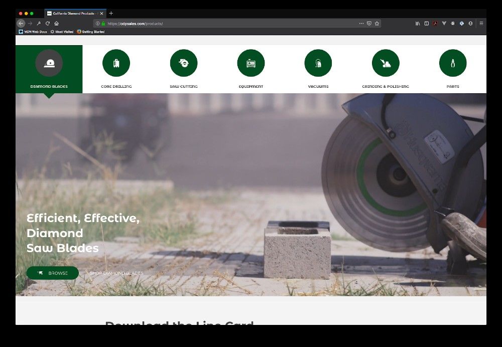
This site creates a unique menu experience using a Tabs module. The content of each tab is a saved row, allowing us to share information and link users to a specific product or service line.
Create A Fullscreen Menu Experience
The page on the left slides in to share contact information to encourage users to get in touch, creating a lead generation opportunity. The off-canvas menu to the right functions as normal.
Wrap-Up
Beaver Builder’s versatility makes it easy to include unique design elements, animations, and other features in your site without building something only your dev team can edit.
The above are just four ways you can use Beaver Builder to step up the professionalism of your sites. What’s the most creative way you’ve used Beaver Builder?
4 Comments
Related articles
Beaver Builder Favorite Features & Why We Love Them
Ever wondered what features the Beaver Builder team loves the most? 🤔 We asked our team members to share their…
Beaver Builder Dev Update: The Road to 2.10 and Beyond
Greetings, Builders! It’s been a busy stretch since our last dev update, and we’re thrilled to bring you up to…
Beaver Builder 2.9 & Themer 1.5: Multi-Layer Backgrounds, Enhanced Color Picker, Loop Module
We’re excited to introduce Beaver Builder 2.9, also known as “Coyote”, packed with exciting updates designed to simplify workflows and…
Join the community
We're here for you
There's a thriving community of builders and we'd love for you to join us. Come by and show off a project, network, or ask a question.
Since 2014
Build Your Website in Minutes, Not Months
Join Over 1 Million+ Websites Powered By Beaver Builder.
 Beaver Builder


It would be great if you could build the scroll animations directly into Beaver Builder like on Divi : Divi Scroll Effects >
https://www.elegantthemes.com/blog/theme-releases/divi-scroll-effects
Very nice
Thanks for the tips. Interested in learning more about the animations in #3. Can you link more info about using the animation scripts with BB? A tutorial would awesome!
This is really exciting! Would love a tutorial for all/any of these examples.